Data Analysis
Data analysis is the process of examining, transforming, and arranging data in a specific way to generate useful information based on it. It also allows for reaching certain outcomes and conclusions through analytical and logical reasoning.
Note
This functionality will be introduced in Ignite UI for Angular as external package in order to ease the configuration and limit the required code at minimum
Data Analysis with DockManager
Go ahead and perform a cell range selection or column selection in order to enable the Chart types view based on the selected data. This view is part of Dock Manager's right pane. From there you can:
- Choose specific chart type and visualize it in separate pane.
- Or use the
Data Analysiscontext button to show different text formatting options.
Note
The Dock Manager Web component provides means to manage the layout of the application through panes, and allowing the end-users to customize it further by pinning, resizing, moving and hiding panes. After selecting data, go ahead and create a couple of charts and pin them (by dragging) to the available areas
Keep in mind (sample related):
- On new data selection chart data will be updated.
- If multi-cell range selection is applied, only the
Text formattingfunctionality will be available. - If selected data is not compatible for any of the charts - an "Incompatible data" warning message will be shown.
Data Analysis Package
You can start using this functionality by following the steps below. Keep in mind that igniteui-angular-extras package is only available through our private npm feed. If you have a valid commercial license, you will have access to the private feed.
Lets start with:
- Installing the package in your application
npm install @infragistics/igniteui-angular-extras
- Installing the package peer dependencies
npm install @infragistics/igniteui-angular igniteui-angular-core igniteui-angular-charts
- After the installation of the packages go ahead and:
- Add the
IgxExtrasModuleto your app.module.ts - Apply
igxChartIntegration,igxConditionalFormatting,igxContextMenudirectives to your grid
- Add the
<igx-grid #grid1 igxChartIntegration igxConditionalFormatting igxContextMenu
    [data]="localData" [autoGenerate]="true">
    <igx-paginator>
    </igx-paginator>
</igx-grid>
And that's it! You can now perform cell range selection and follow the data analysis flow.
Data Analysis Button
The data analysis button is the outlet to visualize your selected data in various ways:
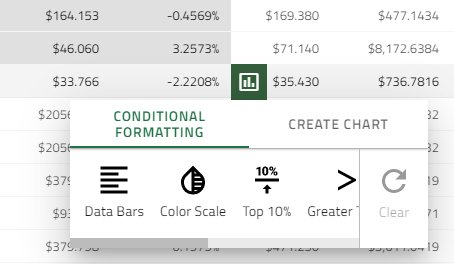
This way every range selection performed in the grid can be easily analyzed in a single click.
The button is rendered on every range selection at the bottom-right of the selection and hides when the selection is inactive. Horizontal and vertical scrolling reposition the button so that it is always rendered at its designated position.
Chart Integration
This section introduces Grid's integration with charting functionality, which allows the end user to visualize a chart based on Grid's selected data and choose different chart types if needed.
The chart will be shown by selecting a range of cells and by clicking on the show analysis button.
Note
The chart creation option is only available when there are numeric values in the selected data.
We currently support the following Chart types:
- Column Chart, Area Chart, Line Chart, Bar Chart,
- Stacked Chart, Stacked 100% Chart,
- Pie Chart, Scatter Chart, Bubble Chart In order to show meaningful Bubble Chart we disable the preview when the data is not in valid format.
Conditional Cell Formatting
If you have a Grid with thousands of rows of data it would be very difficult to see patterns and trends just from examining the raw information. Similar to charts and sparklines, Conditional formatting provides another way to visualize data and make it easier to understand.
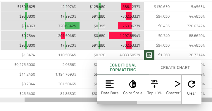
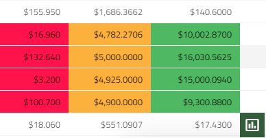
Understanding conditional formatting - it allows for applying formatting such as colors and data bars to cells based on their value in the range selection. The sample below demonstrates how you can configure the Grid to apply Conditional Formatting. It depends on the Conditional formatting selection type what condition rules will be shown. Below you will find the predefined styles (presets) that you can use in order to quickly apply conditional formatting to your data. The formatting of a range gets cleared when performing formatting on different range or through the clear button. The clear button is only active when there is an applied formatting.
Number range selection
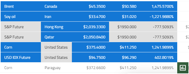
Data Bars- Data bars can help you spot larger and smaller numbers, such as top-selling and bottom-selling products. This preset makes it very easy to visualize values in a range of selected cells. A longer bar represents a higher value. A cell that holds value of 0 has no data bar all other cells are filled proportionally. Positive values are withgreencolor and negative values will bered
Color Scale- The shade of the color represents the value in the cell. The cells that hold values below the*Lowest thresholdwill be colored inred. The cells that are above the*Highest thresholdwill be colored ingreen. And all the cells that are between theLowestandHighest thresholdwill be colored inyellow.
Lowest threshold- Below 33% of the maximum cell value in range selection.
Highest threshold- Above 66% of the maximum cell value in range selection.
Top 10%- Use this preset to highlight the values which are equivalent to top 10% of the selected data.
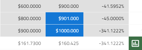
Greater than- This preset marks all valuesGreater than the avaregeDuplicate values- Marks all duplicate values.Unique values- All cell values that are unique will be marked (bluebackground color).
Empty- Marks all cells withundefinedvalues
Text range selection
Text contains- Marks all cells that contain the cell value from thetop-left most selected cell. Example:
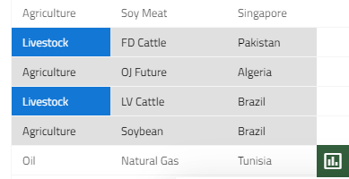
Duplicate values- Marks all duplicate values.Unique values- All cell values that are unique will be marked (bluebackground color).Empty- Marks all cells withundefinedvalues
Demo
Data Analysis Package API
IgxConditionalFormattingDirective
| API | Description | Arguments |
|---|---|---|
ConditionalFormattingType |
An enum, which represents the conditional formatting types | |
IFormatColors |
An interface, which represents the formatting colors | |
formatter: string |
An input property, which sets/gets the current formatting type | |
formatColors |
An input property, which sets/gets the current formatting colors | val: IFormatColors |
onFormattersReady |
An event, which emits the applicable formatting types for the selected data, when they are determined. |
|
formatCells |
Applies conditional formatting for the selected cells. Usage: this.conditonalFormatting.formatCells(ConditionalFormattingType.dataBars) |
formatterName: string, formatRange?: GridSelectionRange [ ], reset: boolean (true by default) |
clearFormatting |
Removes the conditional formatting from the selected cells. Usage: this.conditonalFormatting.clearFormatting() |
IgxChartIntegrationDirective
| API | Description | Arguments |
|---|---|---|
CHART_TYPE |
An enum, representing the supported chart types | |
OPTIONS_TYPE |
An enum, representing the supported options type, which can be applied to a chart component | |
IOptions |
An interface for chart property options | |
chartFactory |
Creates a chart component, based on the provided chart type. Usage: this.chartIntegration.chartFactory(CHART_TYPE.COLUMN_GROUPED, this.viewContainerRef) |
type: any[ ], viewContainerRef: ViewContainerRef |
setChartComponentOptions |
Sets property options to a chart component. Usage: this.chartIntegration.setChartComponentOptions(CHART_TYPE.PIE, OPTIONS_TYPE.CHART, {allowSliceExplosion: true, sliceClick: (evt) => { evt.args.isExploded = !evt.args.isExploded; } }) |
chart: CHART_TYPE, optionsType: OPTIONS_TYPE, options: IOptions |
getAvailableCharts |
Returns the enabled chart types | |
enableCharts |
Enables the provided chart types. By default all chart types are enabled | types: CHART_TYPE [ ] |
disableCharts |
Disables the provided chart types | types: CHART_TYPE [ ] |
onChartTypesDetermined |
An event, emitted when the chart types, applicable for the chartData, are determined. This event emits an object of type IDeterminedChartTypesArgs, which has 2 properties: chartsAvailabilty: Map<CHART_TYPE, boolean> - the enabled/disabled chart types, chartsForCreation: CHART_TYPE[] - the applicable chart types for the chartData |
|
onChartCreationDone |
An event, emitted when a chart is created. This event emits the chart component, which is created | |
chartData: any[ ] |
An input property, which sets/gets the data for the charts | selectedData: any[ ] |
useLegend: boolean |
An input, which enables/disables the legend usage for all chart types. By default it is set to true | |
defaultLabelMemberPath: string |
An input property, which sets/gets the default label member path for the charts. By default the label member path will be determined, based on the provided data. ( if the provided data records have properties with string values, the first string property name of the first data record in the chartData will be selected as a label member path for the charts, if not, the label member path will have value 'Index'. ) |
|
scatterChartYAxisValueMemberPath: string |
An input property, which sets/gets the default radius member path for the scatter bubble chart. If not set, the default Y axis value member path will be the first numeric property name of the first data record in the chartData |
path: string |
bubbleChartRadiusMemberPath: string |
An input property, which sets/gets the default radius member path for the scatter bubble chart. If not set, the default radius member path will be the second numeric property name of the first data record in the chartData |
path: string |
Useful resources
- Angular Universal guide
- Ignite UI Starter Kit
- Server-side rendering terminology
- Getting started with Ignite UI for Angular
- Ignite UI CLI Guide
- Ignite UI for Angular Schematics Guide
 GitHub