
How to Create Your First Business Intelligence Dashboard with Reveal
If you are not familiar with creating dashboards, it can be a little overwhelming trying to figure out how to connect to all the data you have in different systems and build a dashboard to bring all your data together into a full 360-degree view of your business. Reveal is self-service, business intelligence software that enables you […]
If you are not familiar with creating dashboards, it can be a little overwhelming trying to figure out how to connect to all the data you have in different systems and build a dashboard to bring all your data together into a full 360-degree view of your business.
Reveal is self-service, business intelligence software that enables you to visualize your significant business metrics, like marketing performance, monitoring operational trends, visualizing KPIs, and optimizing customer portfolios, in one centralized location. To show you how to achieve this quickly this blog will walk you through the following steps using a sample data Excel file provided to you inside the application:
- Connect to an Excel file
- Create visualizations
- Change the theme of a dashboard
- Save your dashboard
At the end, your dashboard will look like this:
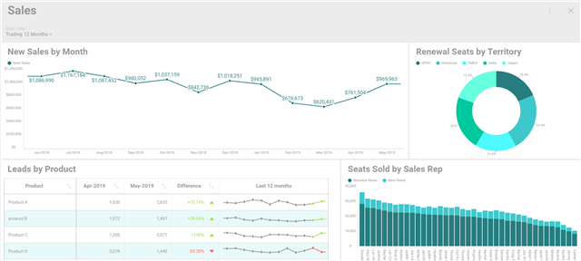
Steps to Data Insights
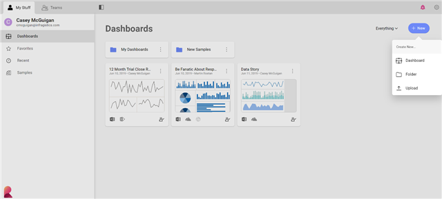
When you come into Reveal for the first time you will be presented with the different samples that we built for you to explore. To begin creating your own, navigate to the Dashboards section on the left panel. Click the new button in the top right-hand corner and select dashboard.
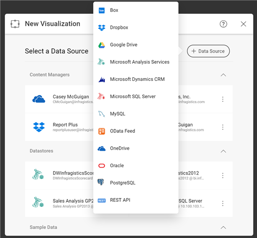
To add your first visualization click the plus in the upper right corner. Here is where you will be able to choose your first data source to connect to your data:
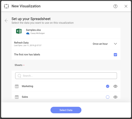
Within OneDrive I navigate to the file I am looking to bring into my dashboard. Once I select my excel file Reveal will bring in the different sheets I have within that file with their names (Marketing, Sales). In addition, I can choose how often I want my data to sync to my dashboard. Here you can see I selected once an hour.
Once you select your sheet you will be brought into the widget editor. On the left hand side, you will see all the columns within that excel sheet along with an indicator for what type of field they are (Date, Value, Category). On the top bar is where you can select your visualization types.
As you begin dragging fields over to the columns field you will see your data start to populate on the right. Or, if you know the visualization you want to create you can select that first! Reveal will change the input fields to let you know exactly what you need in order to create that visual.
To show new sales over time follow these steps:
- Select line chart from the visualization list
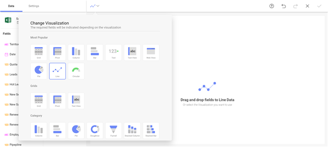
- Drag Date over to label and New Sales over to Values
- Click the Date field you dragged over to change the date aggregation from year to month
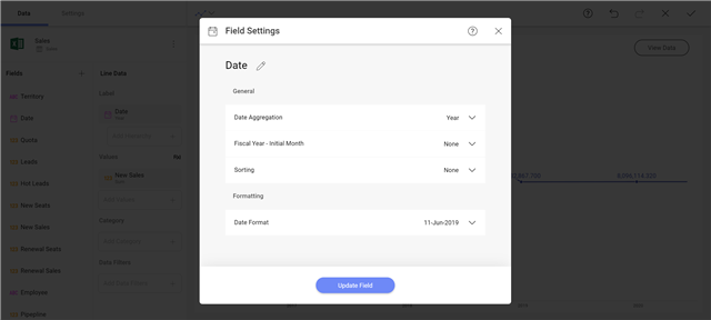
- Click the New Sales field you dragged over and change the formatting from number to currency and fraction digits to 0
- Change the title to New Sales by Month
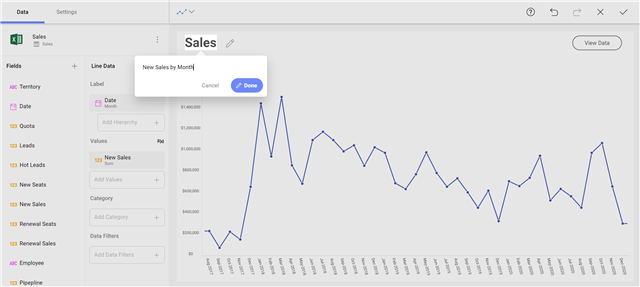
- Click the check mark in the upper right corner
Just like that you have your first visualization!
Adding Filters to Dashboards
Now, let’s add a dashboard filter so you can view a different date range on the fly.
- Click the add filter button on the top left under your dashboard title and select date filter. *note: You can use this to filter using any field within your data source by selecting add Dashboard Filter
- Within the date filter, select a range to set your data to. Use the dropdown to select Trailing 12 Months
- Underneath that you will see the visualization you created listed. If you had created more than one prior to adding this filter that would appear here as well. To connect the visualization to your dashboard filter click connect on the visualization thumbnail. Reveal will automatically connect to the date field within your data source. *note: if you have more than one date field within the excel file and need to switch the one it connects to you can use the overflow menu to edit the connection
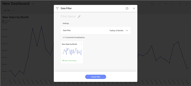
- Once connected click the create filter button at the bottom of the dialog window and see your data pivot to the filter.
To create another visualization, you have several options:
- Click the plus icon on the top right menu bar. Reveal will first list the data you already have within that dashboard. This enables you to create from the same source quickly. You can also add a new source to this dashboard, bringing multiple data sources into one view.
- Click the overflow menu on the visualization and select it and then select copy. This will not only duplicate the fields inside the visualization but also the connection to the dashboard filter if you have one. From here you can quickly go into edit the visualization and change out some fields, change the visualization and more to create a new view.
- Click the overflow menu and now you can select paste. This will paste this visualization right here or navigate to another dashboard to reuse it!
Here are three more powerful visualizations inside the editor to give you ideas on how you can add more to your dashboard:
- Leads by Product
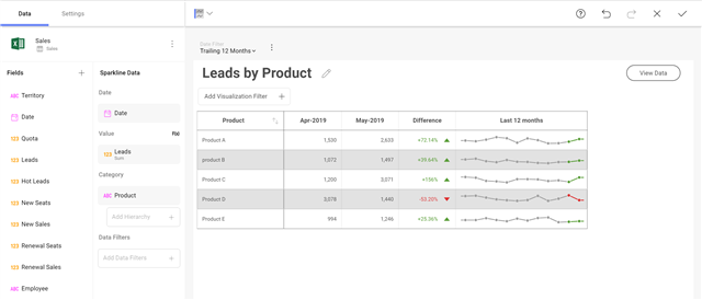
- Renewal Seats by Territory
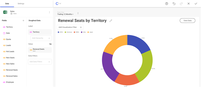
- Seats Sold by Sales Rep
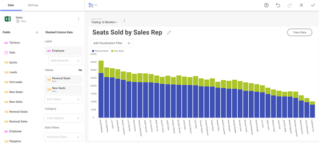
Once you have your visualizations created, you can begin to adjust the size and order of them within your dashboard. Simply click on a visualization to drag it around or to use the nodes to resize it.
*Note: Auto Layout is on by Default until your resize a visualization
Next, using the overflow menu pick a new theme for your dashboard from any of Reveal’s built in options.
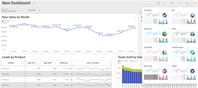
Once you are happy with how your dashboard looks, give it a title and click the check in the upper right corner. You will them be prompted to save it and to choose where you want to save your dashboard. By default, it selects the location where you started creating your dashboard. Along with the option to save to your personal space, (pending permission level), you can save this dashboard to your organization repository or any of the teams that you are a part of.

Just like that you have a beautiful dashboard!
