Infragistics Blogs
Get the latest trends in low-code, app development, product updates and more. Here we share our knowledge, best advice, how-tos, research, insights, and more - all with the aim of helping you learn how to build better apps faster.

Because of security concerns and code visibility, major corporations work with paid open-source software. Free open-source platforms, on the other hand, are the go-to choice for individual devs or small companies and startups with limited budgets.
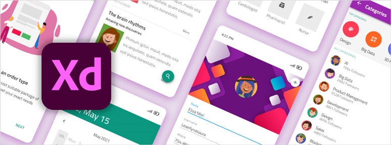
An Adobe XD Design System serves as a single source of truth, collecting design patterns and best design practices for faster transitioning from ideation to design. Learn how to build one.
Here’s how you can develop your own Design System in Sketch to achieve consistency, clear style guidance, and reusable design patterns.
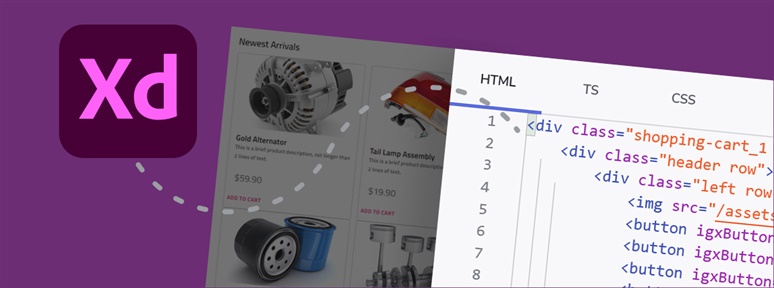
Transforming the XD design files into production-ready code is no longer a tedious task. Learn how to convert Adobe XD easily to HTML with App Builder.

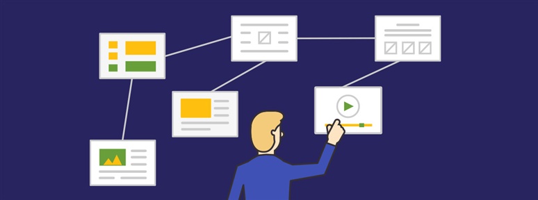
A Design System is a collection of design assets that you use to build user interfaces and preserve consistency. Learn the steps to building a design system on your own.

UX writing is about crafting clear and comprehensible user-centered UI texts related to a product/website design so users can easily navigate and interact with it.

Here is something you should know – there is a difference between UI and UX. And each deserves its own expert. Want to learn more? Read our blog post.

Prototyping tools have become an essential part in the creation of modern, rich, and interactive UI/UX designs. See which ones lead our chart.

Product-Market Fit is essential to any business. It is often applied to start-ups, but it applies to large enterprises too. Learn what is and how to achieve it.
What is interaction design and what is the interaction design process? How does it compare to UX? Well, this article will provide the answers.