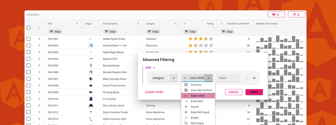
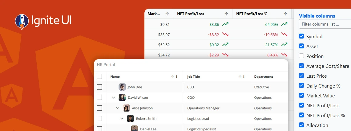
Ignite UI for Angular 14.1.0 Release

Radoslav Mirchev / Tuesday, September 13, 2022

It has been a busy time here at Infragistics, with a number of Ignite UI for Angular, Ignite UI for Web Components and AppBuilder updates and new releases coming in the past few weeks. After the June release of Ignite UI for Angular 14.0.0, that comes with support for the Angular 14, now we are releasing Ignite UI for Angular 14.1.0! Let's see what new goodies we have for you.

Keep in mind that Angular 14.1 builds on a pile of new components and features we added throughout 2022 in Ignite UI for Angular 13.113.2, 22.1 and 14.0 including components, and features such as: 

Cloud-Based WYSIWYG IDE + Angular  

If you are eager to start building your Angular applications with these new components and with the only cloud-based, drag-and-drop WYSIWYG IDE, App Builder, you can check the App Builder roadmap and see when they will be available in its toolbox. 

Angular Grids

 Angular Grid Validator service

The Grid's editing exposes a built-in validation mechanism of user input when editing cells/rows. It extends the Angular Form validation functionality to allow easier integration with a well known functionality. When the state of the editor changes, visual indicators are applied to the edited cell. Angular grid validator service comes with the following validators are supported out-of-the-box:

  • required
  • min
  • max
  • email
  • minlength
  • maxlength
  • pattern

You can find the the full documentation article here.

Example of Angular Grid Editing and Validation

  Angular Pivot Grid State Persistence

Тhe igxGridState directive allows developers to easily save and restore the grid state. When the IgxGridState directive is applied on the grid, it exposes the getState and setState methods that developers can use to achieve state persistence in any scenario. IgxGridState directive supports saving and restoring the state of the following features:

  • Sorting
  • Filtering
  • Cell Selection
  • Row Selection
  • Column Selection
  • Expansion
  • Pivot Configuration

Example of Angular Pivot Grid with State Persistence

 Angular Pivot Grid Filtering Expressions

All dimensions (filters, rows, columns) can be filtered via the chip UI or the API. This functionality is embedded and enabled by default.

 Angular Pivot Grid aggregation method label

 Angular Grid autosize performance improvements

Angular Components

 Update of Angular Tabs UI

Angular Tabs layout

 Angular Combo Updates - filtering strategy, ability to filter multiple fields and new "searchKey" input

Now the Angular Combo component has a "searchKey" input which enables the data key to be used to search or filter by. 

Example of Angular Tabs with search key

Here is the complete Ignite UI for Angular Change Log for 14.1.0

14.1.0

New Features

  • IgxCombo and IgxSimpleComboComponent

    • filterFunction input is added. The new property allows changing of the way filtering is done in the combos. By default filtering is made over the values in combo's data when it is a collection of primitive values, or over the values as defined in displayKey of the combo. If custom filtering function is provided filtering will be done as specified in the provided function.
    • filteringOptions are extended and now contains filterable and filteringKey properties. Setting filterable determines whether combo will be filterable. By default filtering is done over the data value when they are primitive, or over the field of the values equal to displayKey. filteringKey allows to filter data by any data related key.
  • igxPivotGrid

    • Add option to template the pivot value chip content:
    <ng-template igxPivotValueChip let-value>
            {{ value.member }}
    </ng-template>
    
    • Add support for usage with igxGridState to persist state of the pivotConfiguration with an additional pivotConfiguration option:
     <igx-pivot-grid
            #grid1
            [igxGridState]="options" ...
        public options : IGridStateOptions = {
        pivotConfiguration: true
    };
    

    One known issue of the igxGridState directive is that it cannot store functions as the state is stored as string. As a result any custom functions set to memberFunction, aggregator, formatter, styles etc. will not be stored. Restoring any of these can be achieved with code on application level. Hence we have also exposed 2 new events: - dimensionInit - emits when a dimension from the configuration is being initialized. - valueInit - emits when a value from the configuration is being initialized. Which can be used to set back any custom functions you have in the configuration. The default aggregator function, like the ones from IgxPivotNumericAggregate, IgxPivotDateAggregate etc., will be restored out of the box. However if you have any custom aggregators (or other custom functions) they need to be set back in the valueInitevent, for example:

        public onValueInit(value: IPivotValue) {
        if (value.member === 'AmountOfSale') {
            value.aggregate.aggregator = IgxTotalSaleAggregate.totalSale;
        }
    }
    

    Same applies to any custom functions on the dimension, like memberFunction. If it is a custom function you can set it back on the dimensionInit event:

     public onDimensionInit(dim: IPivotDimension) {
        if (dim.memberName === 'AllCities') {
            dim.memberFunction = () => 'All';
        }
    }
    
    • igxGridState: Exposed a stateParsed event to the state directive that can be used to additionally modify the grid state before it gets applied.
    this.state.stateParsed.subscribe(parsedState => {
            parsedState.sorting.forEach(x => x.strategy = NoopSortingStrategy.instance());
        });
    
  • igxGrid

    • Added built-in validation mechanism for Grid Editing. Extends the Angular Form validation functionality You can configure it in 2 ways:

      1. Via template-driven configuration on the igx-column of the grid:

        <igx-column required minlength="4" ...>
      2. Via reactive forms using the FormGroup exposed via the formGroupCreated event of the grid:

        <igx-grid (formGroupCreated)='formCreateHandler($event)' ...>
        public formCreateHandler(formGr: FormGroup) {
            // add a validator
            const prodName = formGr.get('UserName');
            prodName.addValidators(forbiddenNameValidator(/bob/i))
        }

      Edited cells will enter an invalid state when validation fails and will show an error icon and message. Cell will remain invalid until the value is edited to a valid value or the related state in the validation service is cleared.

      You can refer to the documentation for more details: https://www.infragistics.com/products/ignite-ui-angular/angular/components/grid/validation

    • Added ability to auto-size columns to the size of their cells and header content on initialization by setting width auto:

    <column width='auto' ...>
    
    • Added support for restoring filtering expressions with custom filtering operands for the IgxGridStateDirective.
  • Added the IgcFormControl directive that, when imported with its IgcFormsModule, is designed to seamlessly attach to form components from the Ignite UI for WebComponents package and allows using them in Angular templates and reactive forms with support for ngModel and formControlName directives. Currently the only Web Component with support through the directive is igc-rating.

General

  • Breaking Changes - filterable property of IgxComboComponent is now deprecated and will be removed in future version. Use filteringOptions.filterable instead.

Theme Changes

  • Breaking Changes - $disable-shadow property of IgxTabsComponent theme has been removed.

14.0.0

  • Added additional theme properties for the IgxCalendar so that it's easier to style the :hover and :focus states inside the selected date or range of dates.
  • IgxDatePicker and IgxDateRangePicker now expose a weekStart input property like the IgxCalendar
  • IgxCombo and IgxSimpleComboComponent
    • The combobox role, aria-haspopup, aria-expanded, aria-controls and aria-labelledby attributes have been moved from combo wrapper to the combo input. Additionally the IgxSimpleComboComponent input is marked with aria-readonly="false" and aria-autocomplete="list" attributes. The aria-labelled attribute is applied to the combo dropdown as well and can be set by the ariaLabelledBy property, the combo label or placeholder. The serach input within the combo dropdown is now marked as role="searchbox", aria-label="search" and aria-autocomplete="list". The dropdown item container has aria-activedescendant attribute to identify the currently active element of the item list. The IgxCombo container is also marked as aria-multiselectable="true". The dropdown header items role has been changed to group.
  • IgxDropDown
    • The label attribute has been changed to aria-labelledby and can be set by a latterly added input property labelledBy.

New Features

  • IgxCombo and IgxSimpleComboComponent
    • filterFunction input is added. The new property allows changing of the way filtering is done in the combos. By default filtering is made over the values in combo's data when it is a collection of primitive values, or over the values as defined in displayKey of the combo. If custom filtering function is provided filtering will be done as specified in the provided function.

General

  • Updating dependency to Angular 14

  • Migrations

    • Migrations now support Yarn berry (version 2+)
  • IgxGridEditingActions

    • Added new inputs to show/hide the edit and delete buttons - editRow, deleteRow.
  • IgxTabs

    • Behavioral Change - Both scroll buttons are displayed when the tabs are not fully visible. When there is no tabs to be scrolled in one of the directions the corresponding scroll button is disabled.
  • Locale settings

    • IgxDatePicker and IgxDateRangePicker now expose a weekStart input property like the IgxCalendar
    • IColumnPipeArgs interface now expose a weekStart property to control the first week of day in calendar used in the grid for editing and filtering
    • locale property of IgxCalendar, IgxDatePicker, IgxDateRangePicker and IgxGrid will now default to globall Angular application locale, if not set.
    • weekStart property of IgxCalendar, IgxDatePicker, IgxDateRangePicker and IgxGrid will default to the default first day for the current component locale, if not set.

Wrap-Up

We continue to ship new features on a continuous schedule, to improve performance, and to provide stability improvements as we are committed to providing you with the best Angular UI toolkit and related insights to empower you with more know-how. Apart from the newest Pivot Grid that is so crucial, we know that other components like the Angular Data Grid are also super critical. That's why we published a helpful Angular UI Data Grid tutorial to help you learn how to create a full-featured Angular UI Grid from scratch. Go on and watch it.

We also continue to develop the best cloud-based, low-code app builder platform — App Builder —that accelerates app building by mapping Sketch or Adobe XD design files to real UI components and creating production-ready code. So you can generate Angular or Blazor applications faster than ever.  As we mentioned, some of our enhancements come from users like yourself through our GitHub repository. With this in mind, we are always open to suggestions and feedback – it’s what makes us grow and serve you better. Last but not least we know that predictability and visibility on our next goals is critical for you, our business partners, so we have our roadmap always up to date!


Follow us on Medium and stay up-to-date with the latest Angular-related projects that we are working on. Give us a star on GitHub and help us to continue to improve our product by addressing any concerns, questions or feature requests in the issues section.  We will continue to do our best to constantly improve our product experience to meet all your needs and build apps with ease.