Infragistics Blogs
Get the latest trends in low-code, app development, product updates and more. Here we share our knowledge, best advice, how-tos, research, insights, and more - all with the aim of helping you learn how to build better apps faster.

Ignite UI CLI 15.0 turns every new scaffold into an AI-ready workspace — shipping a built-in MCP server, generate-from-image design skills, and pre-wired agent configuration for Angular, React, and Web Components.

This release advances the library's dev-agentic strategy with three consolidated AI Copilot Skills shipped directly in the repository. But this is not all. Read more here.

A Deterministic Design Token Architecture for AI-Generated Applications. Built for Model Context Protocol (MCP) Agent Workflows

To understand why developers move away from this library and what are the other options they explore, this article will take a practical, comparison-driven look at the most popular Angular Material alternatives for 2026.

The right UI library influences development speed, maintainability, and user experience. In the Angular Material vs PrimeNG decision, we can say that both options serve different purposes. Let's dive deep and explore each.

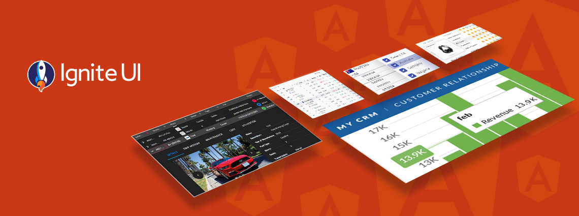
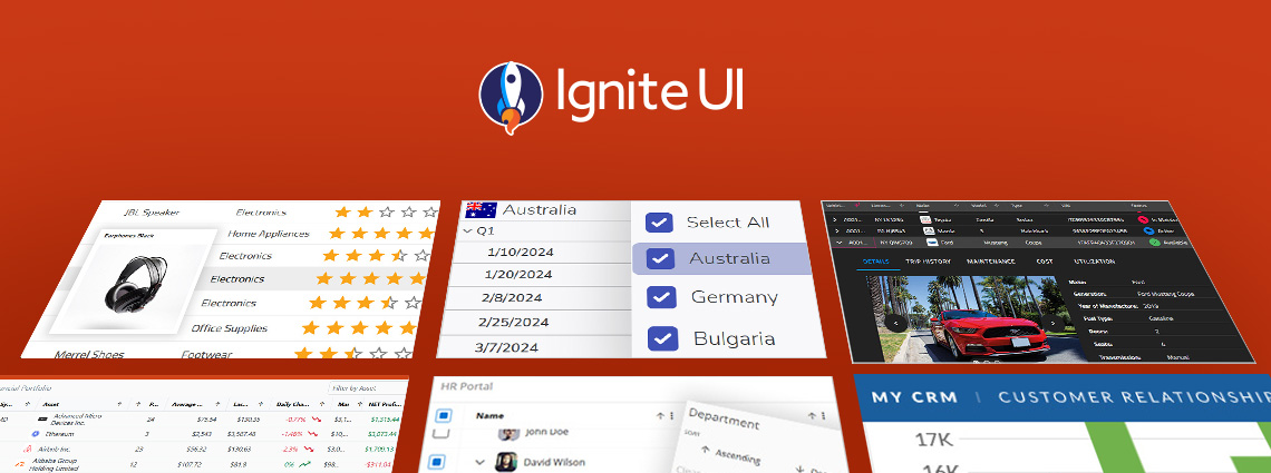
Seamlessly crafted for compatibility, Ignite UI for Angular is the library that enables you to leverage the power of the latest technologies and major releases. Committed to providing you with the best Angular UI toolkit and related insights, our goal is to equip you with more know-how, new features, enhanced performance, and improved stability.
PrimeNG remains a capable starting point, but as your Angular apps scale, you may need a solution that offers better performance, design flexibility, and enterprise-grade reliability.

An Angular Progressive Web App is a web application enhanced with native-like features such as offline access, background synchronization, etc. And this blog post shows you how to build one.
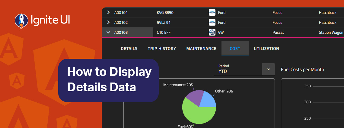
How can you easily display details data on-demand? In this blog post we demonstrate the exact steps, using Ignite UI for Angular Hierarchical Grid. Read more and explore code snippets and examples.
This article lists a mix of 10 Angular app examples that showcase the framework's versatility. See the Angular's strengths applied in action combined with Ignite UI for Angular.