Infragistics Blogs
Get the latest trends in low-code, app development, product updates and more. Here we share our knowledge, best advice, how-tos, research, insights, and more - all with the aim of helping you learn how to build better apps faster.
PrimeNG remains a capable starting point, but as your Angular apps scale, you may need a solution that offers better performance, design flexibility, and enterprise-grade reliability.

An Angular Progressive Web App is a web application enhanced with native-like features such as offline access, background synchronization, etc. And this blog post shows you how to build one.
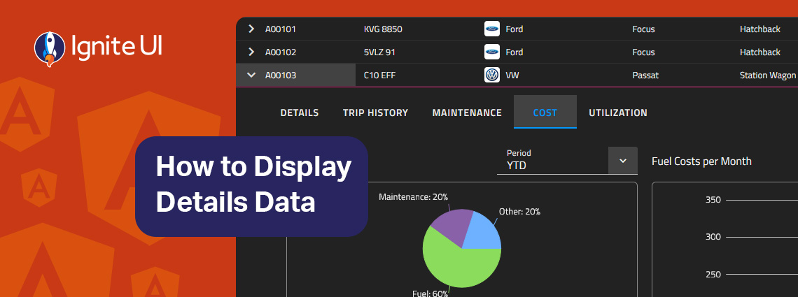
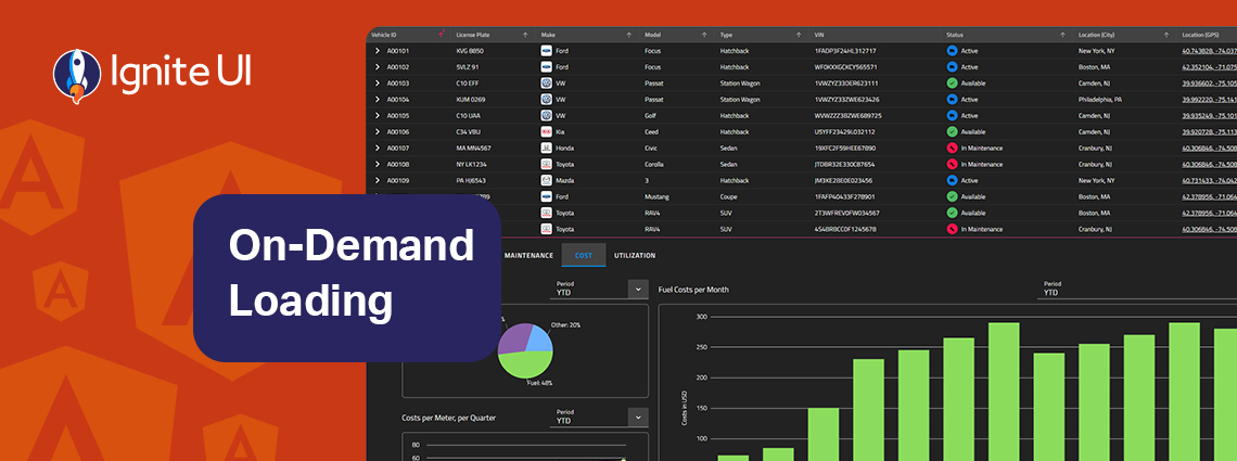
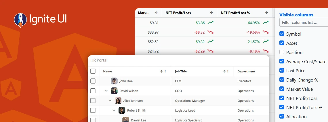
How can you easily display details data on-demand? In this blog post we demonstrate the exact steps, using Ignite UI for Angular Hierarchical Grid. Read more and explore code snippets and examples.
This article lists a mix of 10 Angular app examples that showcase the framework's versatility. See the Angular's strengths applied in action combined with Ignite UI for Angular.
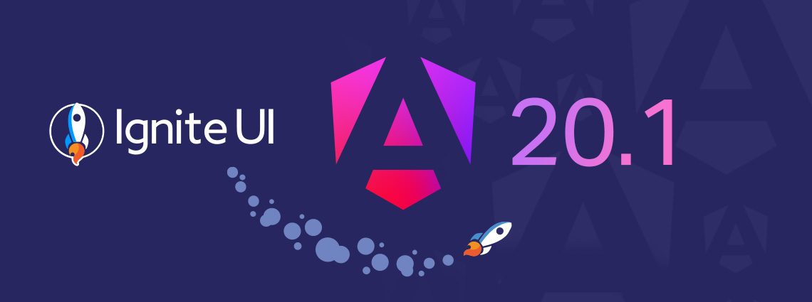
Ignite UI for Angular 20.1 release is out, bringing tons of new enhancements. There are now powerful add-ons like cell merging, dual-side column pinning, and other improvements to the grids.
On-demand data loading is a powerful technique for scaling master-detail interfaces. Instead of fetching every detail upfront, you load related records only when the user needs them. Learn more in this article.
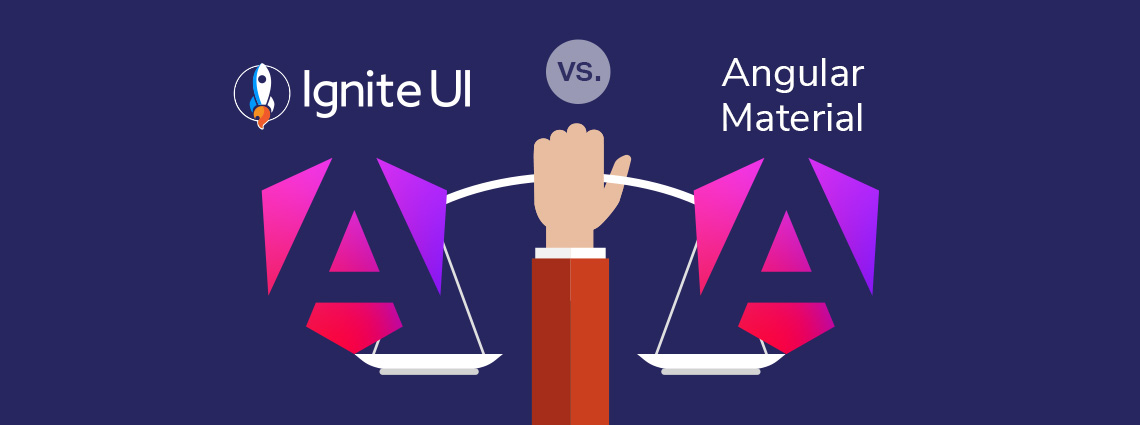
Ignite UI for Angular vs Angular Material - which one to choose? In this blog post, we explore the features, performance, and use cases. Read all about this key criteria and factors.
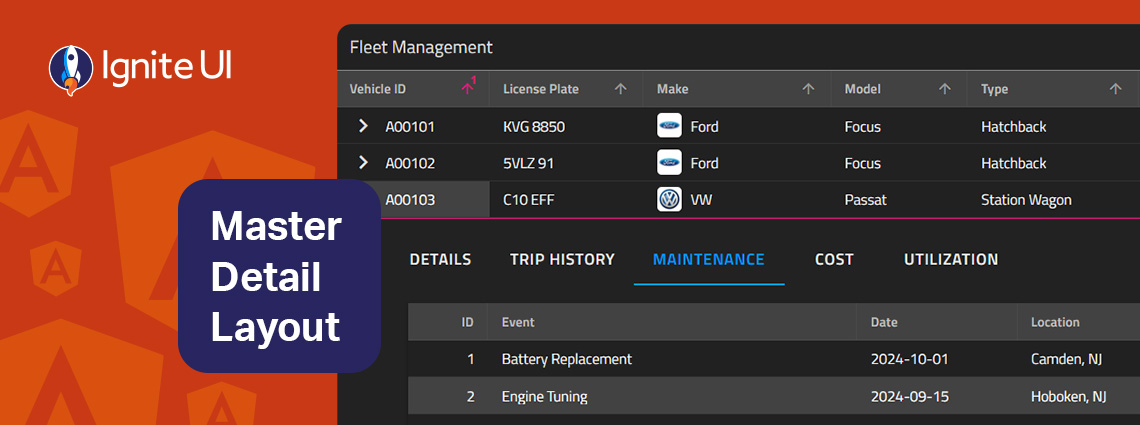
The master-detail layout is a proven UI pattern that provides a straightforward, scalable, and user-friendly way to present related data without overwhelming the screen. Learn more in this article.
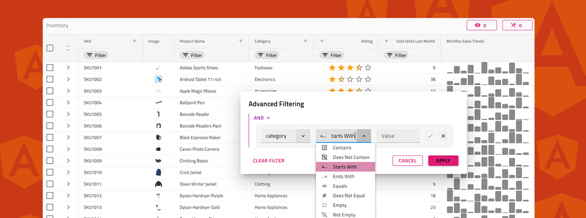
Do you know how to enable Excel-style filtering, Custom filtering operands, Custom filtering strategies, Advanced filtering, Programmatic filtering, or Remote filtering? This article will show you how, including code snippets, examples, and use cases.
What's the best Angular grid on the market in 2025 that can handle any data scenario and provide all the features (basic and advanced) you need? Find out in this detailed guide.