App Builder Components
Using App Builder Components
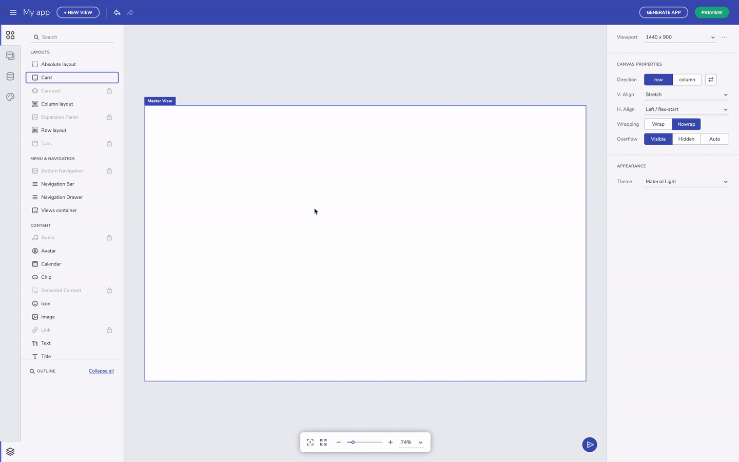
The Toolbox tab on the left let you cycle through the list of all available Ignite UI for Angular components, as well as some App Builder general components, such as absolute, row, column layout and views container. The search input on the top of the components list makes it easy to find a particular component. All of the components are conveniently distributed into groups based on their usage. The grayed-out components have still not been added, and are thus disabled, but soon will be available in next updates. Components can be added to the Design Canvas by dragging and dropping them from the Toolbox.
Quick add components
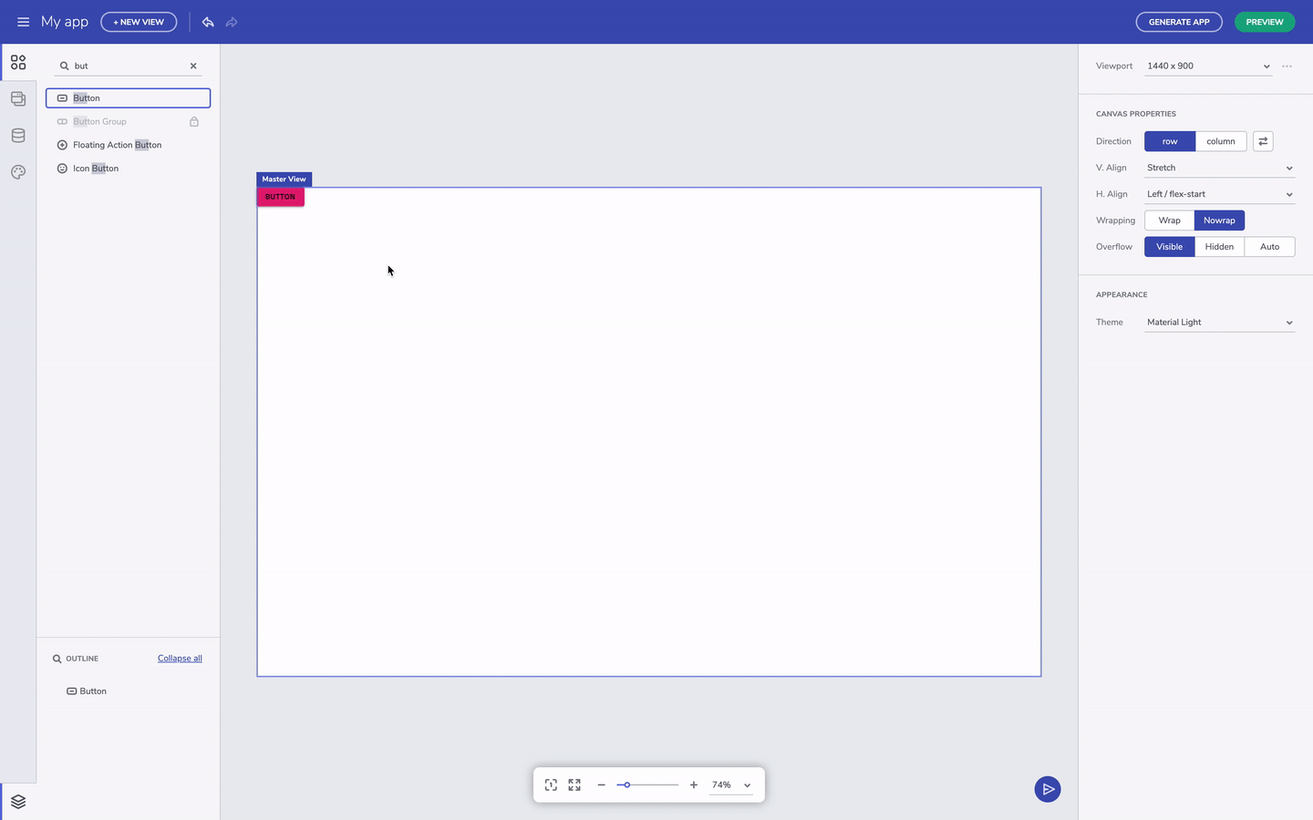
You can also use our quick-add feature by using the keyboard shortcut ctrl+E or cmd+E on a macs to search and add components. Just remember "E" stands for everything. The quick-add keeps track of recently used components making it faster to add components you use frequently. Double-clicking a component in the Toolbox will also add it to the Design Canvas.
Quick add a component
Configuring components
Every component comes with a set of preset types that match the Indigo.Design system. For instance, there are three preset types of buttons in the Indigo.Design system - raised, outlined and flat.
Component's presets
For more complex components, like an input field or say card component, you can turn ON/OFF sections of the component. Also, the component properties also reflect the visual structure of the component, and match the specifications you will find in our developer toolkit like Ignite UI for Angular. In the case of an input field, you can enable or disable the prefix section to add a leading icon.
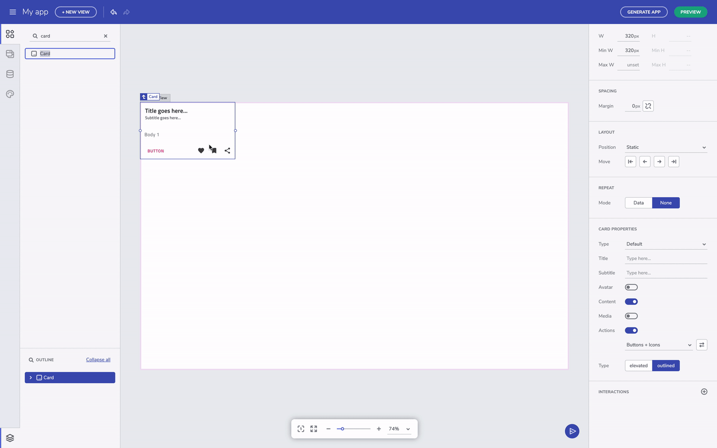
Turn off component's properties
Additional Resources
 GitHub