What’s New: Web Components Tile Manager
Ensuring ultimate app development flexibility and agility with the components you use is key. That's why we've added a new component to the Ignite UI for Web Components toolbox - Tile Manager. Check out its properties and see how to use it.
 Radoslav Mirchev
5 min read
Radoslav Mirchev
5 min read
This Ignite UI for Web Components 5.3 release introduces a brand-new, time-saving component with features that ensure agility and optimal user experience: Tile Manager. In this blog post, we will explain how it works and look at features like resizing, reordering, serialization, and more.
Web Components Tile Manager Component
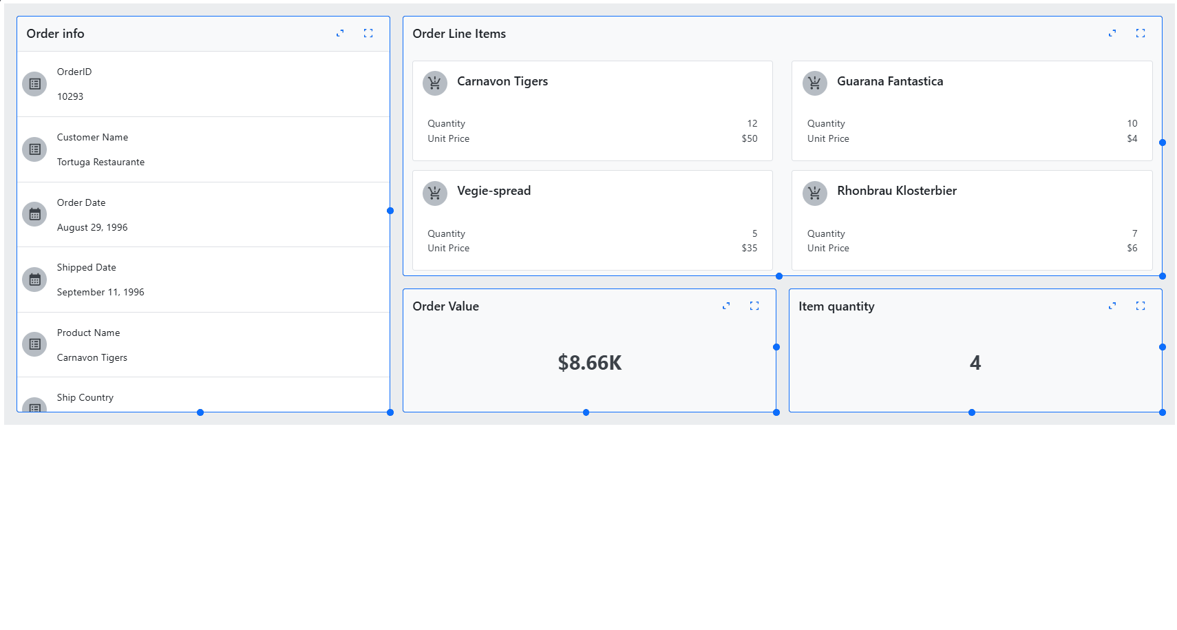
The Web Components Tile Manager component provides UI to display content in individual tiles. It allows users to interact with the tiles by rearranging and resizing them. The freedom to customize the layout and appearance of the content according to their preferences could be matched only by the Dock Manager component. This flexibility enhances the user experience by enabling a more personalized and efficient way to view and manage content.
Properties of the Tile Manager
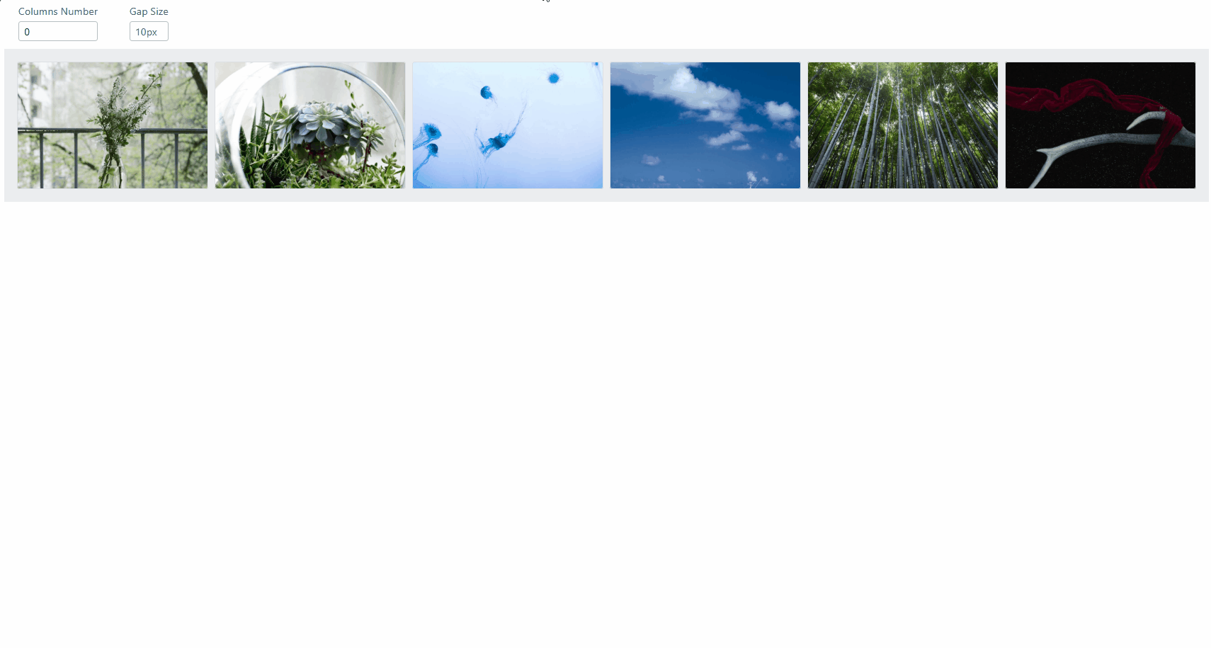
Columns and Rows
As a user, you can define the number of grid columns for Web Components Tile Manager. To do this, simply set the column-count property to the desired number of columns.
Gap
The Gap property defines the space between tiles. The value of the gap property must be a number followed by a length unit (e.g., px, rem, em, …). This value will apply to both the horizontal gap (width) and the vertical gap (height) between tiles.
Minimum Width and Height
Are properties for setting the minimum width of the columns (min-column-width) and the minimum height of the rows (min-row-height) in the Tile Manager. Similar to the gap property, the values for these properties must be a number followed by a length unit.
Resizing
Resizing in the Tile Manager is a functionality that allows tiles to be resized using three different resize adorners.
- Side Adorner: Adjusts the width by modifying the column span.
- Bottom Adorner: Adjusts the height by modifying the row span.
- Corner Adorner: Adjusts both width and height simultaneously.
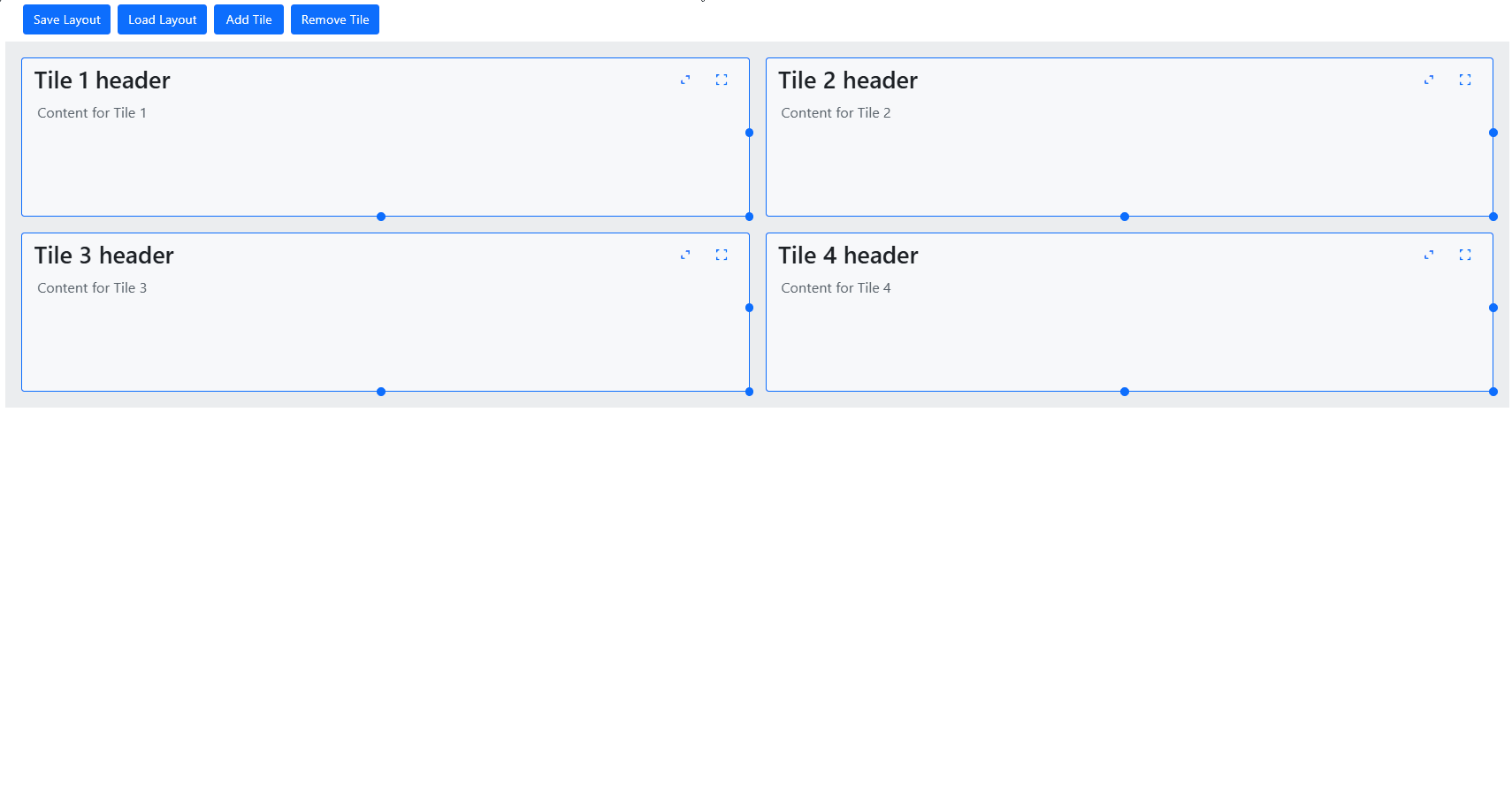
Reorder
You can reorder tiles in the Tile Manager using the drag-and-drop feature. By default, tiles are not draggable. To enable this functionality, set the drag-mode property on the Tile Manager to either tile or tile-header.
- With the
tileoption, you can click and hold anywhere on an individual tile to start dragging it. - With the
tile-headeroption, you can only click and hold in the tile’s header section to start the dragging process.
Serialization
The Web Components Tile Manager provides methods that help manage the layout of tiles:
- The
saveLayoutmethod allows you to save the current arrangement of tiles in the Tile Manager. It captures the current order, size, and position of all tiles so you can restore them to this exact configuration later. - The
loadLayoutmethod enables you to load a previously saved layout. When called, it restores the tiles to the exact state they were in when the layout was saved, including their order, size, and position.
Styling
You can also customize the appearance of the two components – Tile Manager and Tile. The Tile Manager exposes only one CSS property – base which can be used for styling the base wrapper of the Tile Manager. The Tile component exposes several CSS properties that you can use.
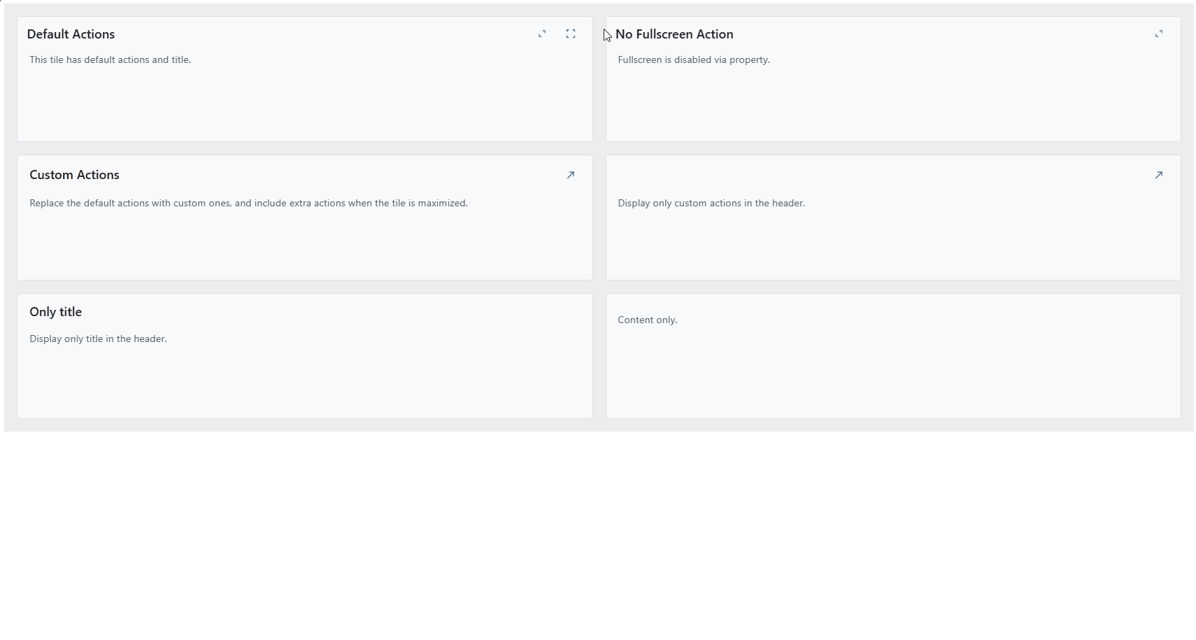
Properties of the Tile component
The Web Components Tile component has properties that can be set individually for each tile. Some of these properties include:
- The
col-spanproperty specifies how many columns the tile will span across in the layout, allowing you to control its horizontal size. - The
row-spanproperty determines how many rows the tile will span vertically, adjusting the tile’s height within the layout. - The
col-startproperty specifies the starting column where the tile is placed. - The
row-startproperty specifies the starting row where the tile is placed. - The
disable-fullscreenproperty hides the default fullscreen action button. - The
disable-maximizeproperty hides the default maximize toggle action button. - The
disable-resizeproperty prevents the tile from being resized by the user.
Ignite UI for Web Components 5.3.0 Changelog
Explore all the details here.
Added
- Tile manager component #1402
- List
- The
igc-list-itemcomponent exposes a newselectedproperty. When set on a list item, the item will become visually highlighted #1590
- The
Changed
- Progressbar
- Use theme schemas #1582
Fixed
- Calendar
- Chip
- Improved responsive layout styles #1588
- Combo
- Improved toggle button visual states #1580
To Wrap It All Up…
Seamlessly crafted for compatibility, Ignite UI for Angular is the library that enables you to leverage the power of the latest technologies and major releases. Committed to providing you with the best Angular UI toolkit and related insights, our goal is to equip you with more know-how, new features, enhanced performance, and improved stability. Some of the enhancements were added thanks to the requests from users like yourself through our Ignite UI for Web Components GitHub repository. With this in mind, we are always open to suggestions and feedback – it makes us grow and better respond to your development needs.
If you need more details, we encourage you to check out our:
In Addition
Follow Ignite UI on Medium to stay up-to-date and learn about the latest Angular-related projects we are working on. Give us a star on GitHub , and help us continue improving our product by addressing any concerns, questions, or feature requests in the issues section.