This is just the beginning. We will continue to expand and refine both our open-source and premium controls so that every developer, from startup innovators to large enterprise teams, can build exceptional digital experiences with the right tools.
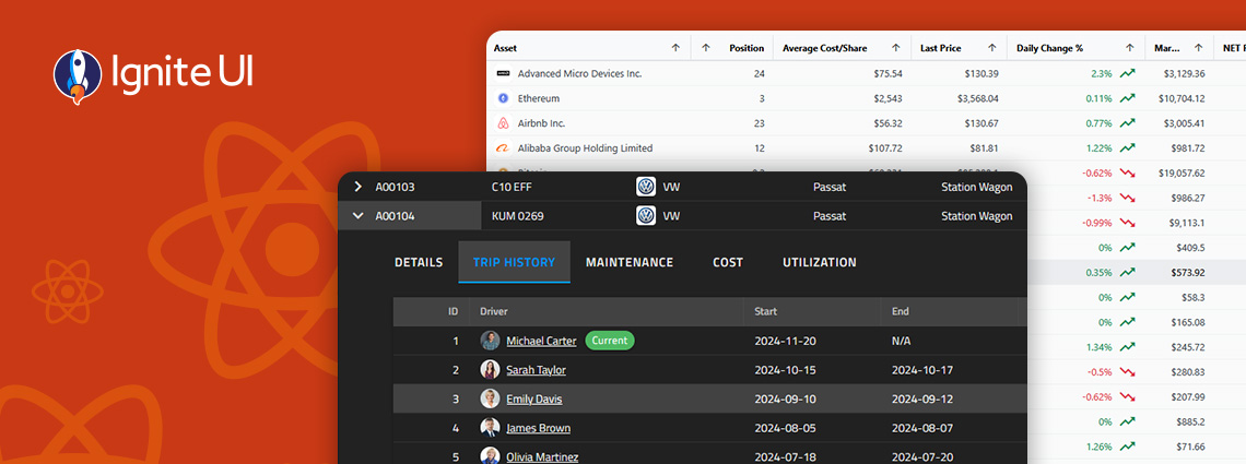
Infragistics Blog
From Grid PDF Export, allowing you to export data from IgrGrid, IgrTreeGrid, IgrHierarchicalGrid, and IgrPivotGrid to new Intl-based rendering pipeline and more. Here are the latest updates in your toolbox.

Grid performance isn’t just about speed here. It's about consistency under heavy data load. When a grid freezes during data operations, it feels slow and unreliable. In real-time decision-making workflows, that unreliability becomes a liability.

From AI Coding Skills, covering component selection, framework integration, theming, and bundle optimization to improved Grid scroll performance, and more.

This release advances the library's dev-agentic strategy with three consolidated AI Copilot Skills shipped directly in the repository. But this is not all. Read more here.

A Deterministic Design Token Architecture for AI-Generated Applications. Built for Model Context Protocol (MCP) Agent Workflows

Two of our most prominent app development tools have come together – Ignite UI and App Builder. Not as a collection of disconnected features, but as foundational drivers for AI-assisted application development, where Ignite UI meets AI and AI agents workflows to operate within a well-defined UI and application model.

To understand why developers move away from this library and what are the other options they explore, this article will take a practical, comparison-driven look at the most popular Angular Material alternatives for 2026.

The right UI library influences development speed, maintainability, and user experience. In the Angular Material vs PrimeNG decision, we can say that both options serve different purposes. Let's dive deep and explore each.

Seamlessly crafted for compatibility, Ignite UI for Angular is the library that enables you to leverage the power of the latest technologies and major releases. Committed to providing you with the best Angular UI toolkit and related insights, our goal is to equip you with more know-how, new features, enhanced performance, and improved stability.

Material UI remains the default option for many developers and teams. But what happens when you look for enterprise-grade capabilities and tools that empower you to build data-heavy applications?