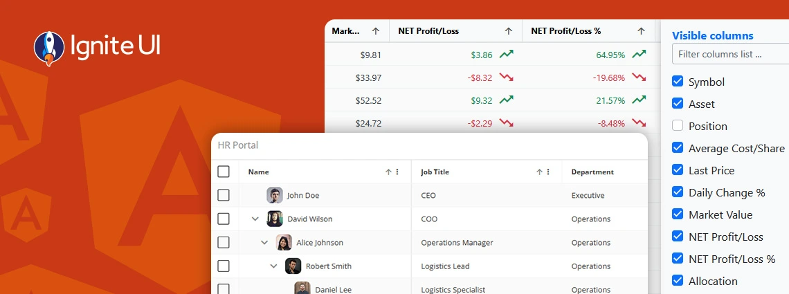
Ignite UI for Angular 20.1 release is out, bringing tons of new enhancements. There are now powerful add-ons like cell merging, dual-side column pinning, and other improvements to the grids.
The App Builder Blog
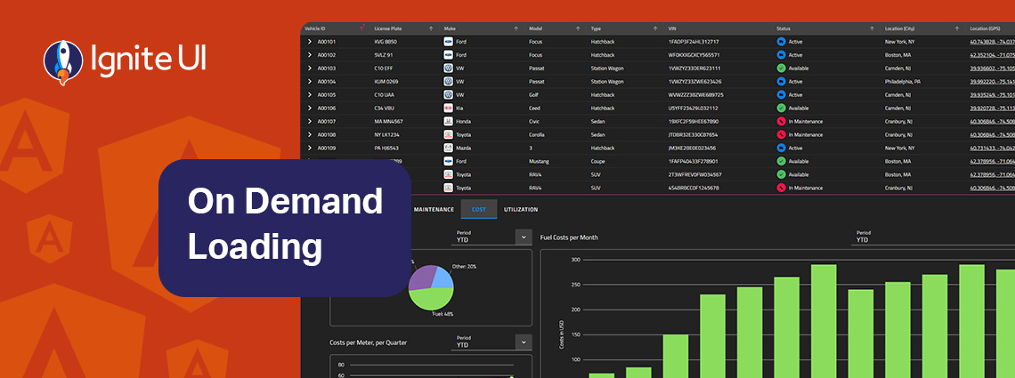
On-demand data loading is a powerful technique for scaling master-detail interfaces. Instead of fetching every detail upfront, you load related records only when the user needs them. Learn more in this article.

Ignite UI for Angular vs Angular Material - which one to choose? In this blog post, we explore the features, performance, and use cases. Read all about this key criteria and factors.

To help you get a clear view of what a Grid can do, I’ve put together 5 React Grid examples built with Ignite UI for React. These React sample apps will show you how different grids perform in real-world scenarios, including powering sales dashboards, managing large-scale ERP systems, and more.
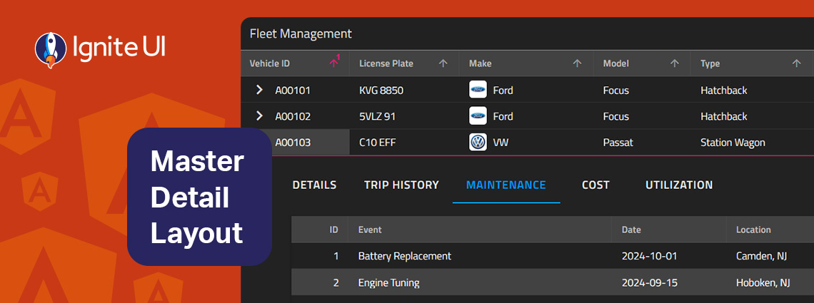
The master-detail layout is a proven UI pattern that provides a straightforward, scalable, and user-friendly way to present related data without overwhelming the screen. Learn more in this article.
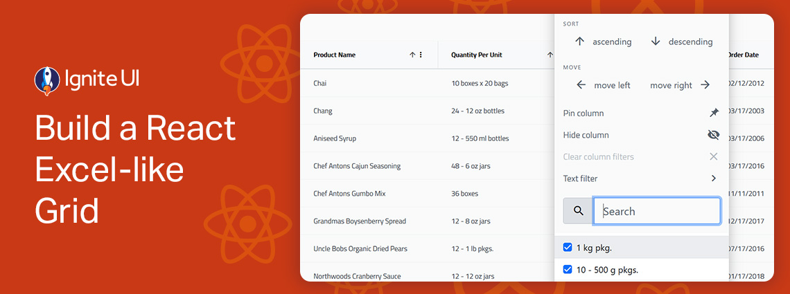
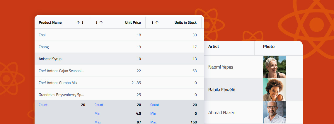
Building a React Excel-like grid isn’t easy but Ignite UI for React makes it surprisingly simple. In minutes, you can integrate a feature-rich, high-performance grid that supports sorting, filtering, editing, Excel-like navigation, and Excel export.
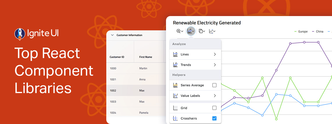
From well-styled design systems to customizable components that give you full control, the React ecosystem offers a wide range of options tailored to different projects and development needs. But which one leads the charts? Here are our top picks.
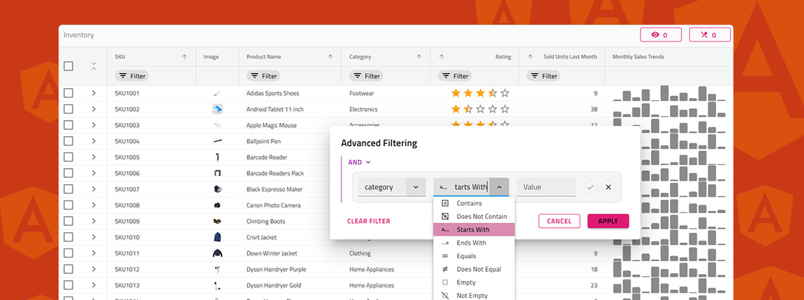
Do you know how to enable Excel-style filtering, Custom filtering operands, Custom filtering strategies, Advanced filtering, Programmatic filtering, or Remote filtering? This article will show you how, including code snippets, examples, and use cases.
When selecting a React data grid, in addition to performance and price, you should also consider how real users will interact with it and what features you will need to match app requirements and users’ expectations. Features like Advanced Filtering, State Persistence, Keyboard Navigation, and Export to Excel aren't just a necessity.
What's the best Angular grid on the market in 2025 that can handle any data scenario and provide all the features (basic and advanced) you need? Find out in this detailed guide.