Skip to content

Infragistics Community Forum / Web / Ignite UI for React / Dark/Light Theme for Ignite UI for React Grid

Dark/Light Theme for Ignite UI for React Grid

New Discussion
Bharat Jangir
Bharat Jangir asked on Mar 29, 2023 9:36 PM

Do we have any option for a Dark/Light theme for React Grid? or is there any alternative for it?

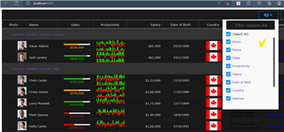
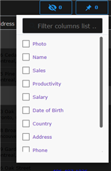
Please provide a sample example to change the theme on React Grid. I have seen all the samples available on the Infragistics website, but unable to find out any option to change the theme color for the Header Toolbar (Filter UI/Column chooser etc.).

http://www.infragistics.com/…/data-grid

Sign In to post a reply

Replies

  • 0
    Michael DiFilippo
    Michael DiFilippo answered on Jan 3, 2023 8:28 PM

    Hello and thank you for contacting Infragistics. Our API (linked below) can be styled in CSS using lower-case property names based on the component it belongs to. IgrDataGrid > ig-data-grid

    http://www.infragistics.com/…/igrdatagrid.html

    eg. The column options and toolbar are separate components that need to be styled as such:

    .ig-grid-column-options {
    –background-color: #191919;
    –text-color: #7446b9;
    }

    .ig-data-grid-toolbar {
    –background-color: #191919;
    –text-color: #7446b9;
    }

    Here is a template and sample from our Grid portion in Dark.

    eg. codesandbox.io/…/hardcore-almeida-suxfxn

    .ig-data-grid {
    /* shared variables used in custom properties */
    –grid_selected_background: #58258b;
    –grid_selected_text_color: #ffffff;
    –grid_normal_background: #191919;
    –grid_normal_text_color: #cccccc;
    –grid_section_background: #333333;
    –grid_section_text_color: #cccccc;
    –grid_focused_color: #7446b9;
    –grid_hyperlink_text_color: #926ec7;
    –grid_error_text_color: #c62828;
    –grid_hover_background: #777777;
    –grid_icon_color: #333333;
    –grid_lines: #272727;

    /* root summary */
    –summary-root-background: #7446b9;
    –summary-root-label-text-color: #191919;
    –summary-root-value-text-color: #191919;

    background-color: var(–grid_normal_background);

    –row-separator-background: var(–grid_lines);
    –row-separator-last-sticky-row-background: var(–grid_lines);
    –row-separator-pinned-row-background: var(–grid_focused_color);
    –row-separator-sticky-row-background: var(–grid_focused_color);

    –header-background: var(–grid_normal_background);
    –header-text-color: var(–grid_normal_text_color);
    –header-separator-background: var(–grid_lines);
    –header-separator-width: 5px;

    –section-header-background: var(–grid_section_background);
    –section-header-text-color: var(–grid_section_text_color);
    –section-header-selected-background: var(–grid_selected_background);
    –section-header-selected-text-color: var(–grid_selected_text_color);

    –cell-selected-background: var(–grid_selected_background);
    –cell-selected-text-color: var(–grid_selected_text_color);

    –cell-text-color: var(–grid_normal_text_color);
    –cell-background: var(–grid_normal_background);

    –sticky-row-background: var(–grid_color_focused);
    –last-sticky-row-background: var(–grid_color_focused);

    –pinned-row-background: var(–grid_color_focused);
    –pinned-row-opacity: 0.5;

    /* not working column properties */
    /* –default-column-width: 150; */
    /* –default-column-min-width: 20; */

    –column-resizing-separator-background: var(–grid_focused_color);
    –column-moving-separator-background: var(–grid_focused_color);
    }

    • 0
      Michael DiFilippo
      Michael DiFilippo answered on Jan 3, 2023 8:30 PM

      If you have any issues styling any of the properties in the API you may submit an issue on our github page:
      github.com/…/issues

    • 0
      Bharat Jangir
      Bharat Jangir answered on Jan 11, 2023 3:07 PM

      Thanks, @Michael for the update.

      I can run this Sample, but I cannot change the styling for "IgrDataGridToolbar" (columnChooser,  columnPinning) UI. Please guide me if I am missing something here. Please see the below screenshots for more information.

      • 0
        Michael DiFilippo
        Michael DiFilippo answered on Jan 11, 2023 5:19 PM

        Hello and thank you for following up. I've created a bug internally to address this issue. I've switched this forum over to a private case. C-00227938, and you can access it after signing into your account on the Infragistics website, here: account.infragistics.com/support-cases.

      • 0
        Bharat Jangir
        Bharat Jangir answered on Jan 11, 2023 5:52 PM

        Okay, Thanks for the update. 

        Do we have any alternative for this behavior.? To apply background-color or text-color to the column chooser and column pinning portions of the IgrToolbarComponent.

      • 0
        Michael DiFilippo
        Michael DiFilippo answered on Jan 12, 2023 6:07 PM

        No alternative solutions were found when I investigated this.

  • 0
    Tara Doridy
    Tara Doridy answered on Mar 29, 2023 9:36 PM

    Infragistics provides a "Theme Manager" for React Grid, which allows you to easily switch between various built-in themes or create your own custom theme. Here's an example of how to use the Theme Manager to switch between the "light" and "dark" themes for the React Grid:

    First, you need to install the Infragistics React Controls package:

    npm install igniteui-react-core igniteui-react-grids

    Then, in your React component, import the necessary modules:

    import { ThemeManager, Theme } from "igniteui-react-core";
    import { IgrGrid } from "igniteui-react-grids";

    To switch between the "light" and "dark" themes, you can use the setTheme method of the ThemeManager. Here's an example of how to toggle between the two themes:

    // Define the light and dark themes
    const lightTheme = Theme.createEmpty();
    const darkTheme = Theme.createEmpty();
    darkTheme.fillColors = ["#1e1e1e"];
    darkTheme.accentColor = "#fff";
    
    // Initialize the grid and set the initial theme
    const gridRef = React.useRef(null);
    React.useEffect(() => {
      ThemeManager.setTheme(lightTheme);
    }, []);
    
    // Toggle between the light and dark themes
    const toggleTheme = () => {
      const currentTheme = ThemeManager.theme;
      if (currentTheme === lightTheme) {
        ThemeManager.setTheme(darkTheme);
      } else {
        ThemeManager.setTheme(lightTheme);
      }
    };
    
    // Render the grid and a button to toggle the theme
    return (
      <>


    );

    This example initializes the React Grid with the "light" theme and sets up a button to toggle between the "light" and "dark" themes. When the button is clicked, the toggleTheme function switches between the two themes using the setTheme method of the ThemeManager.

    Note that you can customize the built-in themes or create your own custom theme by modifying the various properties of the Theme object. You can find more information about the ThemeManager and Theme objects in the Infragistics documentation.

  • You must be logged in to reply to this topic.
Discussion created by
Favorites
Replies
Created On
Last Post
Discussion created by
Bharat Jangir
Favorites
0
Replies
7
Created On
Mar 29, 2023
Last Post
2 years, 11 months ago

Suggested Discussions

Created by

Created on

Mar 29, 2023 9:36 PM

Last activity on

Feb 19, 2026 7:31 AM