The Best 12 Angular Component Libraries Today
With so many Angular libraries available on the market today, how do you choose the best one? Read our list of the best 9 Angular component libraries today.
 Katie Mikova
17min read
Katie Mikova
17min read
Many apps encounter a stack of similar challenges, such as providing an intuitive and consistent user interface (UI), handling or rendering large datasets, enabling seamless data integration, and communicating with other systems using APIs. Angular remains a top framework that enables developers to tackle these challenges with the help of extended features and capabilities packed in different UI libraries.
But with so many options available, how can you determine which is the best Angular component library? We’ve gathered the best 12.
What Is Angular Component Library?
An Angular component library is a package with a collection of ready-to-use UI components for developing consistent, innovative, and dynamic web solutions. These libraries extend the base features of Angular. Many applications need to solve the same general problems, such as presenting a unified user interface, presenting data, and allowing data entry. Developers can create general solutions for particular domains that can be adapted for reuse in different applications.
Typically, the components of these libraries are designed to be highly customizable and reusable, allowing you to quickly adapt buttons, forms, navigation menus, and others to your specific needs, app logic, and project requirements.
The Best 12 Angular Component Libraries To Consider for Your Project
If you’ve already solved the Build vs. Buy Component Library dilemma by deciding to buy one, the next step is to make an informed decision. To make the following list of Angular UI library examples most insightful and useful for you before starting your next app, we based the research on critical factors like the range of features each library offers; documentation, installation instructions, and demos; the size and the type of activity of the community behind these Angular component libraries (blogs, forums, YouTube tutorials, GitHub, etc.); compatibility with other tools like low-code platforms, design systems, testing tools, and more; licensing; maintenance, updates, plus how well the library is built around responsiveness in terms of user feedback and issues.
| Angular Library | Key Components | Best Features | Downsides | License |
|---|---|---|---|---|
| Ignite UI for Angular | Data Grid, Tree Grid, Charts, Pivot Grid, Dock Manager, ComboBox, Dialogs, Calendar, Maps, Query Builder, 50+ Open-Source controls, etc. | Blazing-fast Data Grid, Grid Lite, CLI tools, rich charting, native Angular, real-time updates, branding API, GitHub transparency | Limited Open-Source controls, 24×5 support only | Paid + MIT (Trial Available) |
| Angular Material | Buttons, Dialogs, Inputs, Toolbar, Tables, Icons, Snackbar, etc. | Native Angular, Material Design, easy API, good docs | Limited components (no rich Grid/Charts), tightly coupled to Material Design | MIT |
| Syncfusion | Data Grid, Pivot Grid, Charts, Scheduler, Diagram, Maps, etc. | 90+ components, accessibility standards, extensive theme support | App size can grow, configuration complexities | Paid (Trial Available) |
| Kendo UI | Data Grid, Pivot Grid, Charts, Scheduler, Inputs, Dialogs, TreeView | Day 0 Angular version support, robust Scheduler, Figma-to-CSS, strong docs | Steep learning curve, performance tuning needed | Paid (Trial Available) |
| DevExtreme | Data Grid, Pivot Grid, TreeList, Forms, Scheduler, Charts | Strong data grid, enterprise-grade tools, 1M+ record processing | Smaller Angular focus, slower updates | Paid (Trial Available) |
| NG Bootstrap | Forms, Modals, Dropdowns, Alerts, Buttons | Bootstrap familiarity, accessibility, excellent Modals | Requires Bootstrap knowledge, lacks Grids/Charts | MIT |
| NGX-Bootstrap | Datepicker, Modals, Carousel, Accordion, Tabs, Timepicker | Modular, mobile-ready, good customization options | Lacks full Bootstrap core, large size, poor maintenance | MIT |
| PrimeNG | Charts, Forms, Editors, Listbox, Sliders, Dropdown | 80+ components, Theme Designer, CLI integration | Overwhelming, templating gaps, complex outputs | MIT |
| ApexCharts | Charts, (basic) Grid | MIT, interactive charts, 100+ samples | Not a full UI kit, limited chart types | MIT |
| Nebular | Layouts, Modals, Lists, Cards, Forms | No 3rd-party dependencies, built-in Auth/Security | Limited customization, steep learning curve | MIT |
| Clarity | Data Grid, Date Picker, Inputs, Alerts, Stack View | UX focus, VMware backing, design consistency | Minimal component set, no theme support, enterprise-only feel | MIT |
| Core UI | Footer, Buttons, Accordion, Alert, Modal, Navbar, Tooltip | Various themes, Bootstrap compatibility | Limited feature set, not frequently updated | MIT |
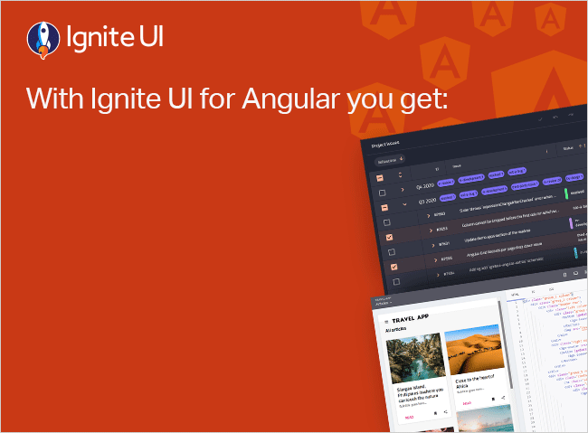
Ignite UI for Angular
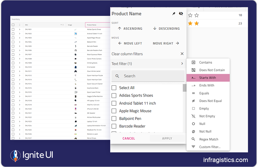
This is a comprehensive Angular components library featuring hundreds of native Angular UI components, including a blazing-fast Angular Data Grid and over 60 high-performance Angular charts. It is compatible with Angular 19 and built to be enterprise-grade. There is also a set of over 50 free-to-use controls under the MIT license.
The Premium components it packs:
Pivot Grid, Hierarchical Grid, Query Builder, Tile Manager, Dock Manager, Combo, Tree Grid, Data Grid, Charts, Gauge, Calendar, Dialog, Splitter, Treemap, DatePicker, Combo, Spreadsheet, Icon, Drop Down, Paginator, and a lot more.
Best Things It Offers/Does:
- Robust Grid component that can handle unlimited rows and columns of data.
- CLI tools that provide different project templates.
- 50+ Open-Source controls including Grid Lite, Stepper, Tree, List, Dialog, Input, and many more.
- Data analysis using Dock Manager.
- Comprehensive and detailed documentation, sample apps, tutorials, how-to guides.
- Provides access to custom templates and real-time data updates.
- Features an intuitive API for easy theming and branding.
- Simplified data entry and a faster way to bind to data with minimal code.
- Improved row selection with features such as multi-click use of tabs.
- Enables you to build expressive dashboards and render millions of data points.
- Rich chart components with every common category chart type, plus Google Finance and Yahoo Finance charts, and more.
- Low-code App Builder™ with production-ready code generation and GenAI functionality that’s part of the Infragistics Ultimate plan.
- Native Angular Material components are written for optimal file size.
- Bootstrap support plus custom themes for complete control.
- 100% transparency on GitHub.
- Different subscription plans.
The Downside:
- Customer support is 24×5.
- It isn’t free to use (except for the Grid and Charts).
Angular Material
Previously known as Material2, Google developed the official UI component library based on Angular and TypeScript. It delivers different pre-built UI components that apply common interaction patterns matching the Material Design guidelines. Still, developers can customize the look and feel of the Angular Material components to match app requirements and purposes.
The components it packs:
Autocomplete, Datepicker, Paginator, Stepper, Tabs, Buttons, Cards, Chips, Dialogs, Icons. Inputs, Lists, Menus, Toolbars, Tooltips, Typography, Tables, Snackbar, Sliders, Selects.
Best Things It Offers/Does:
- Customizable navigation menus, buttons, forms, dialog boxes, and more.
- Navigation, virtual scrolling.
- Simple and straightforward APIs.
- Supports design and usability best practices and consistency across various platforms.
- Rich and thorough documentation.
- Leverages the built-in directives and services of the framework.
The Downside:
- Its components are based on the Material Design standard (which is advantageous and disadvantageous at the same time). An advantage because visual changes might be introduced without supporting former alternatives. A disadvantage because it stays up to date with the latest web standards.
- Lack of robust components like Grids and Charts.
- Lack of rich functionalities of the existing components. They follow a minimalistic functionality approach.
Syncfusion
Syncfusion is a lightweight and user-friendly library, offering a broad set of Angular components for building enterprise-grade apps. All the components are touch-friendly and have been built as modules to enable selective referencing.
The components it packs: Data Grid, Pivot Grid, Tree Grid, Chat UI, Charts, Scheduler, Diagram, Maps, PDF Viewer, Word Processor, Calendar, ListView, Dropdowns, Buttons, Inputs, and more.
Best Things It Offers/Does:
- Offers over 90 Angular components.
- Includes a powerful data grid with virtualization, editing, and export features.
- All the components follow the accessibility guidelines and standards, including ADA, Section 508, WCAG 2.2 standards, and WCAG roles.
- Complete source code, unit test files, and e2e test scripts are available on GitHub.
- Good documentation and live demos.
- Supports Material, Bootstrap, Tailwind CSS, and Fabric designs.
The Downside:
- The breadth of components can increase app size if not tree-shaken carefully.
- Some developers report occasional complexity in component configuration.
Kendo UI
Kendo UI is one of the most popular Angular libraries available on the market, known for its deep support for Angular-specific features, consistent theming, 110+ UI components, and integrations with reporting and testing tools.
The components it packs: Data Grid, Pivot Grid, Charts, DropDowns, Navigation, Inputs, Date Pickers, Scheduler, Editor, TreeView, Layout tools, Dialogs, Notifications, Tooltips, and more.
Best Things It Offers/Does:
- 30-day FREE trial including technical support and training.
- Strong enterprise focus with advanced components like Scheduler and Pivot Grid.
- Consistent design system with built-in themes: Material, Bootstrap, and Kendo UI Design System.
- Ability to load 1 million data cells in seconds.
- Regular releases, day 0 support of new Angular versions, plays well with others.
- Thorough documentation, API reference, and Angular CLI integration.
- Ability to convert Figma Variables by importing the Figma design into ThemeBuilder to generate CSS.
The Downside:
- Some users cite a steeper learning curve for advanced components.
- Performance can require optimization for large datasets.
DevExtreme
DevExpress offers a specialized Angular component set targeted at data-intensive applications. While the company is more established in desktop development, its Angular tools bring similar capabilities, particularly in grid performance, charting, and reporting.
The components it packs: Data Grid, Pivot Grid, TreeList (Tree View and List View Hybrid), Card View, Forms and Editors, Charts, Scheduler, File Manager, Google, Bing, and Vector Maps, and more.
Best Things It Offers/Does:
- Cross-platform component suite with 80+ Angular controls.
- 30+ chart types and refined gauge widgets.
- Pivot Grid with an optimized client-side data engine that can process up to 1,000,000 records.
- Focused on enterprise workflows with strong spreadsheet and scheduling tools.
- 30-day trial and 60-day money back guarantee.
The Downside:
- Smaller Angular-specific community compared to other frameworks they support.
- Updates can lag slightly behind Angular version releases.
NG Bootstrap
This lightweight Angular UI library, built entirely in TypeScript, contains a collection of Angular directives and widgets.
The components it packs:
Forms, Navigation Menus, Powerful Grids, Alert, Buttons, Dropdown, Typehead, Modals.
Best Things It Offers/Does:
- Provides components and design patterns that developers are already familiar with, so there’s no steep learning curve.
- Expands the Bootstrap components’ capabilities.
- With support for accessibility features, including the World Wide Web Consortium (W3C) specifications for Accessible Rich Internet Applications (ARIA).
- Excellent Modal component for creating highly customizable and configurable modal dialogs.
The Downside:
- Requires knowledge of Bootstrap and Angular to utilize the NG Bootstrap library.
- With dependency on Bootstrap 4 CSS.
- Lack of components – no Grid or visual components like Charts.
NGX-Bootstrap
NGX-Bootstrap may sound similar to the previous UI library, but it is an entirely different open-source project built on AngularJS. It extends the component capabilities of Bootstrap and provides more advanced customization options for component styling.
The components it packs:
Alerts, Accordion, Buttons, Carousel, Collapse, Datepicker, Dropdown, Modals, Pagination, Popover, Progressbar, Rating, Sortable, Tabs, Timepicker, Tooltip, Typehead.
Best Things It Offers/Does:
- Components that are designed to be modular, flexible, and adaptable.
- Retain excellent performance on both mobile and desktop.
- You can easily apply custom templates and styles.
The Downside:
- Doesn’t contain all the core components of Bootstrap.
- Implementing it may require a certain level of expertise.
- The larger size of ngx-bootstrap can increase the size of the app that is being built.
- Poor maintainability and infrequent releases.
PrimeNG
With 7,300+ GitHub stars and 296,000 weekly NPM downloads, PrimeNG is another top component library for Angular, ranking among the best ones. Open-source widgets, professionally designed ready-to-use templates, and quick installation make this library a great choice.
The components it packs:
Charts, Forms, Icons, Calendars, Chips. Dropdown, Knob, KeyFilter, Editor, Listbox, SelectButton, TreeSelect, Rating, RadioButton, Slider, etc.
Best Things It Offers/Does:
- A pack of 80+ different components that are easy to implement.
- It features a theme designer that allows you to create your own themes.
- Ability to choose from pre-built, touch-optimized Flat and Material themes.
- Customizable native Angular CLI.
- Seamless integration using Angular’s lifecycle hooks and built-in directives.
- Great documentation/ API docs and live samples.
The Downside:
- Using it can become too overwhelming and complex due to too many features and components.
- With trickier outputs that may require some extra programming to manually emit an event from a nested component.
- Fails to provide some basic events.
- Templating isn’t available on every component you would normally expect.
ApexCharts
An expert JavaScript charting library that has recently started developing grids as well. It helps you build interactive data visualizations with a simple API and 100+ ready-to-use samples. It includes over a dozen chart types that deliver beautiful, responsive visualizations in your apps and dashboards.
The components it packs:
Charts, Grids.
Best Things It Offers/Does:
- A MIT-licensed, open-source project that can be used in commercial and non-commercial projects.
- Various chart features, including tooltips, interactivity, animations, and more.
- You can define your own color palette or choose a pre-defined one as a quicker solution.
- No registration is needed.
- With 100+ samples.
The Downside:
- Limited number of chart types.
- Limited number of grids.
- Not a complete Angular UI kit.
Nebular
It is an Angular UI component library with over 40 UI components in four customizable themes (Default, Dark, Cosmic, and Corporate). At its core, it uses the Eva design system in implementation. The primary goal of this kit is to focus on the adaptability and design of your application. An interesting fact: It was recognized at the prestigious AngularConnect back in 2018.
The components it packs:
Stepper, Lists, Sidebar, Menu, Tabs, Layouts, Cards, Lists, Accordion, Form Elements, Data Tables, Modals, etc.
Best Things It Offers/Does:
- No third-party dependencies.
- Great for its local support.
- Ready to use admin dashboard – ngx-admin.
- Free distribution of its source code thanks to the MIT license.
- With Authentication layers and Security modules that control more-granular access to specific resources.
- Delivers assets for teams that work with Sketch or Figma and want to start the design-dev process from this point.
- There are additional components, such as the Chat UI, Badge, and others.
The Downside:
- Limited customization option.
- Some may find it challenging to learn and get used to it.
Clarity
This one is built and maintained by VMware and combines UX guidelines, Figma libraries, an HTML/CSS framework, and a set of data-bound Angular components. It features a card-based design, providing a flexible and modular system with easy-to-use card components.
The components it packs:
Accordion, Badges, Buttons, Input Fields, Select Boxes, Data Grid, Date Picker, Forms, Header, Alerts, Dropdowns, Labels, Lists, Stack View, Spinners, and more.
Best Things It Offers/Does:
- Brings consistency thanks to the shared visual language that is used across all components.
- Extensive documentation with tutorials, guides, and API references.
The Downside:
- Offers just the most common components.
- The focus is on UX.
- Some may find the cards concept a bit confusing or incomplete for their purposes.
- Works with Clarity Design system, which is a bit peculiar as you might not be very fond of the style.
- There are no other themes available.
- Works more like an enterprise-focused design system.
Core UI
Core UI works as an Angular admin dashboard template and UI library, delivering beautifully handcrafted UI controls. It is a MIT-licensed open-source project and is free to use.
The components it packs:
Footer, Buttons, Accordion, Alert, Modal, Navbar, Tooltip, Toast, Header, Image, Callout, Cards, Collapse, Dropdown, Breadcrumb, and a few more.
Best Things It Offers/Does:
- Offers various themes to cover different requirements.
- With a ready-to-use environment.
- Provides enterprise-grade support.
- Compatibility with Bootstrap.
- A wide range of input field styles and templates.
The Downside:
- Customization options may not be suitable for all purposes.
- Primarily used for building dashboards.
- With a limited set of features.
- Maintaining and developing new features is only sustainable with proper financial backing.
- It is not updated frequently.
Some Conclusive Extra-Thoughts…
In conclusion, what does the best Angular Ui library offer to development teams? We’ve identified these fundamental benefits that comprehensive and modern Angular component libraries deliver to developers, including:
- Reusability
A comprehensive Angular component library allows for component reusability. This way, you don’t have to recreate a component from scratch again and again. Instead, you can easily reuse pre-built components in different projects, saving time and resources and achieving consistency throughout the app.
- Scalability
The best component library for Angular can also help you scale projects more quickly and efficiently. As the app becomes more complex, you can easily add new components to the library without breaking existing functionalities.
- Customization options
You may be working on different projects, so having the freedom to fine-tune things like themes and styles is crucial in making an app distinguishable and achieving a better user experience (UX). You also align UI components with the branding and the design language behind the Angular app.