PrimeNG Alternatives: What Library Fits Your Project – Infragistics
PrimeNG remains a capable starting point, but as your Angular apps scale, you may need a solution that offers better performance, design flexibility, and enterprise-grade reliability.
 Katie Mikova
15min read
Katie Mikova
15min read
PrimeNG has long been one of the go-to Angular UI libraries thanks to its wide range of prebuilt components, ready-to-use widgets, and easy setup. But most importantly, people prefer it for its MIT license. However, as Angular apps grow more complex, PrimeNG’s limitations start to show and teams are prompted to start looking for PrimeNG alternatives instead.
Developers often mention challenges such as:
- Performance bottlenecks in large data grids.
- Limited charting flexibility due to its dependency on ChartJS.
- Maintenance overhead that comes with open-source frameworks.
- A lot of breaking changes with little to no documentation.
The library’s theming system, while customizable, can also feel dated or restrictive when building modern design systems. In community discussions, opinions tend to split.
- Some value its convenience and free MIT license.
- Others see it as a good starting point but not a long-term solution for enterprise-grade apps that demand speed, scalability, and maintainability.
To help you find the right fit for your next Angular projects, this article will take an objective look at the top PrimeNG alternatives for 2025.
An Alternative to PrimeNG Component Library: Quick Overview
Before we deep-dive into other options with their pros and cons, let’s explore them at a glance with the most critical aspects.
| Library | License | Key Strengths | Limitations | Best For |
|---|---|---|---|---|
| PrimeNG | MIT | Large component set, easy setup, broad community support | ChartJS dependency, performance issues at scale, dated theming | General Angular apps & quick builds |
| Ignite UI for Angular | Commercial (Free trial) | Enterprise-grade performance, 100+ components, robust grid, 18K+ tests, pro support | Paid license, may be overkill for small projects | Enterprise-scale apps; data-heavy apps; high-performance dashboards |
| Angular Material | Free | Google-maintained, clean Material Design, great accessibility | Limited component variety, rigid design language | Internal tools, prototypes, Google-styled apps |
| Syncfusion Angular UI | Commercial | Advanced data visualization, strong grid & export tools, solid docs | Licensing cost, less flexible theming | Data-heavy dashboards, BI & analytics apps |
| Kendo UI for Angular | Commercial | Feature-rich grid, accessibility, enterprise support | Pricing, larger bundle size | Complex enterprise applications |
| DevExtreme Angular Components | Commercial | Highly customizable, modular imports, rich UI widgets | Paid license, steeper learning curve | Custom UIs, tailored enterprise dashboards |
| NG Zorro | MIT | Beautiful Ant Design-based UI, i18n, free and open-source | Moderate performance | Design-centric open-source projects |
| Clarity UI (VMware) | MIT | UX-first, accessibility-driven, great for admin tools | Opinionated look, smaller catalog | Admin and internal enterprise tools |
| Nebular (Akveo) | MIT | Eva Design System, built-in auth & security modules, flexible theming | Fewer advanced data components, variable maintenance | SaaS dashboards, secure portals |
| Taiga UI | MIT | Modern, lightweight, TypeScript-first, excellent DX | Smaller ecosystem | Lean, modern Angular apps |
A Detailed Overview of PrimeNG Alternatives
Let’s explore all the PrimeNG alternatives, what controls it offers, the usage, and more.
Ignite UI for Angular
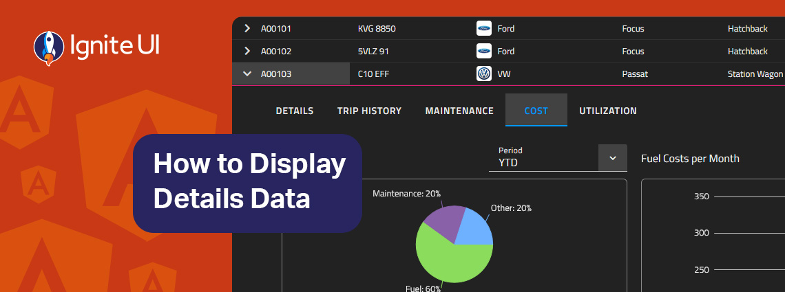
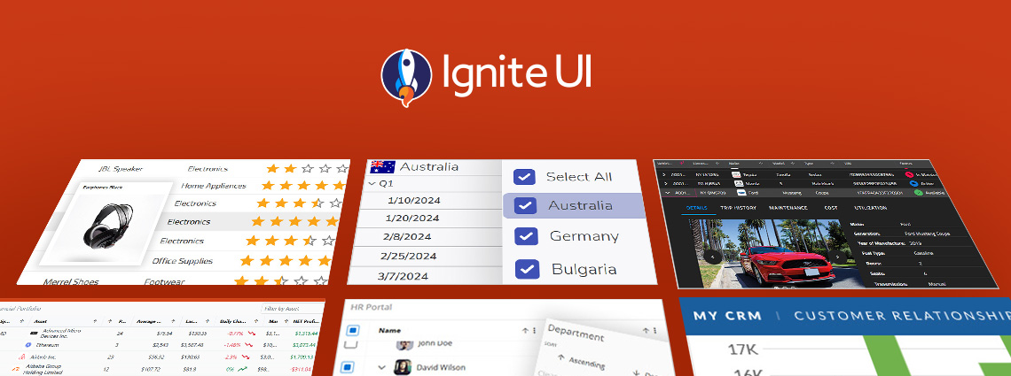
This is one of the most comprehensive Angular component libraries on the market, featuring native Angular UI components, such as the fastest Angular Data Grid and 60+ high-performance Angular charts. It is compatible with Angular 20 and built to be enterprise-grade.
The components it packs: Pivot Grid, Hierarchical Grid, Query Builder, Tile Manager, Dock Manager, Combo, Tree Grid, Data Grid, Charts, Gauge, Calendar, Dialog, Splitter, Treemap, DatePicker, Combo, Spreadsheet, Icon, Drop Down, Paginator, and a lot more.
Best things it offers/does:
- Includes advanced components such as Data Grid, Hierarchical Grid, Pivot Grid, and Tree Grid, Dock Manager, supporting virtualization, advanced filtering, grouping, sorting, exporting, and Excel-like interactions.
- Comes with a comprehensive charting library, including financial charts, stock charts, indicators, and BI-focused visualizations.
- Optimized for high-performance rendering of large datasets with built-in row and column virtualization.
- Offers customizable themes beyond Material Design and enterprise UX patterns.
- There are feature-packed and optimized Angular sample apps, helping teams get started more easily, inspect best practices, the code behind each app, and more.
- Provides commercial-grade support with SLAs, priority bug fixes, and transparent product roadmaps.
- With proven UI patterns like the Master-Detail layout for presenting related data.
- Ships with hundreds of live, runnable code samples and extensive documentation to accelerate development.
- Seamlessly integrates into Angular projects, fully supporting Angular’s dependency injection and reactive forms.
- Allows teams to consolidate their UI stack by reducing reliance on third-party libraries for grids, charts, or dashboards.
- Designed with accessibility and internationalization (i18n) in mind, ensuring enterprise compliance.
- Different subscription plans.
The downside: It isn’t fully free for commercial projects, but it’s free for non-commercial, educational, or evaluation purposes, and offers both a free trial and flexible subscription plans for professional or business use cases.
Angular Material
Angular Material is developed by Google and it’s one of the most popular UI component libraries on the market. Based on Angular and TypeScript, it delivers pre-built UI components that apply common interaction patterns matching the Material Design guidelines. Still, developers can customize the look and feel of the Angular Material components to match app requirements and use cases.
The components it packs: Autocomplete, Datepicker, Paginator, Stepper, Tabs, Buttons, Cards, Chips, Dialogs, Icons, Inputs, Lists, Menus, Toolbars, Tooltips, Typography, Tables, Snackbar, Sliders, Selects.
Best things it offers/does:
- Customizable navigation menus, buttons, forms, dialog boxes, and more.
- Navigation, virtual scrolling.
- Simple and straightforward APIs.
- Supports design and usability best practices and consistency across various platforms.
- Rich and thorough documentation.
- Leverages the built-in directives and services of the framework.
The downside:
- Strict adherence to Material Design – both a strength and a limitation.
- Missing complex components like advanced grids or charts.
- Minimalistic functionality by design.
If you want, you can compare Ignite UI for Angular vs Angular Material in this dedicated blog post.
Syncfusion
Syncfusion is one of the lightweight PrimeNG alternatives we’ve selected, offering various Angular components for building enterprise-grade apps. The controls this library offers are touch-friendly and have been built as modules to enable selective referencing.
The components it packs: Data Grid, Pivot Grid, Tree Grid, Chat UI, Charts, Scheduler, Diagram, Maps, PDF Viewer, Word Processor, Calendar, ListView, Dropdowns, Buttons, Inputs, and more.
Best things it offers/does:
- 90+ Angular components with strong accessibility (ADA, Section 508, WCAG 2.2).
- High-performance Data Grid with virtualization, editing, and export.
- Supports Material, Bootstrap, Tailwind, and Fabric themes.
- Complete source code and test files on GitHub.
- Great documentation and live demos.
The downside:
- The breadth of components can increase app size if not tree-shaken carefully.
- Some developers report occasional complexity in component configuration.
Kendo UI
Kendo UI is another well-known UI library that delivers a comprehensive set of Angular controls. It is known for its deep support for Angular-specific features, consistent theming, 110+ UI components, and integrations with reporting and testing tools.
The components it packs: Data Grid, Pivot Grid, Charts, DropDowns, Navigation, Inputs, Date Pickers, Scheduler, Editor, TreeView, Layout tools, Dialogs, Notifications, Tooltips, and more.
Best things it offers/does:
- 30-day free trial with full support.
- Strong focus on enterprise apps: Scheduler, Pivot Grid, etc.
- Consistent theming (Material, Bootstrap, Kendo).
- Handles 1M+ data cells efficiently.
- Day-zero Angular version support and Figma → CSS theming via ThemeBuilder.
- Excellent docs and API reference.
The downside:
- Some users cite a steeper learning curve for advanced components.
- Performance can require optimization for large datasets.
DevExtreme
DevExpress is also part of our PrimeNG alternatives list that offers a set of 80+ Angular components for data-heavy applications. While the company is more established in desktop development, its Angular tools bring similar capabilities, particularly in grid performance, charting, and reporting.
The components it packs: Data Grid, Pivot Grid, TreeList (Tree View and List View Hybrid), Card View, Forms and Editors, Charts, Scheduler, File Manager, Google, Bing, and Vector Maps, and more.
Best things it offers/does:
- 80+ responsive Angular controls across data and visualization.
- 30+ chart types and gauges with real-time update support.
- An intuitive and easy-to-use Angular TreeList widget.
- UI Template gallery, which includes responsive Angular UI templates for various usage.
- Optimized Pivot Grid handling up to 1M records.
- Strong enterprise workflows: spreadsheets, scheduling, reports.
- 30-day trial and 60-day money-back guarantee.
The downside:
- Smaller Angular-specific community compared to other frameworks they support.
- Updates can lag slightly behind Angular version releases.
NG Zorro
This is an open-source Angular component library built on top of Ant Design, bringing a polished, enterprise-grade UI aesthetic to Angular projects. It’s maintained by the NG-ZORRO team and community contributors, making it one of the most visually refined free Angular libraries available.
The components it packs: Buttons, Forms, Tables, Grids, Modals, Date Pickers, Tree Views, Tabs, Menus, and a wide range of Ant Design-inspired layout and navigation elements.
Best things it offers/does:
- A clean, professional Ant Design look suited for enterprise dashboards and SaaS products.
- Comprehensive component coverage, rivaling many commercial suites.
- Accessible and responsive by default, with TypeScript support.
- Active open-source community and regular updates aligned with Angular releases.
- Free under the MIT license, ideal for teams with limited budgets.
The downside:
- Performance can dip with very large data sets compared to optimized commercial grids.
- Customization is somewhat constrained by Ant Design’s opinionated styling.
- Limited professional support (relies mostly on community contributions).
Clarity
This one is built and maintained by VMware and combines UX guidelines, Figma libraries, an HTML/CSS framework, and a set of data-bound Angular components. What makes it a great PrimeNG alternative is the fact that it features a card-based design, providing a flexible and modular system with easy-to-use card components.
The components it packs: Accordion, Badges, Buttons, Input Fields, Select Boxes, Data Grid, Date Picker, Forms, Header, Alerts, Dropdowns, Labels, Lists, Stack View, Spinners, and more.
Best things it offers/does:
- Brings consistency thanks to the shared visual language that is used across all components.
- Extensive documentation with tutorials, guides, and API references.
The downside:
- Offers just the most common components.
- The focus is on UX.
- Some may find the cards concept a bit confusing or incomplete for their purposes.
- Works with Clarity Design system, which is a bit peculiar as you might not be very fond of the style.
- There are no other themes available.
- Works more like an enterprise-focused design system.
Nebular
This PrimeNG alternative is an Angular UI component library with over 40 UI components across four customizable themes (Default, Dark, Cosmic, and Corporate). At its core, it uses the Eva design system in implementation. The primary goal of this kit is to focus on the adaptability and design of your application.
The components it packs: Stepper, Lists, Sidebar, Menu, Tabs, Layouts, Cards, Lists, Accordion, Form Elements, Data Tables, Modals, etc.
Best things it offers/does:
- No third-party dependencies.
- Great for its local support.
- Ready to use admin dashboard – ngx-admin.
- Free distribution of its source code thanks to the MIT license.
- With Authentication layers and Security modules that control more granular access to specific resources.
- Delivers assets for teams that work with Sketch or Figma and want to start the design-dev process from this point.
- There are additional components, such as the Chat UI, Badge, and others.
The downside:
- Limited customization option.
- Some may find it challenging to learn and get used to it.
Taiga UI
This one offers a comprehensive set of UI controls for Angular and is open source, making it an ideal choice when selecting among different PrimeNG alternatives. Especially for developers with a limited budget or those who want to build basic apps.
The components it packs: Accordion, ActionBar, Alert, Badges, Buttons, Carousel, Dialog, DropDown, Icon, Label, SheetDialog, Table, Tree, and more.
Best things it offers/does:
- It is modular and fully treeshakable.
- The components are very flexible and are ready for any use case.
- They use CSS custom properties for all the styling and provide easy methods to customize the controls with dark themes out of the box.
- The UI components use OnPush and the whole project is developed with strict TypeScript mode.
- There are 130+ components, 100+ directives, dozens of tokens, utils and tools.
The downside:
- Smaller ecosystem and fewer advanced components (e.g., charts).
- Limited documentation compared to older projects.
Wrap Up: What to Look for in PrimeNG Alternatives?
When deciding between UI libraries to replace PrimeNG, weigh both engineering depth and developer experience. Here’s what matters most:
- Performance and scalability: How do the PrimeNG alternatives handle large data grids and heavy workloads?
- Design flexibility and theming: Can it adapt to your brand’s design system and requirements?
- Component: Does it include advanced components (grids, charts, forms, editors)?
- Support and documentation: Are there regular updates, QA processes, and reliable help channels?
- Licensing and reliability: Is it open source or commercial, what’s the true cost of using a free open-source solution, who maintains it?
Ultimately, PrimeNG remains a capable starting point, but as your Angular applications scale, you may start looking for PrimeNG alternatives that offer better performance, design flexibility, and enterprise-grade reliability. More comprehensive Angular libraries like Ignite UI for Angular deliver all of this, combining high-performance grids, advanced visualizations, every feature you need, and dedicated support for teams that build and maintain apps at scale.