
What’s the Best React UI Library: Top 9
From well-styled design systems to customizable components that give you full control, the React ecosystem offers a wide range of options tailored to different projects and development needs. But which one leads the charts? Here are our top picks.
 Katie Mikova
15 min read
Katie Mikova
15 min read
React has secured its place as a core technology in modern software development for a good reason. Its speed, scalability, versatility, and consistent UX, make it ideal for building everything – from real-time chat applications and e-commerce websites to enterprise-grade tools. Even though there’s a significant focus on generative AI right now and its impact on app development, the foundation still matters. And for many, the foundation is React.
However, even the strongest foundation needs the right building blocks. That’s where the best React component library options come in. They deliver toolboxes of feature-packed, reusable UI controls that help developers move faster, stay consistent, and build better experiences without reinventing the wheel. From well-styled design systems to customizable components that give you full control, the React ecosystem offers a wide range of options tailored to different projects and development needs.
If you are evaluating options broadly, start with the main React Data Grid pillar page. If you want implementation detail, see the React Data Grid component docs.
And here are the top React UI libraries leading our list. What will we explore?
- Features and capabilities
- Licensing options
- Use cases for each library
- Strengths and weaknesses
| Library | Key Features | AI Capabilities | License | Ideal Use Cases |
|---|---|---|---|---|
| Ignite UI | Virtualized Data Grid, 60+ charts, Excel Import/Export, App Builder, Dock Manager, Pivot Grid, Hierarchical Grid, 50+ Open-Source controls (free React data grid and more) | App Builder AI (low code + GenAI) | Commercial + MIT | Enterprise apps, financial apps, analytics-heavy UIs |
| MUI | Material Design, SSR support, design kits, theming engine | None | MIT (MUI Core), Commercial (MUI X) | MVPs, SaaS products, general UI needs |
| Ant Design | Enterprise UI Suite, Form/Table Controls, i18n, CSS-in-JS Theming | None | MIT | Enterprise tools, CRMs, internal business platforms |
| Chakra UI | Buttons, CheckBox, Form Control, Icon Button, Light and Dark UI | None | MIT | Startup UIs, MVPs, accessible apps |
| Radix UI | Unstyled accessible primitives, headless components, fully composable | None | MIT | Custom design systems, Tailwind integrations |
| Fluent UI | Fluent Design, Office/Teams styling, TypeScript, accessibility built-in | None | MIT | Microsoft ecosystem apps, Office-style interfaces |
| React Bootstrap | Bootstrap components in React, responsive layout, React hooks support | None | MIT | Legacy Bootstrap migrations, simple responsive UIs |
| KendoReact | 120+ components, feature-rich grid, schedulers, AI Assistant | AI Coding Assistant | Commercial (+ Free Tier) | Enterprise apps, data-heavy UIs, apps with real-world logic |
| Syncfusion | 90+ controls, Excel-like grid, Pivot Table, themes, mobile support | None | Commercial (+ Free Trial) | Financial dashboards, analytics UIs, enterprise-grade apps |
Ignite UI
It is a complete enterprise-grade React library tailored for high-performance, data-rich applications. Backed by 35+ years of development experience, our library delivers hundreds of customizable Premium UI components and 50+ Open-Source controls, ensuring developers’ freedom, faster time to market, and enhanced productivity. When it comes to integrating Ignite UI for React into your Next.js project, it all happens easily, quickly, and seamlessly.
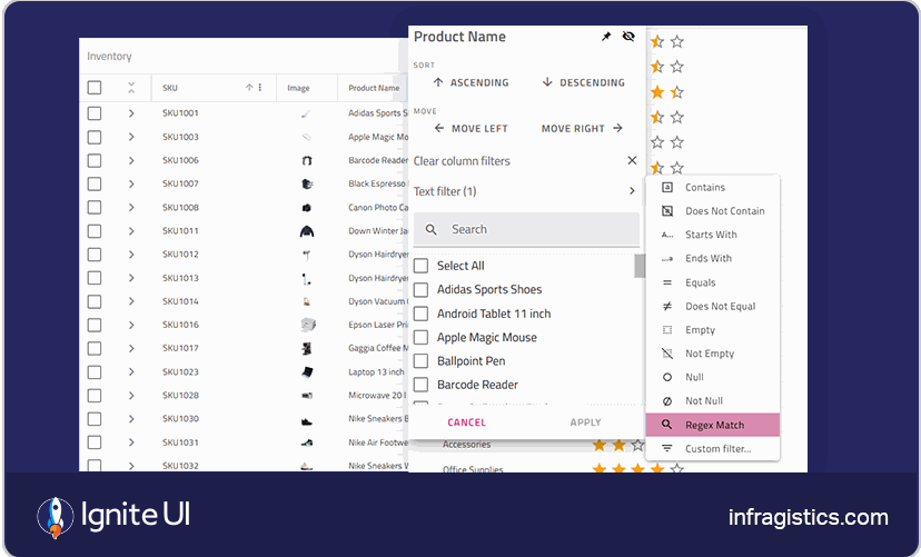
The Premium Components It Packs: Virtualized Data Grid, Pivot Grid, Hierarchical Grid, DockManager, Carousel, Card, Avatar, Spreadsheet, Combo, List View, Tree Grid, Maps, Dashboard Tile, Stepper, Navigation Drawer, Button, Input, Date Picker, SnackBar, Financial Chart, Bar Chart, and many more.
The Open-Source Components It Packs: Free React data grid – Grid Lite, Stepper, Input, Dialog, Tree, and many more.
The Best Things It Offers/Does:
- Highly customizable, accessible, and extremely performant under heavy data loads.
- Feature-packed and blazing fast grids.
- 60+ charts, gauges, and maps optimized for millions of data points.
- Excel import/export and data binding support.
- 50+ Open-Source controls under the MIT-license, such as React data grid open-source component, Stepper, and others.
- Simplified React Server-Side Rendering.
- CLI starter templates for React scaffolding.
- Enterprise-ready: scalable, accessible, responsive.
- Unified cross-framework experience.
- Theming options: Material, Fluent, Indigo, and Bootstrap.
- Comprehensive documentation, tutorials, and sample apps to get you started.
- Low-code App Builder™ with production-ready code generation and GenAI functionality as part of the Infragistics Ultimate plan (App Builder AI).
Limitations:
- Customer support is 24×5.
- It isn’t free to use (but there’s a free trial).
Best for: Responsive, enterprise-grade applications, reporting tools, fintech, or anything where data volume is off the charts.
MUI (Material UI)
Material UI is one of the top React component libraries, following Google’s Material Design principles with modern extensibility. If you browse Reddit, you will see that it is preferred due to its set of Material Design-based components and theming capabilities.
The Components It Packs: Toolbar, Data Grid, Charts, Date and Time Pickers, Tree View, Export, Quick Filter, Icons, Text Fields.
The Best Things It Offers/Does:
- First‑class TypeScript support.
- Server-Side Rendering support.
- Works well with Next.js.
- There’s a large community and support.
- Design kits and starter templates.
- Theme toggling customization with support for dark and light modes.
- Built-in support for responsive layouts.
- Integration with other tools (styled components).
Limitations:
- Developers report that Material UI adds a lot of code to every component and a layer of indirection.
- When projects grow, the design and needs may diverge to a point where teams could override a significant portion of the CSS and some of its functional behavior.
- Doesn’t offer deep customization.
Best for: Bringing an implementation of Material Design on React, cross-platform apps that function on mobile and desktop platforms, developers who don’t want to create their own components and styling.
Ant Design (AntD)
We’ve listed Ant Design among the top React UI libraries for its high-quality React components. It has more than 95k stars on GitHub and over 1.8 million weekly downloads on NPM.
The Components It Packs: Grid, Button, Icon, Typography, Divider, Flex, DropDown, Steps, Tabs, CheckBox, Form, Radio, Slider, TimePicker, TreeSelect, Avatar, Carousel, List, Table, Tree, Tooltip, and others.
The Best Things It Offers/Does:
- Enterprise-class UI designed for web applications.
- Over 50 UI controls for enterprise-level applications.
- Written in TypeScript with predictable static types.
- With a whole package of design resources and development tools.
- Built-in internationalization support for various languages.
- Theme customizations based on CSS-in-JS.
- Easy to adjust styles to align with branding or specific styles.
- MIT license.
Limitations:
- The visual style is quite distinct and less flexible for some brands.
- Large bundle footprint unless manually optimized.
- Heavy API surface may overwhelm lighter use cases.
Best for: Crafting complex, data-driven interfaces, any app that requires a professional look and functionality, enterprise dashboards, CRMs, and internal tools.
Chakra UI
It is a fast-growing React library, preferred for its modularity, accessibility, flexibility, and extensibility. There is a wide range of components for building responsive React applications. It is actively maintained and has an expanding open-source community, giving developers a sense of reliability.
The Components It Packs: Box, Drawer, Grid, Buttons, CheckBox, Form Control, Icon Button, Input, Radio, Select, TextArea, Slider, Badge, Table, Avatar, and others.
The Best Things It Offers/Does:
- It follows WAI-ARIA standards for all components.
- Themeable so it can match design needs and aesthetics.
- Designed with composition in mind.
- Optimized for multiple color modes with Light and Dark UI.
- Active community.
Limitations:
- A smaller component set.
- Might not provide the necessary React Grid and Chart features.
- Not very customizable.
Best for: Startups, SaaS interfaces, MVPs, modern apps with accessibility and theming needs.
Radix UI
This open-source component library is known for its focus on accessibility and ease of maintenance. What sets it apart from other top React libraries is its unique approach: it offers a collection of unstyled, accessible UI primitives for building fully customized interfaces.
The Components It Packs: Grid, Data List, Dialog, Tooltip, Dropdown Menu, Hover Card, Icon Button, Inset, Popover, Checkbox, Card, Button, Avatar, Tooltip, Tabs, Theme, etc.
The Best Things It Offers/Does:
- It is fully accessible and adheres to WAI-ARIA standards by default.
- Headless components and it works with Tailwind, Styled-components, or custom CSS.
- Composable architecture suitable for custom design systems.
- Cross-browser compatibility for consistent performance.
- Small and modular – import only what you need.
- Completely open-source and free.
Limitations:
- No pre-styled components; styling overhead falls on the developer.
- Requires more effort to build polished UI elements.
- Learning curve.
Best for: Teams building custom designs, ideal as a starting point for design system architects, and developers who want complete control over styling.
Fluent UI
This is Microsoft’s official React component library for building experiences aligned with the Fluent Design System. It is excellent if you’re building apps that live inside Microsoft 365 or align with enterprise styling.
The Components It Packs: Buttons, Grids, Checkboxes, Notifications, Menus, essential Inputs, Toolboxes, and others.
The Best Things It Offers/Does:
- Components that match Microsoft’s ecosystem.
- Strong accessibility and keyboard support.
- Easy theming to match Office or Teams branding.
- Full TypeScript support.
- It is free and open-source.
- Created with easy accessibility in mind, and works on all platforms.
- You can use the code and modify it based on your needs.
Limitations:
- Some components feel tailored for Microsoft-specific use cases.
- Might not be appropriate for data-heavy apps.
- Not a vibrant dev community.
Best for: Apps targeting a Microsoft ecosystem or building Office-style interfaces, developers and designers with prior experience.
React Bootstrap
This one is also positioned among the top React UI Libraries, built on top of the popular Bootstrap CSS framework.
The Components It Packs: Buttons, Forms, Navigation, Modals, Tooltips, and so on.
The Best Things It Offers/Does:
- Components follow the accessibility standards and are compatible with React hooks.
- Developers can customize and extend components to match their applications’ designs.
- Very good documentation and active community.
- Mobile-first and responsive.
- Additional tutorials and guides to facilitate development.
- Clean integration with the Bootstrap ecosystem.
- Free to use.
Limitations:
- Doesn’t include advanced features like grids or data charts.
- Limited to Bootstrap’s visual language.
Best for: Programmers familiar with Bootstrap or migrating legacy apps, responsive web applications that adapt to different screen sizes and devices.
KendoReact
Some consider it the best React UI library. While we can’t really say it is the absolute best, KendoReact consistently ranks among the top ones. With 120+ enterprise-grade components and an integrated AI Coding Assistant, it’s a strong choice for teams looking to build robust, data-driven applications.
The Components It Packs: Grid, Scheduler, Editor, Charts, Spreadsheet, AI Prompt, Form Layout, Dropdown, Date Inputs, CheckBox, ListBox, Button, ListView, Pager, Filter, SpreadSheet, Excel Export, Toolbar, TextBox, Tooltip, Slider, Charts, and many more.
The Best Things It Offers/Does:
- A comprehensive set of customizable controls, including a feature-rich data grid.
- Comprehensive documentation, demos, and support.
- Roadmap transparency and a large community.
Limitations:
- Commercial license.
- Steeper learning curve.
- Components customization may be a bit challenging.
Best for: Data-heavy, enterprise-grade applications, apps with complex UIs, and real-world business logic.
Syncfusion
It offers a well-established React library, delivering 90 customizable and feature-rich controls for building enterprise-level applications. Designed for high-performance and scalability, Syncfusion React JS deserves its place among the top React component libraries. And here’s why.
The Components It Packs: Data Grid, Tree Grid, Pivot Table, Scheduler, Calendar, DatePicker, DateRangePicker, TimePicker, ComboBox, TextBox, CheckBox, Button, Dialog, Tooltip, Splitter, Excel-like Spreadsheet, File Manager UI, etc.
The Best Things It Offers/Does:
- Supports screen readers, keyboard navigation, and high-contrast themes.
- RTL support and easy integration of multiple locales.
- Uniform appearance across all components, easy to theme and customize.
- Each component has demos, API references, and tutorials.
- Multiple Theme options – Material, Bootstrap, Tailwind CSS, and Fabric designs.
- Touch and mobile support.
- Complete source code, unit test files, and e2e test scripts are available on GitHub.
- All components have been built as modules to enable selective referencing.
Limitations:
- Not open-source; free usage is limited to the Community License.
- Large bundle size.
- Steeper learning curve.
Best for: Data-heavy UIs that require visualizations, charts, and interactive analytics, teams looking for a complete UI suite with minimal external dependencies.
A Short Decision-Making Guide: Choosing the Right React Component Library
With so many powerful UI libraries available in 2025, choosing the best React UI library depends on your project’s specific needs. Below is a quick guide to help you make an informed decision based on common use cases:
For Enterprise Apps
If you’re building complex, data-driven enterprise applications and UIs, consider using Ignite UI, KendoReact, or Ant Design as the best React UI library. These libraries provide advanced grids, free React data grid options, data visualizations, and export features that are ideal for internal tools, management platforms, or scenarios ranging from simple to complex.
For Fast MVPs or Startup Apps
Need to move quickly and launch fast? Chakra UI and MUI are the best React component library options. They offer a fast setup, clean design defaults, and a gentle learning curve, which is perfect for small teams or early-stage products.
For Custom Design Systems
When your team needs full control over styling and component logic, opt for Radix UI or Headless UI. These top React UI libraries provide accessible, unstyled component primitives that are perfect for building entirely custom, brand-aligned design systems.
For Financial or Analytics-Heavy Applications
What’s the best React UI library if your application involves large datasets, real-time dashboards, or financial tools? In this case, consider Syncfusion or BlueprintJS. Both libraries offer high-performance charts, data grids, and specialized components tailored for analytical use cases.

