What Are the Best Ant Design Alternatives for React?
Is Ant Design really enough when you have to build more complex, data-rich and modern-looking applications? Are grid controls comprehensive enough and do they deliver the required features and performance?
 Katie Mikova
17min read
Katie Mikova
17min read
Many consider Ant Design to be a sufficient React library, providing the necessary components for building well-performing React applications. Its enterprise visual design, rich component set, and being free and open-source under the MIT license for both personal and commercial use make it a great choice for many developers and teams.
But is this really enough when you have to build more complex, data-rich and modern-looking applications? Are grid controls comprehensive enough and do they deliver the required features and performance? How about charts or exclusive controls like Dock Manager?
When considering all this, there appear to be some drawbacks and people start looking for Ant Design alternatives.
But what else does the market provide?
In this overview blog post, we will explore the top React Ant Design alternative options. We will compare them against key segments like components, grid and charting strengths, performance, ease of customization, and use cases.
Most Common Ant Design Limitations
Some of the most common challenges and disadvantages when it comes to Ant Design include:
- Heavy styling footprint
- Performance issues at large scale with AntD Table
- Opinionated design system
- Theming complexity
- Uses its own design language, which limits development freedom
- Limited data visualization and advanced grid capabilities
- Accessibility may require additional developer effort
- Not very responsive design
- There are breaking changes between versions (especially for the v4 → v5 transition which many Reddit users claim to have been disruptive).
- Documentation challenges, where deeper technical details or issue discussions may appear in Chinese, making troubleshooting harder for global teams
- Not super easy to customize, but improvements were seen in version 5
- Not great on mobile
- GitHub issues are mostly Chinese
Note: These limitations come directly from developer experiences shared across Reddit threads, (primarily in r/reactjs and r/webdev), GitHub issue discussions, and feedback from the Ignite UI developers.
Ant Design Alternatives: Quick Overview
When reaching to the “it’s just great” point that doesn’t work anymore, Ant Design becomes a bit insufficient. In this table, you can have a look at other Ant Design alternatives that deliver much more comprehensive feature-sets and high-performance components that
| Library | License | Component Depth | Data Grid | Charting | Downsides | Best Use Cases |
| Ignite UI for React | Commercial + MIT-licensed components | Very deep (enterprise-level) | Excellent – virtualized, spreadsheet-like, pivot grid | Excellent – 60+ chart types, financial & real-time | Advanced Grids, Charts, and features require Commercial license | Enterprise dashboards, analytics apps, large-scale data-heavy applications |
| Material UI (MUI) | MIT | Large, polished consumer components | Moderate | Moderate | Material look is opinionated; grid requires Pro version for full features | SaaS apps, consumer apps, marketing sites |
| Chakra UI | MIT | Medium | Limited | Limited | No advanced grid or charts | Startups, small to mid-sized apps, accessibility-first projects |
| Mantine | MIT | Large & flexible | Good | Good | Newer ecosystem | Highly customized apps, modern React UIs |
| Fluent UI | MIT | Broad but Microsoft-centric | Basic | Basic | Very Microsoft-styled; less design flexibility | Enterprise/internal apps aligned with Microsoft/Office design |
| PrimeReact | MIT / Commercial | Very broad | Good | Good | Styling complexity; heavier UI | Admin dashboards, enterprise internal tools |
| Radix UI | MIT | Unstyled primitives | None | None | Requires full custom styling; no data components | Teams building custom design systems |
| shadcn/ui | MIT | Medium (copy-paste components) | None | None | Not a complete library; no data components | Tailwind-based apps, modern marketing sites |
| Syncfusion React | Commercial (with community license) | Very deep, enterprise-grade | Excellent – virtualization, pivoting, grouping | Excellent – wide chart suite | Commercial license for many users | Enterprise data-heavy apps, reporting tools |
| KendoReact | Commercial + Free components | Very deep | Excellent – fast, feature-rich | Excellent | Fully commercial; higher cost | Enterprise apps needing complete UI suite |
| DevExpress React | Commercial | Medium (React set growing) | Excellent – high-performance | Excellent – dashboards | Smaller React ecosystem; commercial | Financial apps, reporting dashboards |
The Best Ant Design Alternatives in Detail
Let’s have a closer look at all Ant Design alternatives that lead the market today.
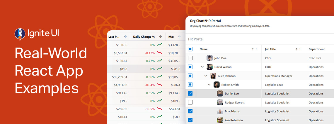
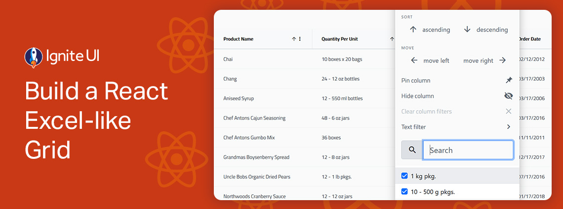
Ignite UI for React
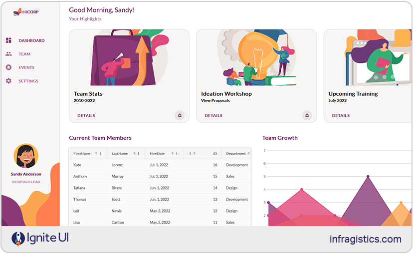
Ignite UI for React delivers one of the most comprehensive React UI libraries on the market, with 100+ enterprise-grade, high-performance components designed for complex, data-intensive applications. These premium controls are built for speed, scalability, and rich functionality, offering features like real-time data grids, advanced charting and visualizations, hierarchical data components, and more.
And as of now, one of the most recent changes and the biggest update yet to Ignite UI is the release of 50+ fully open-source components under MIT license suitable for production. This move solidifies our goal to provide the ultimate developer productivity, experience, and modern capabilities with the flexibility that each project requires. So, if you want zero restrictions, ability to integrate free components into commercial products without licensing hurdles, and maintain full ownership, then the open-source controls in Ignite UI for React will become the best React Material UI alternative for you.
Ignite UI Open-Source components: Grid Lite, Accordion, Avatar, Badge, Banner, Button, Button Group, Calendar, Card, Carousel, Checkbox, Chip, Circular Progress, Combo, Stepper, Date Picker, Drop Down, Input, Dialog, List, Toolbar, Tile Manager, Snackbar, and more.
Ignite UI Premium components: However, if you’re looking for advanced capabilities and enterprise-grade components such as high-performance Data Grid, Pivot Grid, Tree Grid, Charts, Excel Library, Dock Manager, Spreadsheet, Maps, Gauges, Hierarchical Grid, powerful real-time visualizations, and other controls – Ignite UI for React also offers a full suite of premium tools.
Strengths:
- Modern, production-ready and enterprise-grade UI controls with advanced features.
- MIT-licensed components with no usage restrictions.
- Ensures A11y Keyboard accessibility, ARIA, and accessible color palette.
- Lightweight and fast, with noticeably smaller bundle size than many Material UI components.
- Consistent design system with theming options for Material, Fluent, Bootstrap, and custom styling.
- Easy integration with existing React projects, requiring minimal setup.
- Scalable upgrade path to enterprise-grade controls.
- Excellent documentation, how-to guides, webinars, tutorials, and more.
- Backed by 35+ years of experience, ensuring long-term stability and professional support.
Weaknesses: The MIT-licensed controls do not have advanced features and capabilities for complex, data-driven projects, requiring charts, fast-performance grids, etc.
Best for: Teams who require flexible React UI library, feature-packed controls, advanced app building experience; developers who need free, flexible, MIT-licensed React components with no licensing; building different apps – start-up projects, PWAs, lightweight apps, customer-facing applications, admin dashboards, enterprise-grade, data-heavy solutions, and more.
Material UI
This one is a popular library offering a suite of open-source components, implementing Google’s Material Design. It features a powerful styling engine and theming system, plus feature-rich controls like Button, TextField, Card, Snackbar, Dialog, DataGrid, Tabs, Slider, Stepper, Chip, Autocomplete, Drawer, and many more.
Strengths:
- Highly customizable, with design tokens, theming APIs, CSS variables, and different styling options (Emotion, styled-components, or custom).
- Good documentation with examples.
- Strong accessibility and ARIA compliance across core components.
- Reliable community support and an ecosystem of tutorials, StackOverflow answers, and third-party integrations.
- Modern and responsive design system suitable for consumer-facing products.
- SSR-friendly for frameworks like Next.js.
Weaknesses:
- Bound to the Material aesthetic, often requiring additional effort to customize beyond Google’s design language.
- Advanced DataGrid features require a paid license.
- Bundle size can grow quickly, especially with heavy use of styled components.
- Some developers consider the learning curve steep for deeply customizing themes or component variants.
Best for: Consumer-facing apps, teams comfortable with Google’s Material Design, apps with theme-driven UI controls.
Chakra UI
This one is another Material UI alternative that lets you create a React project using a template, which determines the files and dependencies included with the generated project. Key components that it provides include Drawer, Grid, Buttons, CheckBox, Form Control, Icon Button, Input, Radio, Select, TextArea, Slider, Badge, Table, Avatar, and others.
Strengths:
- It follows WAI-ARIA standards for all components.
- Themeable so it can match design needs and aesthetics.
- Optimized for multiple color modes with Light and Dark UI.
- Active community.
- It is designed for composition and well documented.
- Provides sufficient accessibility defaults.
- Accessible, modern, and easy-to-style UI components.
Weaknesses:
- A limited component set.
- Might not provide the necessary React Grid and Chart features.
- Not very customizable.
Best for: Startups, SaaS interfaces, MVPs, modern apps with accessibility and theming needs, and marketing sites.
Mantine
Mantine is a lightweight React UI library, built on top of React and TypeScript. It delivers 120 easy-to-customize components and 70 hooks. Some of the most popular controls are Combobox, Custom Select, Date Pickers, Notifications, Modals, and more.
Strengths:
- It has an entire styles API, allowing a lot of customization.
- With large component catalog.
- Clear documentation.
- The controls are built with native CSS, meaning styles are performant and easy to override.
- You can bring your own library to style Mantine components.
- It exports global styles both for light and dark theme.
- It is a community-driven project with more than 500 contributors.
Weaknesses:
- Lacks an advanced, enterprise-grade data grid.
- Not as battle-tested in enterprise environments as older libraries.
- Some inconsistencies in styling across complex components.
Best For: Startups, SaaS products, and fast-moving teams that need a wide variety of UI components; applications requiring modern theming and rapid development across UI patterns.
Fluent UI
This is Microsoft’s official React component library for building apps following the Fluent Design System. The most used and popular components it packs are Buttons, Grids, Checkboxes, Notifications, Menus, essential Inputs, Toolboxes, and others.
Strengths:
- Components that match Microsoft’s ecosystem.
- Ensures consistent look and feel across various platforms and devices.
- Strong accessibility and keyboard support.
- Easy theming to match Office or Teams branding.
- Full TypeScript support.
- It is free and open-source.
- Created with easy accessibility and responsiveness in mind.
- You can use the code and modify it based on your needs.
Weaknesses:
- Some components feel tailored for Microsoft-specific use cases.
- Might not be appropriate for data-heavy apps.
- Not a vibrant dev community.
Best for: Apps that live inside Microsoft 365 or align with enterprise styling; developers and designers with prior experience.
Radix UI
This open-source component library is a good MUI alternative because of its accessibility and ease of maintenance. Something that stands out here is that Radix UI’s offers a collection of unstyled, accessible UI primitives for building fully customized interfaces. What components does it pack? Grid, Data List, Dialog, Tooltip, Dropdown Menu, Hover Card, Icon Button, Inset, Popover, Checkbox, Card, Button, Avatar, Tooltip, Tabs, Theme, and many more.
Strengths:
- It is fully accessible and adheres to WAI-ARIA standards by default.
- Headless components and it works with Tailwind, Styled-components, or custom CSS.
- Composable architecture suitable for custom design systems.
- Cross-browser compatibility for consistent performance.
- Small and modular – import only what you need.
- Completely open-source and free.
Weaknesses:
- No pre-styled components; styling overhead falls on the developer.
- Requires strong design resources and more effort to build polished UI elements.
- Learning curve.
Best for: Teams building custom designs, ideal as a starting point for design system architects, and developers who want complete control over styling.
shadcn/ui
shadcn/ui is a unique approach to component development: instead of being a traditional library, it provides a collection of pre-made UI components built with Radix primitives and Tailwind CSS. The main idea here is to allow you to copy them directly into your codebase, giving you full control over the implementation, styling, and long-term maintenance of every component. Some of the most prominent controls include Field, Input Group, Item, Data Table, Bitton, Date Picker, Dropdown Menu, Chart, Pagination, and many more.
Strengths:
- Beautiful and clean default styling built with Tailwind.
- Full component ownership as they live directly in your codebase.
- Very customizable since nothing is abstracted away.
Weaknesses:
- Not a full-featured component library.
- Maintenance responsibility depends entirely on your team and your own efforts.
- Larger projects can accumulate duplicated or inconsistent component versions.
Best For: Tailwind-first teams; developers building custom or heavily branded UIs; applications that require complete control over every component; design-driven startups and marketing sites.
PrimeReact
The last one among our top Material UI alternatives is PrimeReact which is a complete UI suite for React.js. It delivers over 80 feature-packed and easy-to-customize components, such as Chip, Dropdown, Editor, InputGroup, IconField, Calendar, Listbox, Knob, ToggleButton, and others.
Strengths:
- Various customizable components and widgets.
- Multiple themes and styling presets available out of the box.
- Strong community and long-standing reliability.
- Good documentation and example-driven learning resources.
Weaknesses:
- Styling can feel heavy or outdated compared to modern libraries.
- Some UX patterns are inconsistent across components.
- May suffer some performance issues compared to lighter, more optimized libraries.
Best For: Teams that want a ready-to-use component suite and don’t mind heavier styling; applications requiring many UI widgets; developers who prefer a large ecosystem without the need for heavy customization or design work.
Syncfusion React
Syncfusion for React is another Antd alternative with 145+ enterprise-grade, high-performance, and responsive UI controls. Developers often prefer it because it features React-first implementations for data-intensive controls, an AI coding assistant, and examples for Next.js. Some of the best controls include DataGrid, Pivot Grid, Charts, Scheduler, Spreadsheet, Diagram, PDF Viewer, and many more.
Strengths:
- Feature-rich DataGrid, pivot table, scheduler, Excel-like components, and an impressive suite of data visualization tools
- Delivering features like virtualization, grouping, summaries, editing, Excel-like features, and large data volumes.
- Great charting and visualization suite with interactive dashboards, financial charts, and scientific data support.
- Consistent design language with theming across all components.
- Excellent documentation, full API references, and thousands of live examples.
- Offers a free trial.
Weaknesses:
- Fully commercial for most organizations, which may not fit teams seeking only MIT-licensed solutions.
- More complex API surface, especially for large components with many advanced features.
Best for: Data-heavy business apps, reporting dashboards, analytics platforms, applications requiring advanced grids and charts.
KendoReact
With over 100 React controls, KendoReact is among the best Ant Design alternatives for React developers. The library ensures great performance and consistent APIs across all components, shining particularly in data management, visualization, and productivity components. There are key controls such as DataGrid, Charts, Scheduler, Pivot Grid, DateRangePicker, TreeList, Form, Editor, Gantt Chart, and more.
Strengths:
- One of the most prominent components is the DataGrid, delivering virtualization, editing, filtering, sorting, grouping, and advanced data operations.
- There’s an excellent charting library for financial, scientific, and intuitive visualizations.
- It now provides free tier of the enterprise-grade KendoReact component library with 50+ React UI components and design/UI customization tools.
- Several professionally designed themes and Figma design kits.
- Consistent API and UX across the entire ecosystem.
- Strong support for accessibility, localization, and internationalization.
Weaknesses:
- Higher cost than many alternatives, not ideal for early-stage startups.
- Theming can feel rigid compared to libraries built for heavy customization from scratch.
Best for: Enterprise teams requiring a fully supported, component suite with powerful grids and charts; apps handling large datasets; applications requiring a mature ecosystem.
DevExpress React
DevExpress React empowers React app development with 80+ components for building business dashboards, data-heavy apps, and more. What makes it a great React Ant Design alternative? Mostly its fast DataGrid, Scheduler, Pivot Grid, File Manager, Mapping, Charts, Editors, Form components, and Dashboard-like visualizations optimized for analytics-heavy apps.
Strengths:
- It provides a professional UI Template gallery.
- The DataGrid is fast, can handle large data sets, and includes various data shaping/data editing/data layout options.
- Strong TypeScript support and API consistency.
- Excellent documentation and commercial support with long-term maintenance.
- Built with performance-first architecture.
Weaknesses:
- Commercial-only, with no free MIT option.
- Fewer general-purpose UI components; focused more on data-heavy business widgets.
- Visual design is more traditional unless heavily themed.
Best for: Financial and analytical dashboards, enterprise reporting tools, data-heavy internal apps, apps requiring high-performance grids and charts.
In Conclusion…
The best alternative to Ant Design depends on the scope of your project, the features and components you need, the type of app you build, your budget, customization requirements, and other key factors. But we can filter your choice based on a common and simple criteria:
- Choose Ignite UI, Syncfusion, KendoReact, or DevExpress if your app is data-heavy and performance-critical.
- Choose Material UI, Ant Design, or PrimeReact if you want a simple, established design system with fast development.
- Choose Mantine, Radix, or shadcn/ui if you want full design flexibility and modern customization.
- Choose Chakra UI or Fluent UI if accessibility or ecosystem alignment is your key requirement.
If you want to try Ignite UI for React and experience the full suite of advanced grids and features, try the Premium components. You can always start with the MIT-licensed controls and expand later.
