
Ignite UI for Angular 20.1 Is Out! What’s New & Exciting?
Ignite UI for Angular 20.1 release is out, bringing tons of new enhancements. There are now powerful add-ons like cell merging, dual-side column pinning, and other improvements to the grids.
 Radoslav Mirchev
7min read
Radoslav Mirchev
7min read
Fighting complexities in your code? Well, the Ignite UI for Angular 20.1 release is all about streamlining and facilitating your development workflows and processes. We’ve doubled down on making the Angular grid work better for you with brand-new features and performance enhancements. With powerful add-ons like cell merging, which enhances readability by eliminating duplicate values, and dual-side column pinning for maximum flexibility and control, you can deliver cleaner data displays, optimized datasets, and a smoother user experience. Focus on building, not debugging.
Here’s everything new at a glance.
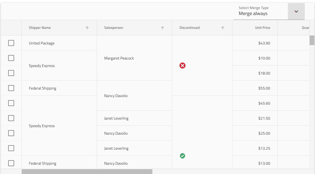
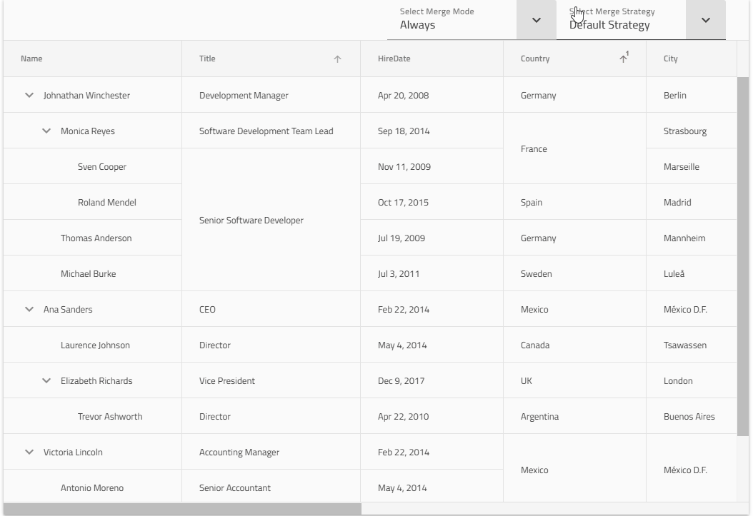
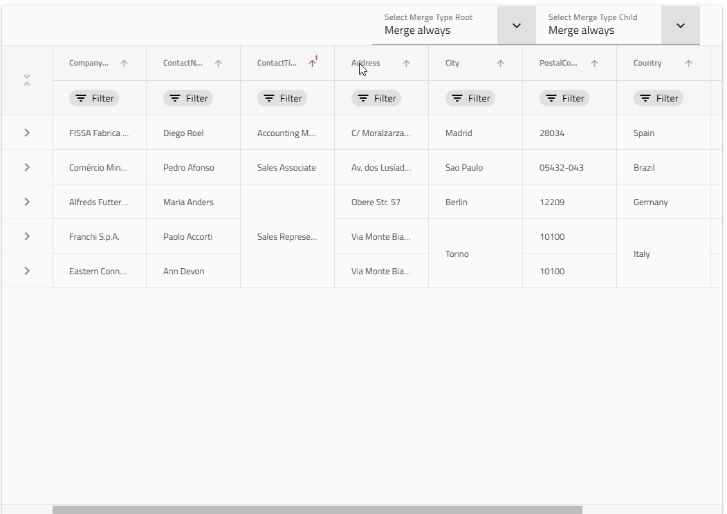
Grid Cell Merging feature
The Ignite UI for Angular Grids provides a Cell Merging feature that combines two or more adjacent cells with the same value into a single, larger cell. Merging is applied vertically within a column and helps improve readability by reducing duplicate values. The feature can be configured to merge cells either by default, matching data values, or by applying a custom condition.
The Cell Merging feature is available for:
Grid Column Pinning on Both Sides
With Ignite UI for Angular 20.1, you can specify each column pinning location separately, allowing you to pin columns to both sides of the grid for greater convenience, easier optimization of data sets, and achieving desired UX for your Angular application.
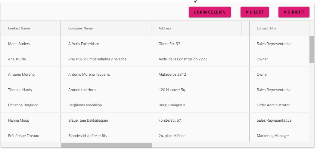
The Column Pinning on both sides is available for Angular Data Grid, Angular Tree Grid, and Angular Hierarchical Grid.
Pushing the Boundaries of Angular Grid Performance
At Infragistics, we’ve always taken pride in delivering the fastest Angular grids in the world and now, we’re taking performance to the next level. Over the past few sprints, our development teams have been focused on optimizing the core of our Angular components library: Data Grid, Tree Grid, and Hierarchical Grid.
Faster Than Ever: The Optimized Sorting Pipeline
The first significant improvement to be released in Ignite UI for Angular 20.1 is a comprehensive optimization of the sorting pipeline. We know that for applications handling large datasets, every millisecond counts. Our initial acceptance criteria were ambitious: to benchmark grouping performance and demonstrate at least a 25% improvement in execution time for datasets with 10,000 rows or more.
The results? We’ve blown past that benchmark, achieving:
- 3x to 4x faster sorting for datasets with 100,000 records.
- Overall data operation time reduced by ~35% in grids, within the application scenario, with 100K rows.
These enhancements mean that your applications will feel more responsive and fluid than ever before, even when dealing with massive amounts of data. This is a testament to our developers’ dedication to continuous improvement and their passion for delivering the best possible user experience.
This latest optimization in Ignite UI for Angular 20.1 is a clear demonstration of our philosophy. We believe in taking the extra mile to empower developers with tools that are not only feature-rich but also incredibly performant. We’re excited to continue this journey of innovation and to see the incredible applications you’ll build with the enhanced power of Ignite UI for Angular.
Compatibility with Angular 20
Released on the 9th of June, with Ignite UI for Angular 20.0.0.
Complete CHANGELOG for Ignite UI for Angular 20.1.0
New Features
IgxGrid,IgxTreeGrid,IgxHierarchicalGrid- Introduced a new cell merging feature that allows you to configure and merge cells in a column based on same data or other custom condition, into a single cell.It can be enabled on the individual columns:<igx-column field=”field” [merge]=”true”></igx-column>The merging can be configured on the grid level to apply either:
onSort– only when the column is sorted.always– always, regardless of data operations.
cellMergeModeisonSort.The functionality can be modified by setting a custommergeStrategyon the grid, in case some other merge conditions or logic is needed for a custom scenario.It’s possible also to set amergeCompareron the individual columns, in case some custom handling is needed for a particular data field. - Added ability to pin individual columns to a specific side (start or end of the grid), so that you can now have pinning from both sides. This can be done either declaratively by setting the
pinningPositionproperty on the column:<igx-column [field]=”‘Col1′” [pinned]=’true’ [pinningPosition]=’pinningPosition’> </igx-column>public pinningPosition = ColumnPinningPosition.End;Or with the API, via optional parameter:grid.pinColumn(‘Col1’, 0, ColumnPinningPosition.End); grid.pinColumn(‘Col2’, 0, ColumnPinningPosition.Start);If propertypinningPositionis not set on a column, the column will default to the position specified on the grid’spinningoptions forcolumns.
- Introduced a new cell merging feature that allows you to configure and merge cells in a column based on same data or other custom condition, into a single cell.It can be enabled on the individual columns:<igx-column field=”field” [merge]=”true”></igx-column>The merging can be configured on the grid level to apply either:
IgxCarousel- Added
selectmethod overload accepting index.
- Added
IgxDateRangePicker- Now has a complete set of properties to customize the calendar:
headerOrientationorientationhideHeaderactiveDatedisabledDatesspecialDates
- As well as the following templates, available to customize the contents of the calendar header in
dialogmode:igxCalendarHeaderigxCalendarHeaderTitleigxCalendarSubheader
- Added new properties:
usePredefinedRanges– Whether to render built-in predefined rangescustomRanges– Allows the user to provide custom ranges rendered as chipsresourceStrings– Allows the user to provide set of resource strings
- Behavioral Changes
- Added cancel button to the dialog, allowing the user to cancel the selection.
- The calendar is displayed with header in
dialogmode by default. - The picker remains open when typing (in two-inputs and
dropdownmode). - The calendar selection is updated with the typed value.
- The calendar view is updated as per the typed value.
- The picker displays a clear icon by default in single input mode.
IgxPredefinedRangesAreaComponent- Added new component for rendering the predefined or custom ranges inside the calendar of the
IgxDateRangePicker
- Added new component for rendering the predefined or custom ranges inside the calendar of the
- Now has a complete set of properties to customize the calendar:
IgxDatePicker- Similar to the
IgxDateRangePicker, also completes the ability to customize the calendar by introducing the following properties in addition to the existing ones:hideHeaderorientationactiveDate
- Behavioral Changes
- The calendar selection is updated with the typed value.
- The calendar view is updated as per the typed date value.
- Similar to the
IgxOverlay- Position Settings now accept a new optional
offsetinput property of typenumber. Used to set the offset of the element from the target in pixels.
- Position Settings now accept a new optional
IgxTooltip- The tooltip now remains open while interacting with it.
IgxTooltipTarget- Introduced several new properties to enhance customization of tooltip content and behavior. Those include
positionSettings,hasArrow,sticky,closeButtonTemplate. For detailed usage and examples, please refer to the Tooltip README.
- Introduced several new properties to enhance customization of tooltip content and behavior. Those include
General
IgxDropDownnow exposes aroleinput property, allowing users to customize the role attribute based on the use case. The default islistbox.IgxTooltipTarget- Behavioral Changes
- The
showDelayinput property now defaults to200. - The
hideDelayinput property now defaults to300. - The
showTooltipandhideTooltipmethods do not takeshowDelay/hideDelayinto account.
- The
- Behavioral Changes
IgxGrid,IgxTreeGrid,IgxHierarchicalGrid,IgxPivotGrid- Sorting improvements
- Improved sorting algorithm efficiency using Schwartzian transformation. This is a technique, also known as decorate-sort-undecorate, which avoids recomputing the sort keys by temporarily associating them with the original data records.
- Refactored sorting algorithms from recursive to iterative.
- Groupby improvements
- Refactored grouping algorithm from recursive to iterative.
- Optimized grouping operations.
- Sorting improvements
To Wrap It All Up…
Seamlessly crafted for compatibility, Ignite UI for Angular is the library that enables you to leverage the power of the latest technologies and major releases. Committed to providing you with the best Angular UI toolkit and related insights, our goal is to equip you with more know-how, new features, enhanced performance, and improved stability. Some of the enhancements were added thanks to the requests from users like yourself through our Ignite UI for Angular GitHub repository. With this in mind, we are always open to suggestions and feedback – it makes us grow and better respond to your development needs.
If you need more details, we encourage you to check out our:
