
App Builder Release – What’s New in Infragistics Ultimate 23.1
More features and capabilities, brand-new UI controls, better design-development processes, and interactive data visualization experience. It’s all included in the latest 23.1 Launch.
With today’s launch, we are very excited to get Infragistics App BuilderTM Ultimate 23.1 into your hands. New features and UI controls, more capabilities, better design-development processes, and interactive data visualization experience. It’s all included.
Let’s look at each update in more detail.
Or if you prefer, you can watch this quick App Builder 23.1 Release overview.
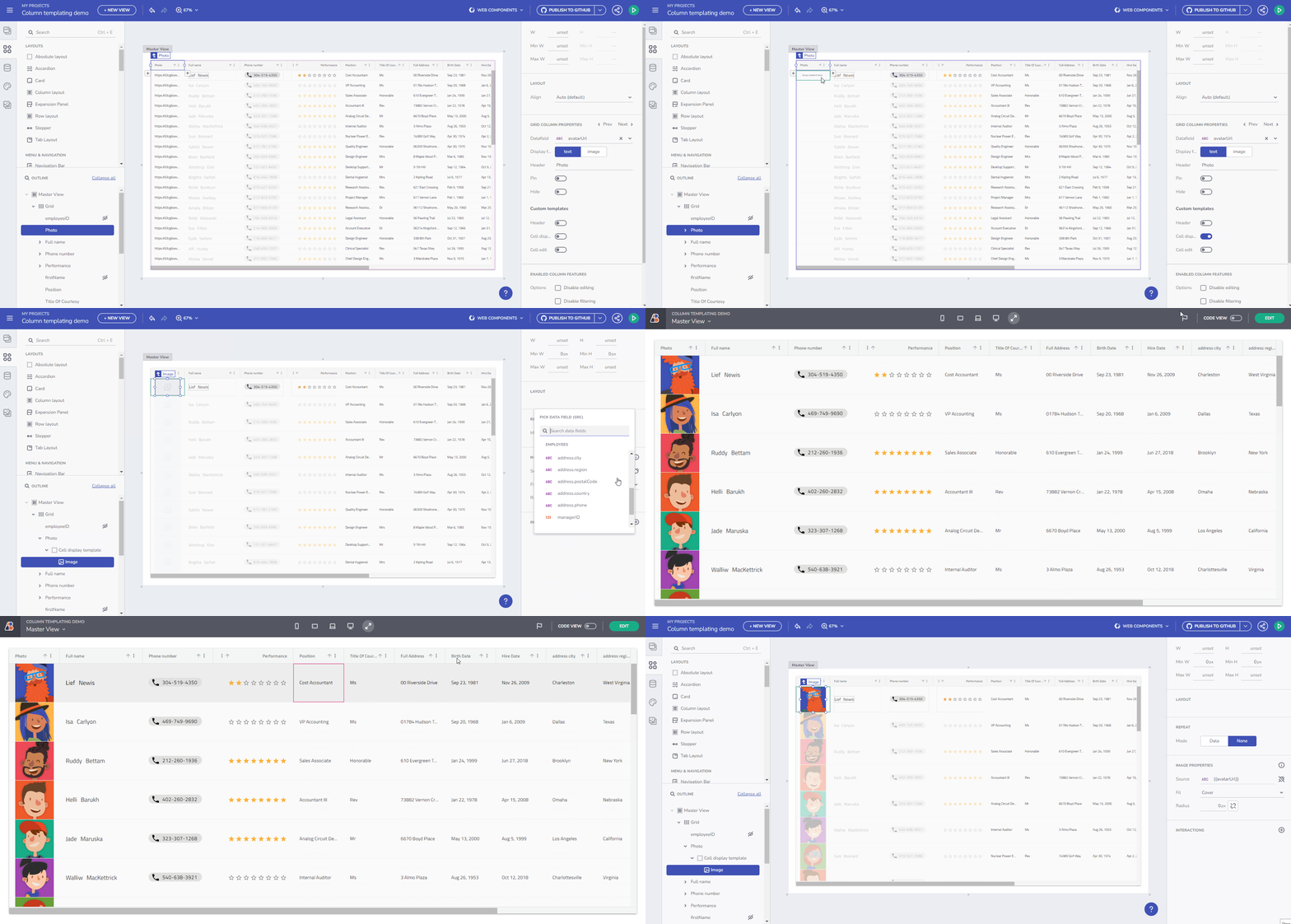
Grid Column Templating – header, display, and editing
I am happy to share that we now expose a way to build your own Column Template for each of the Grid Columns. Imagine that you have a data source that has different fields for First and Last name, and Address details like – street, city, and postal code. You now can combine all of them into one Cell Display value and reduce the visible columns. A few more examples could be found below:
- URL data fields can now be associated with a custom Image component.
- Show a Rating component and give a visual clue on certain numeric values.
- Provide a more visual way to indicate that certain column contains Phone numbers.
Above are just a few examples of the power that Column templating gives you. The image below is showing how the examples above work in action.
Live demo of the Column Templating feature.
Grid Column Header, Cell, and Cell Editing are the available templating options.
Reveal Dashboard
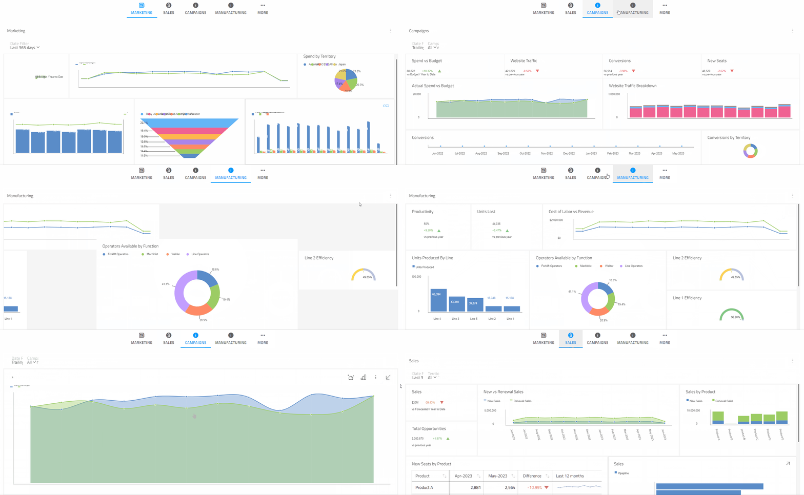
You can now add a Reveal Dashboard directly from the App Builder Toolbox and specify your URL to the Reveal Server SDK hosting your data. Consider the App Builder as a Client application that gets a baseURL, which is the endpoint of your server from which the WYSIWYG App Builder will send/receive the requests and responses.
When the Reveal Dashboard is loaded, you can specify a Dashboard name out of the four available options – Marketing, Sales, Campaigns, and Manufacturing. We do host our own server for testing purposes only. Upon export, you will get a reference to our Trial Server “https://samples.revealbi.io/upmedia-backend/reveal-api/” (base URL), exposing only the Marketing dashboard for demo purposes.
Check out this live application showcasing the power of Reveal.
Reveal Overview
Reveal is a business intelligence solution that is purpose-built for embedded analytics. With Reveal, you can:
- Deliver full-featured self-service dashboards and modern reporting.
- Use in any JavaScript framework (like React, Angular, Vue JS, Web Components, or Blazor), Windows Forms or WPF application.
- Customize the UX to match your brand experience.
- Connect to almost any data source to populate your dashboards.
- Deploy to any cloud – public or private – or your own on-premises servers in a Java, ASP.NET, or Node.js backend.
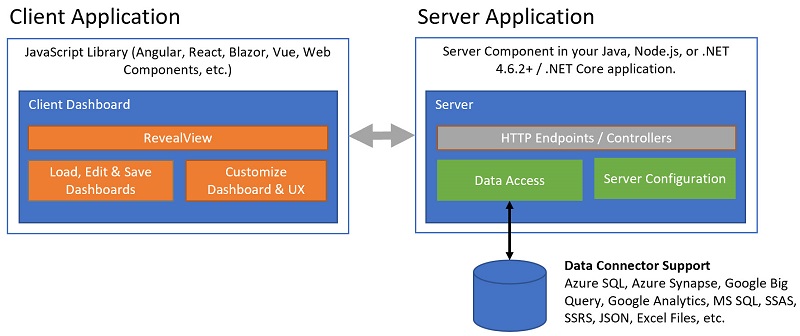
Reveal has 2 core components that enable the delivery of dashboards to your client application
Figma Auto-Layout
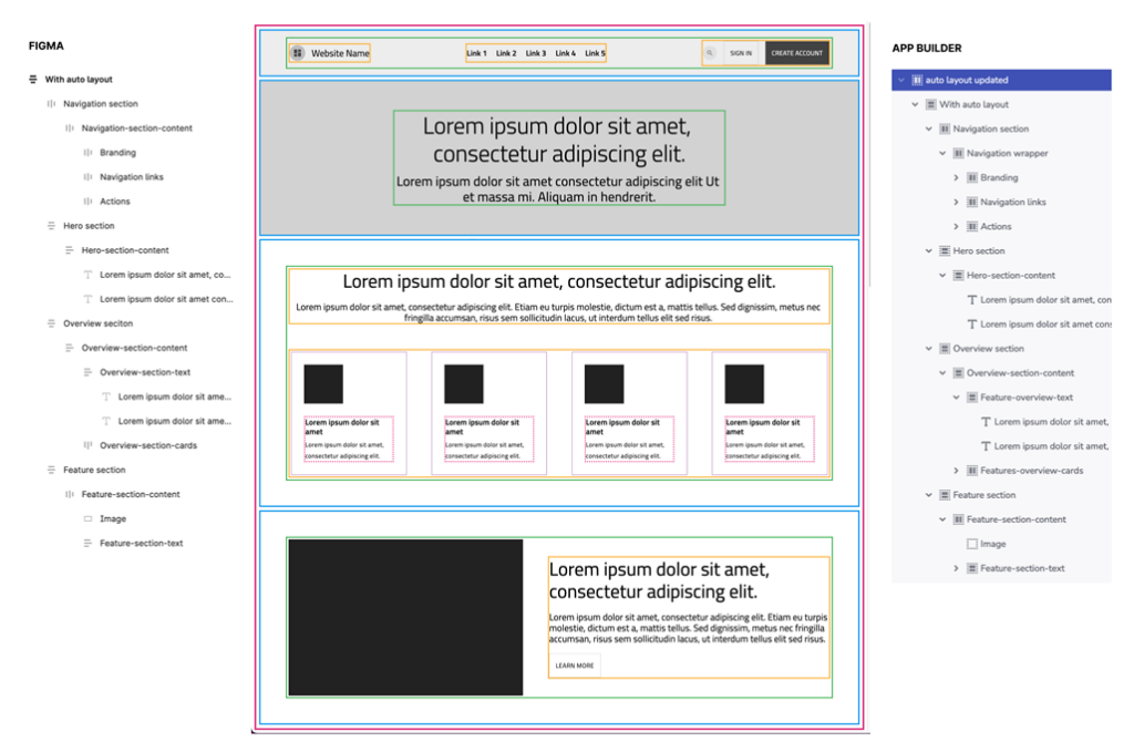
With the updated Figma UI Kit now, if a designer uses Auto-Layout in Figma to create a design, the App Builder parser will utilize this and consider that to build the layout of the app. If Auto-Layout is not used, the parser will default to the absolute layout.
Here you can find more about Using Figma auto-layout with App Builder to speed up Design to Code
The Figma Auto-Layout is an implementation of Flexbox layouts inside Figma. While it’s exposed slightly differently to designers, the intent is to bridge designed layouts with Web-Layouts. This has been explained in this article.
What are the benefits?
- Designer enables Auto-Layout when creating designs in Figma, starting with setting the whole Artboard as Auto-Layout.
- Makes use of nested Frames, also with Auto-Layout enabled within each Frame.
Let’s look at the following example design to see how the frames can be mapped to layouts in App Builder.
Grid CRUD Actions
The App Builder Grid’s functionalities are growing with yet another one – Grid Create, Read, Update and Delete actions with Web API calls. You can now wire those to the Grid editing action buttons and take leverage of real-time Web API updates. Upon code generation, the App Builder will create the necessary services to handle the API calls for Creating, Getting, Updating, and Deleting a resource.
If the Grid is bound to a Customers table (Swagger path Image 1), the Data Interactions section will be loaded with the methods available for customers upon adding such interaction (Image 2).
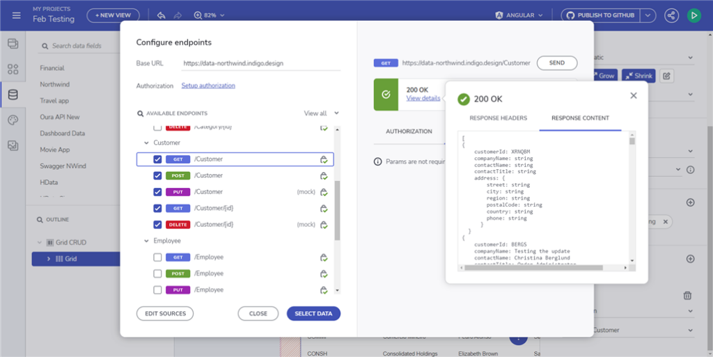
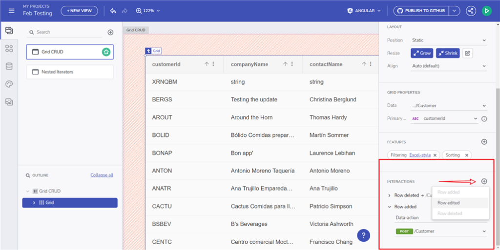
Here you can read more about Grid CRID Actions.
Hierarchical Iterators Binding Support
Applicable to components like Tree, Cards, and Containers. The example below is showing how a simple Tree and Tree Grid can bind to data sources with a hierarchical structure.
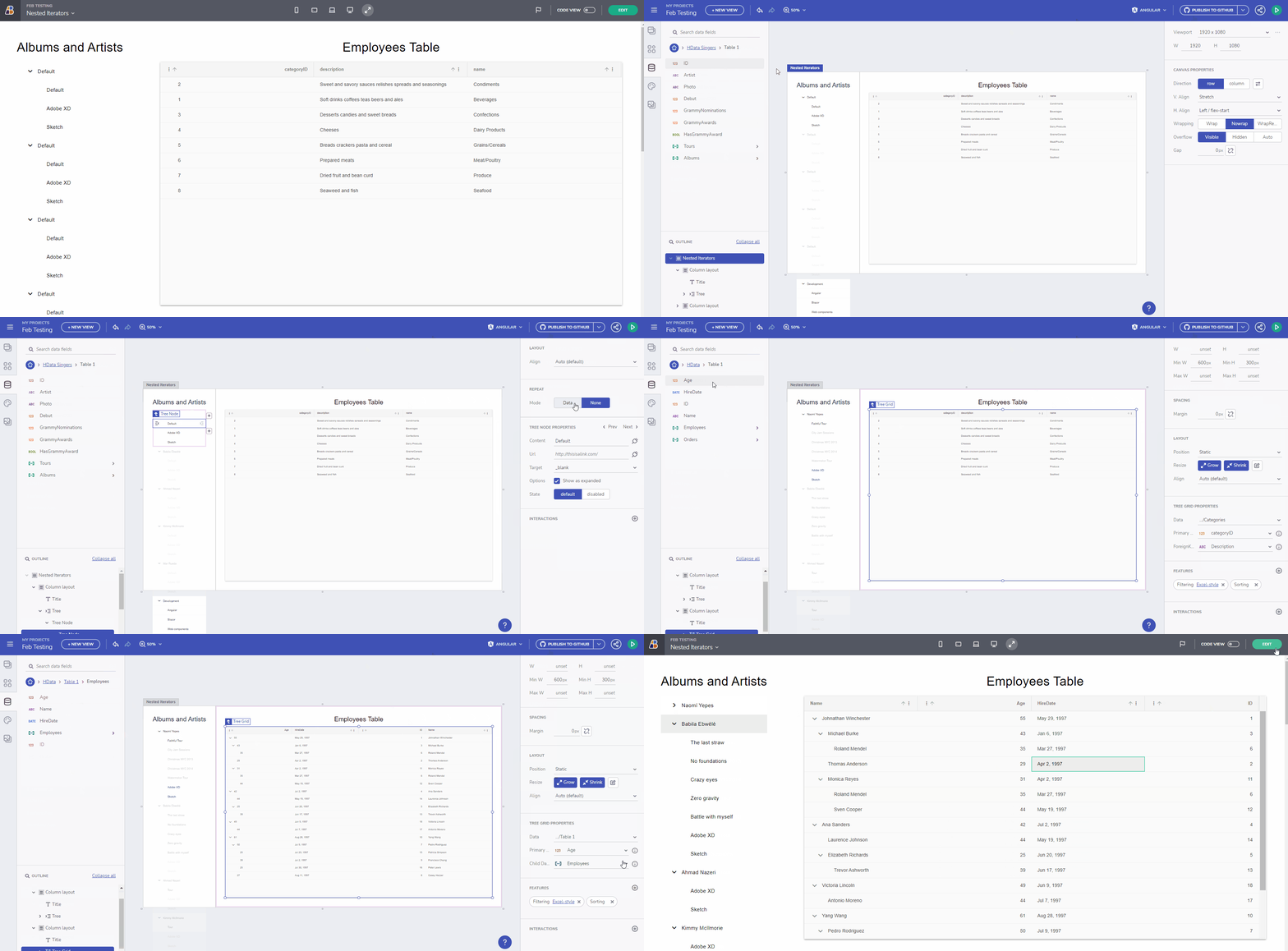
Here you can read more about the Hierarchical iterators binding support.
Chart Aggregations Feature
You can now group and aggregate data in a Category chart when repeated labels are present. The basic idea for this feature is very similar to a grid. Let’s say you wanted to group by Category (groceries, household, restaurants) and then obtain the maximum value of the Amount column. You could assign that data to the category chart and then specify the group to Category and summaries for max amount.
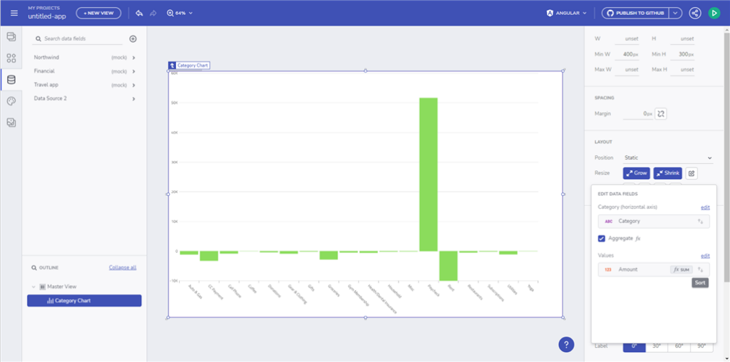
Read more about the new Chart aggregations feature.
New On-Premises Version
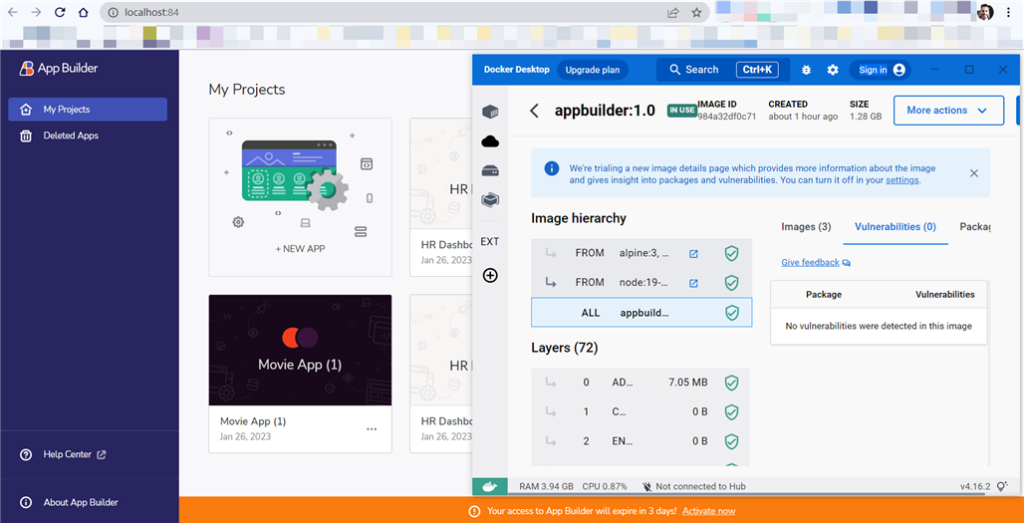
App Builder On-premises software servers each organization’s unique Data Security, Maintenance, Storage, and Software Development needs. The on-premises version of AB provides an easy way for organizations to access such cloud-based platforms by allowing them to use their own instance and run it on their own infrastructure and to be accessible only by internal personnel.
New Sample Applications
Below you can see the applications that have been added, exposing a UI for a variety of functionalities.
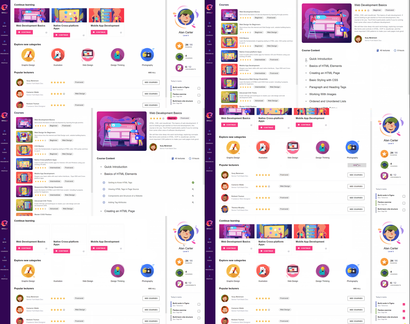
Learning Portal
Learning management app to track progress on courses based on popular topics or instructors. Features custom lists bound to REST, and adaptive layouts.
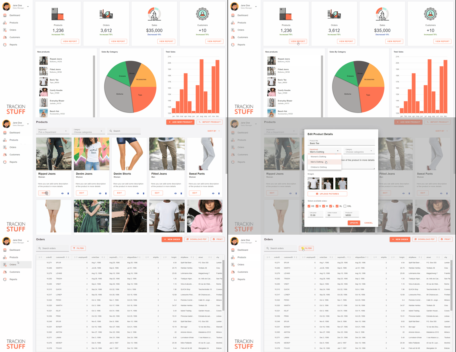
Inventory Management
A reporting dashboard to manage inventory levels and review products in stock. Uses custom side navigation for routing and category charts to report on performance.
App Builder Documentation
Documentation is vital to every product, and we have invested quite some time in improving our help docs. We’ve added topics for each of the new components:
- Accordion – Accordions are often used to manage a large amount of information in a compact space and to allow users to focus on specific pieces of information selectively
- PieChart – Each section, or pie slice, has an arc length proportional to its underlying data value. Categories are shown in proportion to other categories based on their value percentage to the total value being analyzed as parts of 100 or 100%. The Pie Charts are appropriate for small data sets and are easy to read and understand.
- Rating – The component enables users to apply a rating to an item or experience, such as a product, service, page, other entity, and more. The Rating can display a single user’s, or an aggregate, star rating, and it’s used to let users set their own star rating.
- Stepper – Useful UI element that can be used to display a process or workflow in a step-by-step manner, allowing the user to easily understand where they are in the process and what steps are remaining. Currently, we support the Stepper component only in Figma. In Sketch, it will be added in the near future.
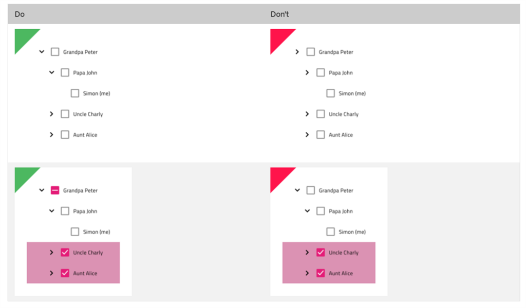
- Tree – Used as a visual representation of the hierarchical relationship between categories, presented in a list structure. The Tree component supports three display densities – Comfortable, Cosy, and Compact. A quick tip: Make sure you switch the state of the Expand Icon to “Expanded” when you have expanded Тree Nodes. If some of the children (but not all) of a Tree Node are selected, make sure to switch the state of the Checkbox of the parent node to an indeterminate state:
Also, we’ve updated topics related to:
- Styling – App Builder provides elaborate means for styling all 60+ UI components that also map to Ignite UI for Angular controls. The theming engine in our Angular product allows for creating custom color themes that can restyle the whole product in just a few lines of code. App Builder also implements these theming mechanisms to let users change the complete look of their apps with just a few clicks.
- UI Patterns – There are 180+ UI Patterns enhanced with the same responsive web design behavior and theming capabilities. The UI Patterns can be found spread across separate pages of the library in Figma and Sketch. Below is a snippet of some of the list patterns, such as a contacts list, searchable and filterable lists, and list empty states when no matching results are found:

Other Improvements
- Added Align-self property to override V.align and H.align defined on parent layout (CSS Flex-box).
- Added Border-radius property to set Rounding for Row/Column/Absolute layout components
- Show the app name as a page title in the browser
- Select all data fields when adding a new data collection
- Added option to maximize the Create new application dialog
- Improved layout heuristics to create CSS Flexbox layouts from Figma designs that use Auto-layout.
- Updated Figma plugin to create apps using theme palette and Dark theme.
- Automatically extract SVG and PNG as image assets when creating apps from Figma design files.
- Unified dropdown in the App Builder menu to download design system resources and join our Discord channel.
- New code generation for Combo, Select, and Dialog components (Blazor)
- New toggle for unlicensed code export
- Bug fixes and general improvements
Wrap Up!
As you can see, there are tons of new features and updates with the Infragistics Ultimate 23.1 release that will significantly improve, streamline, and modernize how you build beauty and simplicity, one app at a time.
We have details for each piece of this release and you can check them out here:
- Angular – Changelog & Updates
- App Builder – Change Log & What’s New
If you need more details, we encourage you to check out our:
To experience everything, visit your customer portal and get the latest version. As usual, we are always excited to get your feedback and hear what you want to add or recommend. So please email me at zkolev@infragistics.com and let me know how we can help you continue delivering value to your customers with Infragistics.


