Ignite UI for Blazor 23.1 Release: See What's New
Ignite UI for Blazor 23.1 Release is out. Explore the new features and best-of-breed components: Pivot Grid, Stepper, Combo, Dialog, and Select. Read more.
 Radoslav Mirchev
4min read
Radoslav Mirchev
4min read
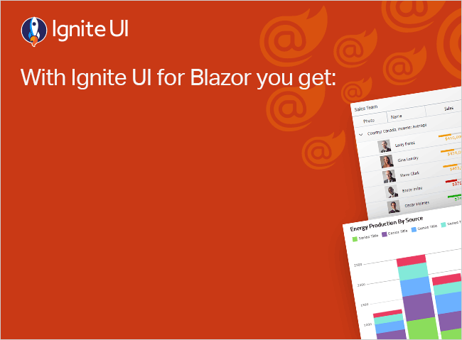
We continue to deliver the best-of-breed components for Blazor and today’s release of Ignite UI for Blazor 23.1 is packed with exciting updates, introducing four impressive new components: Pivot Data Grid, Combo Component (included Single Select Combo feature), Stepper, and Dialog component.
And that’s just the tip of the iceberg! We’ve also invested significant effort in enhancing our documentation and samples, ensuring they meet your expectations. Join us as we dive into all the exceptional components and features unveiled in this highly-anticipated Ignite UI for Blazor 23.1 release.
Pivot Grid
Ignite UI for Blazor Pivot Grid is used for summing up and representing voluminous multidimensional data in a cross-tabular format. The data summary can be easily and quickly sorted, grouped, or filtered. Such data can include sums, averages, and other statistics. End-users are enabled to modify the pivot table layout through drag-and-drop operations according to their needs.
You can try out the Ignite UI for Blazor Pivot Grid in the App Builder.

ComboBox
The Blazor ComboBox component represents a drop-down list that provides editable functionalities, allowing users to choose multiple options from a predefined list. The Ignite UI for Blazor ComboBox Component also provides filtering capabilities, grouping, and adding custom values to a dropdown list. It can be used as an alternative to the HTML select tag and has several out-of-the-box features such as data binding (local and remote), filtering, grouping, custom templates for items, header and footer, custom values, and more.
You can try out the Ignite UI for Blazor ComboBox in the App Builder.

Stepper
The Ignite UI Blazor Stepper is a highly customizable component that visualizes content as a process and shows its progress by dividing the content into successive steps. It appears as a vertical or horizontal line. Provided first in the Ignite UI for Angular library, the stepper component in Blazor now also delivers a wizard-like workflow and multiple features like step validation, styling, orientation, and keyboard navigation.
You can try out the Ignite UI for Blazor Combo Box in the App Builder.

Combo Box Single Select Mode
The Blazor `ComboBox` supports single-selection mode and quick filtering of the list of items via the main input prompt. Users can quickly type in the item they are looking for and be presented with a list of options. Upon pressing the enter key, the first highlighted match will be selected.
Dialog
The new Ignite UI for Blazor Dialog component displays some information or prompts the user for an action or confirmation. It is shown in a modal window, meaning that the user is not allowed to interact with the main app until a certain action is performed that closes the dialog.
You can try out the Ignite UI for Blazor Dialog Component in the App Builder.

Update Data Grid Documentation and Samples
We’re excited to announce that we’ve updated and improved the documentation and examples for the ‘IgbGrid’! Our team has been working hard to make it even easier for developers to use this powerful tool. The new documentation provides more detailed explanations and guidance, while the updated examples show you exactly how to implement the ‘IgbGrid’ in your projects. These improvements will save you time and help you get the most out of the ‘IgbGrid.’ Don’t miss out – check out the updated documentation and examples now!
Wrap-Up
The new Infragistics Ultimate 23.1 brings major Blazor improvements with the idea of empowering developers to build better high-performance web applications than before by leveraging a range of cutting-edge components like Pivot Grid, Stepper, Combo, Dialog, and Select.
Yet, apart from continuously shipping new features and controls, we are also committed to providing our dev community with the most useful insights, how-to guides, getting-started resources and documentation, ensuring more know-how and a better understanding of our Blazor UI toolkit.
We have details for each piece of this release and you can check them out here:
- Ignite UI for Angular – Changelog & Updates
- Ignite UI for Web Components – Changelog & Updates
- Ignite UI for Blazor – Readme
- App Builder – Change Log & What’s New
If you need more details, we encourage you to check out our: