
The DockableGroupPanes class of the WinDockManager™ control can organize and display its child panes in one of four styles. The style used to display the child panes is based on the group’s ChildPaneStyle property.
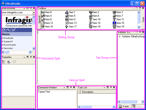
A horizontal splitter bar is used to separate the child panes in a horizontal split group. Moving the splitter bar between two panes only affects the size of those panes and does not affect the size of sibling panes (i.e. other child panes with the same Parent). The splitter will not allow the bar to be moved in such a way that would size either pane below their minimum or above their maximum sizes. Children of a horizontal style group may be maximized or minimized. When a pane is maximized, only the caption of the other panes within the group are displayed. When a pane is minimized, only its caption is displayed.
A vertical split group behaves the same as a horizontal split group. The only difference is the splitter bar that separates the child panes is displayed vertically.
Each child of a tab group is displayed as a tab item. Only the contents of one tab item in a group may be displayed at one time. An item may be programmatically selected by settings its IsSelectedTab property. By default, if the TextTab of a pane has not been set, the Text property will be used as the caption for the tab item.
Certain properties of the group’s GroupSettings property apply specifically to tab groups. These properties are all prefaced with the word 'Tab' (e.g. TabStyle, TabLocation, etc.). Two other properties also have an impact on the behavior of the tab items - CloseButtonBehavior and PinButtonBehavior . Each determines whether the associated button acts on the currently displayed tab or on all the tabs in the group. By default, the CloseButtonBehavior is set to CloseActiveTab and the PinButtonBehavior is set to PinTabGroup, which match Visual Studio’s default settings. With these settings set as such, only the active tab will be closed when the Close button is pressed but all panes will be unpinned when the Pin button is pressed.
Each child of a sliding group, other than the selected item, only displays a button representing the item. When the button is pressed, the pane associated with that button is displayed and the currently selected item is collapsed.
This type of groups is similar to tab group in that only one item is displayed at any time. Also, PinButtonBehavior and CloseButtonBehavior affect the behavior of the child items in the group.