
This topic explains how to set DataTemplates for the content of diagram items and for editing that content.
The following topics are prerequisites to understanding this topic:
This topic contains the following sections:
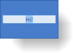
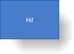
Diagram items have two templates that can be applied to their content – display template and edit template. The display template defines the presentation of the content, and the edit template is the template applied when editing the item’s content.
The following screenshot demonstrates the default content and edit templates applied to a diagram node.
Manage the visual presentation of the content of the diagram items (nodes and connections) with a display template. Additionally, a set of Node-Level properties provide a convenient way to handle the most trivial aspects of content visualization, such as horizontal alignment and margins, and the element flow relative to the container element (fit in / overlap).
The display template is supplied pre-defined and applied to the diagram items by default. The default data template specifies a template for the content container. That template is the same for both nodes and connections: a TextBlock control with its Text property bound to the DiagramItem.Content value (with the only difference being a 2 px margin around the text block for nodes).
To control the positioning of the nodes’ content within the content container, nodes have a set of explicit properties, enabling you to configure the positioning without having to define it in the template. These properties are:
HorizontalContentAlignment
VerticalContentAlignment
For diagram connections, the content is always positioned in the middle of the connection line.
The following table briefly explains the configurable aspects of the content of the diagram nodes and connections and maps them to the properties that configure them.
Applying a custom template for a diagram node or a diagram connection is done by setting the DisplayTemplate property to a DataTemplate in which the value of the Content property is internally set as the DataContext of the data template.
The following table maps the desired configuration to the property settings that manage it.
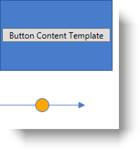
The screenshot below demonstrates how a node and a connection in the xamDiagram would look as a result of the following settings:
Following is the code that implements this example.
In XAML:
<ig:XamDiagram>
<ig:DiagramNode Content="Button Content Template" Width="160">
<ig:DiagramNode.DisplayTemplate>
<DataTemplate>
<Button Content="{Binding}" />
</DataTemplate>
</ig:DiagramNode.DisplayTemplate>
</ig:DiagramNode>
<ig:DiagramConnection Content="Orange" StartPosition="0,150" EndPosition="120,150">
<ig:DiagramConnection.DisplayTemplate>
<DataTemplate>
<!-- Binding the ellipse's fill to the connection's
Content and the Stroke to the connection's Stroke -$$->$$
<Ellipse
Fill="{Binding}"
Stroke="{Binding Stroke, RelativeSource={RelativeSource AncestorType=ig:DiagramConnection}}"
Width="20" Height="20"/>
</DataTemplate>
</ig:DiagramConnection.DisplayTemplate>
</ig:DiagramConnection>
</ig:XamDiagram>Applying a custom edit template for a diagram node or a diagram connection is done by setting the EditTemplate property to a DataTemplate. The value of the Content property is internally as the DataContext of the data template.
The following table maps the desired configuration to the property settings that manage it.
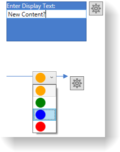
The screenshot below demonstrates how a node and a connection in the xamDiagram would look as a result of the following settings and when in edit mode:
Following is the code that implements this example.
In XAML:
<ig:XamDiagram xmlns:sys="clr-namespace:System;assembly=mscorlib">
<ig:DiagramNode Content="Button Content Template" Width="160">
<ig:DiagramNode.EditTemplate>
<DataTemplate>
<StackPanel>
<TextBlock Text="Enter Display Text:" Foreground="WhiteSmoke" />
<TextBox Text="{Binding Content, RelativeSource={RelativeSource AncestorType=ig:DiagramNode}}"/>
</StackPanel>
</DataTemplate>
</ig:DiagramNode.EditTemplate>
<ig:DiagramNode.DisplayTemplate>
<DataTemplate>
<Button Content="{Binding}" />
</DataTemplate>
</ig:DiagramNode.DisplayTemplate>
</ig:DiagramNode>
<ig:DiagramConnection Content="Orange" StartPosition="0,150" EndPosition="120,150">
<ig:DiagramConnection.EditTemplate>
<DataTemplate>
<!-- Binding the ComboBox's SelectedItem to the connection's Content. If a complex object
is set as the connection's Content, a simple binding with a Path set to the property path
of the property that has to be edited is enough. -$$->$$
<ComboBox SelectedItem="{Binding Content, RelativeSource={RelativeSource AncestorType=ig:DiagramConnection}}">
<sys:String>Orange</sys:String>
<sys:String>Green</sys:String>
<sys:String>Blue</sys:String>
<sys:String>Red</sys:String>
<ComboBox.ItemTemplate>
<DataTemplate>
<Ellipse Fill="{Binding}" Width="20" Height="20"/>
</DataTemplate>
</ComboBox.ItemTemplate>
</ComboBox>
</DataTemplate>
</ig:DiagramConnection.EditTemplate>
<ig:DiagramConnection.DisplayTemplate>
<DataTemplate>
<!-- Binding the ellipse's fill to the connection's
Content and the Stroke to the connection's Stroke -$$->$$
<Ellipse
Fill="{Binding}"
Stroke="{Binding Stroke, RelativeSource={RelativeSource AncestorType=ig:DiagramConnection}}"
Width="20" Height="20"/>
</DataTemplate>
</ig:DiagramConnection.DisplayTemplate>
</ig:DiagramConnection>
</ig:XamDiagram>The following topic provides additional information related to this topic.