It’s DevWeek! The London Barbican Centre hosts the UK’s largest developer conference. Close to 600 developers are here - and so are we. Infragistics is represented with a booth and we’ve had a lot of interesting conversations already.…
On 19 November, 2015 I spoke at the Innovations in Software Technologies and Automation (ISTA) conference in Sofia, Bulgaria. My presentation, “Design, Usability and Complex Systems”, centered on the notion that people (developers, business owners, the…
Visualizing data instead of presenting them as ASCII in lists or tables makes sense because we’re much better in processing graphical than numerical data (the so-called pictorial superiority effect). Also, graphical visualizations are considered to be…
Recently, TIME magazine published this info graphic about top-earning movies. It’s kinda interesting. I spent much more time looking at this than I normally would have. So by that definition, the graphic already reached its goal of engaging its audience…
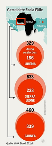
Here’s a cool data viz story. A large weekly magazine in Europe has recently published some statistics about Ebola cases in four African countries. It’s in German, but bear with me here.
Per country, the outer bubble depicts the number of…
Last month at the Human-Computer Interaction International conference in Orlando, I came across some interesting research results. The be honest, the only reason why I paid attention to those was that the they were authored by a Fraunhofer Institute.…
On October 23-24, 2015 I’ve been invited to speak at the User Centered Design (UCD) conference held annually in London. This is a more interesting conference than most (to me) because the talks center around the disruptive and transformative power…
I am currently finishing up working on a book with a few other Infragistics coworkers (and one other person outside of Infragistics) about designing and implementing Enterprise Dashboards using Silverlight. The book is due out in September, but it is…