Infragistics Ultimate 25.2 Release Is Out: What’s New?
This release reinforces our commitment to performance, consistency, and modernization, while simultaneously empowering teams to design and develop with more speed, control, and cross-platform consistency than before.
 Stanislav Balev
10min read
Stanislav Balev
10min read
We are excited to share that Infragistics Ultimate 25.2 release is here! It delivers a cohesive experience no matter the tech stack, unifying Angular, React, Blazor, Web Components, WPF, and WinForms under one modern, high-performance foundation. Beyond the AI advances in App Builder, developers gain the freedom to build seamlessly across platforms without compromise with synchronized updates like Azure Maps integration, advanced charting features, and full support for Angular 20, React 19, and .NET 10.
This release reinforces our commitment to performance, consistency, and modernization, while simultaneously empowering teams to design and develop with more speed, control, and cross-platform consistency than before.
Let’s have a look at all the enhancements and updates in detail.
Grid Performance Improvements
Optimized Sorting Performance: Faster Than Ever
- Framework: Angular, React, Web Components, Blazor
- Components: Data Grid, Tree Grid, Hierarchical Grid, Pivot Grid
At Infragistics, we’ve always taken pride in delivering the fastest Angular grids in the world and now, we’re taking performance to the next level. Over the past few sprints, our development teams have been focused on optimizing the core of our Ignite UI components libraries: Data Grid, Tree Grid, Hierarchical Grid and Pivot Grid.
The significant improvements were first released in Ignite UI for Angular 20.1 as a comprehensive optimization of the sorting pipeline. We know that for applications handling large datasets, every millisecond counts. Our initial acceptance criteria were ambitious: to benchmark grouping performance and demonstrate at least a 25% improvement in execution time for datasets with 10,000 rows or more.
The results? We’ve blown past that benchmark, achieving:
- 3x to 4x faster sorting for datasets with 100,000 records.
- Overall data operation time reduced by ~35% in grids, within the application scenario, with 100K rows.
The sorting performance updates affected:
- Angular Data Grid, Angular Tree Grid, Angular Hierarchical Grid and Angular Pivot Grid
- React Data Grid, React Tree Grid, React Hierarchical Grid and React Pivot Grid
- Web Components Data Grid, Web Components Tree Grid, Web Components Hierarchical Grid and Web Components Pivot Grid
- Blazor Data Grid, Blazor Tree Grid, Blazor Hierarchical Grid and Blazor Pivot Grid
Grid Cell Merging
- Framework: Angular, React, Web Components
- Components: Data Grid, Tree Grid, Hierarchical Grid, Pivot Grid
The Ignite UI Grids provide a Cell Merging feature that combines two or more adjacent cells with the same value into a single, larger cell. Merging is applied vertically within a column and helps improve readability by reducing duplicate values. The feature can be configured to merge cells either by default, matching data values, or by applying a custom condition.
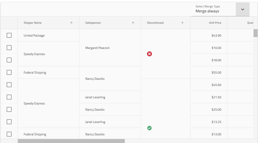
The cell merging feature is available for:
- Angular Data Grid, Angular Tree Grid, Angular Hierarchical Grid
- React Data Grid, React Tree Grid, React Hierarchical Grid
- Web Components Data Grid, Web Components Tree Grid, Web Components Hierarchical Grid
Grid Pinning on Both Sides
- Framework: Angular, React, Web Components
- Components: Data Grid, Tree Grid, Hierarchical Grid, Pivot Grid
Now you can specify each column pinning location separately, allowing you to pin columns to both sides of the grid for greater convenience, easier optimization of data sets, and achieving desired UX for your modern web application, no matter what you prefer to use Angular, React, Web Components or Blazor.
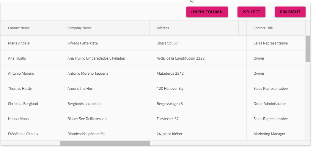
The pining on both sides feature is available for:
- Angular Data Grid, Angular Tree Grid, Angular Hierarchical Grid
- React Data Grid, React Tree Grid, React Hierarchical Grid
- Web Components Data Grid, Web Components Tree Grid, Web Components Hierarchical Grid
Beautiful New Grid Samples
- Framework: Angular, React, Web Components
- Components: Data Grid, Tree Grid, Hierarchical Grid, Pivot Grid
The latest Infragistics Ultimate release introduces five powerful Grid examples, showcasing real-world use cases and advanced grid capabilities that redefine data-driven app development. From hierarchical inventory and ERP dashboards to HR org charts, financial portfolio tracking, sales analytics, and fleet management systems, each sample highlights high-performance data grids with features like sorting, filtering, exporting, real-time updates, and multi-level data visualization. Together, these examples demonstrate the flexibility and speed of Ignite UI’s Grid component and how it empowers developers to deliver modern, interactive, enterprise-grade web applications.
ERP / Inventory

Org Chart / HR Portal

Financial Portfolio App

Sales Dashboard

Fleet Management System

Beautiful New Chart Samples
The updates in the release bring a refreshed charts experience as well, expanding the visual storytelling power of Ignite UI with a new suite of interactive chart samples that make data exploration faster and more intuitive than ever. From column, bar, and line charts to pie, step, and polar charts, each example demonstrates how the Charts component can turn complex datasets into clear, dynamic insights. With smooth animations, responsive layouts, and theming options, you can easily create dashboards that compare performance, track trends, and highlight key metrics with precision and style.

New Dock Manager Sample
- Framework: Angular
- Components: Dock Manager, AI Chat component
As part of the Infragistics Ultimate 25.2 release, we also introduced a brand new sample of the Ignite UI for React Dock Manager, designed to give developers full control over app layouts with easy-to-drag panes that can be resized, floated, pinned or hidden. This example showcases how easily you can build multi-window, multi-screen applications where users rearrange their workspace with ease, save custom layouts, and create rich dashboards with maximum flexibility.

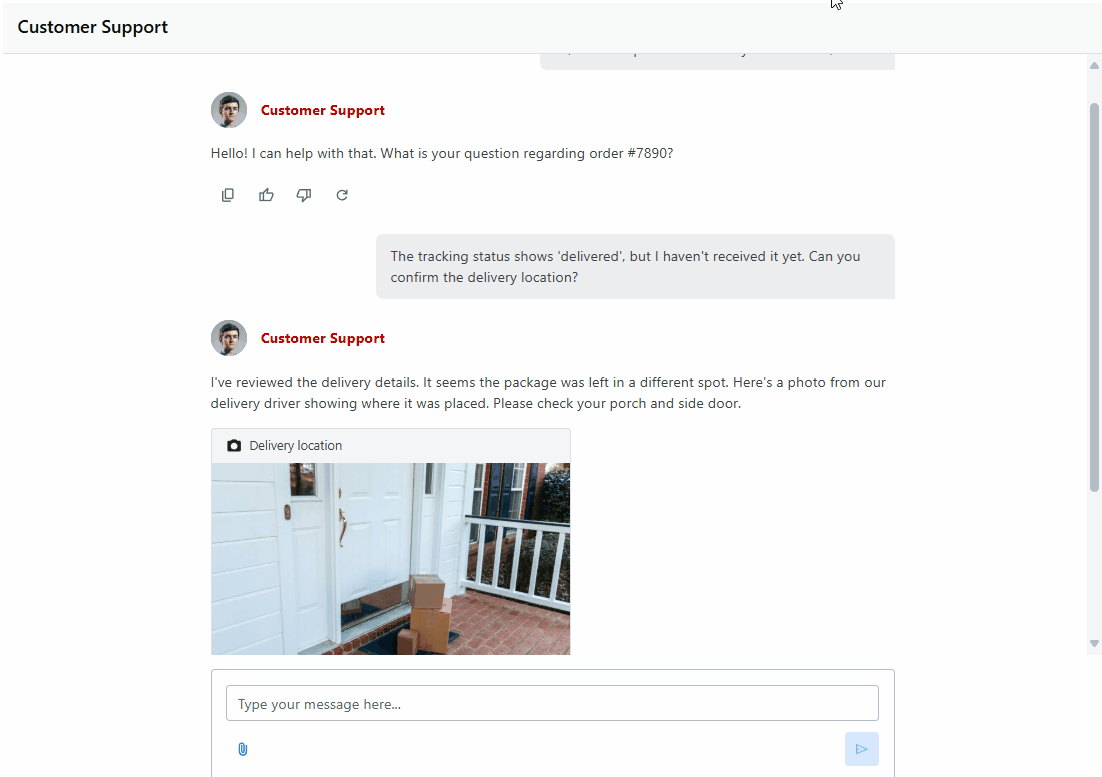
AI Chat Component
Framework: React, Web Components
The Ignite UI Chat component provides a complete solution for building conversational interfaces in your applications. Whether you are creating a customer support tool, a collaborative workspace, or a chatbot assistant, the Chat component gives you the building blocks you need: sending and receiving text messages, uploading file attachments, displaying quick reply to suggestions, showing typing indicators when the other participant is writing a response.
Unlike a static message list, the Chat component is interactive and designed for real-time communication. It manages input, rendering, and user interaction while giving you full control over how messages and attachments are displayed. It also exposes an extensive rendering API that lets you override any part of its layout or visuals.
Date Range Picker Component
- Framework: React, Web Components
- Already available in: Angular
The Ignite UI Date Range Picker is a lightweight component that includes a text input and a calendar pop-up, allowing users to easily select start and end dates. It is highly customizable to fit various application requirements, offering features such as date range restrictions, configurable date formats, and more.
Tooltip Component
- Framework: React, Web Components, Blazor
- Already available in: Angular
The Ignite UI for Web Components Tooltip component provides a way to display a tooltip for a specific element. A tooltip is a popup that displays information related to an element, usually when the element receives keyboard focus or when the mouse hovers over it.
Tile Manager Component
- Framework: React, Blazor
- Already available in: Angular, Web Components
The Ignite UI Tile Manager component enables the display of content in individual tiles. It allows users to interact with these tiles by rearranging and resizing them, giving them the freedom to customize the layout and appearance of the content according to their preferences. This flexibility enhances the user experience by enabling a more personalized and efficient way to view and manage content.
Mask Input Component
- Framework: Blazor
- Already available in: Angular, React, Web Components
The Ignite UI for Blazor Mask Input is an input field that allows the developer to control user input and format the visible value, based on configurable rules. It provides different input options and ease in use and configuration.
Divider Component
- Framework: Blazor
- Already available in: Angular, Web Components
The Ignite UI for Blazor Divider allows the content author to easily create a horizontal/vertical rule as a break between content to better organize information on a page.
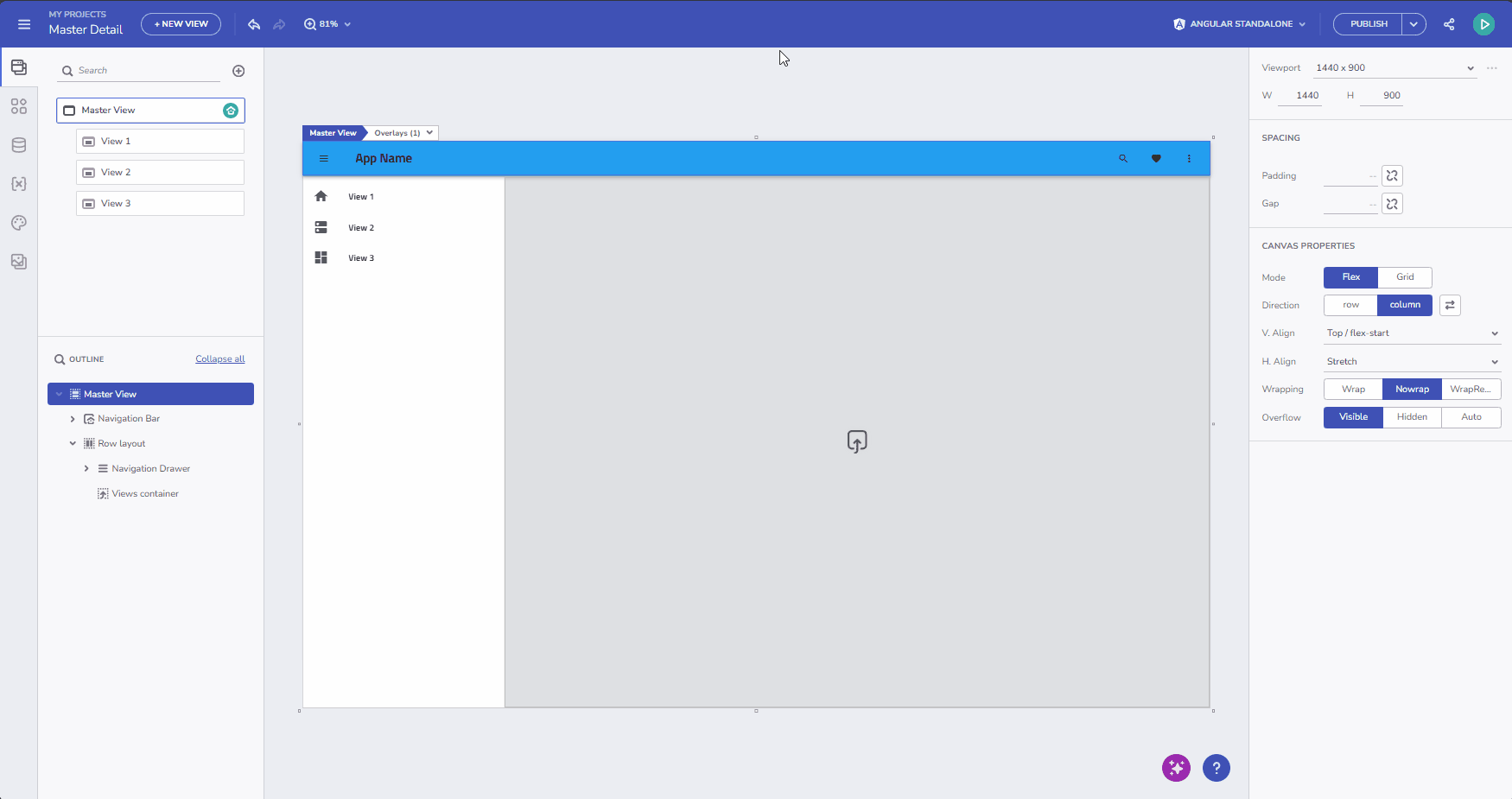
What’s New in App Builder?
Included in Infragistics Ultimate, App Builder is the only low-code tool that streamlines app development from design to code with every component, tool, and capability you need. The latest updates now focus on powerful AI enhancements, expanded grid capabilities, and performance-boosting upgrades. The goal is to foster continuous innovation, helping your team and company stay ahead of your competition, while building apps faster than ever.
Here are the highlights.
Generate Views from Images
- You can now upload one or more images and let AI generate corresponding app views automatically.
- This feature streamlines design workflows, transforming visual assets into functional app layouts in seconds.
Smarter Data Source Generation
AI now produces more accurate data sources for components like Grids and Data Charts, reducing setup time and making generated apps immediately functional.
Pivot Grid Enhancements

- Configuring a Pivot Grid is now easier than ever. Instead of manually defining rows, dimensions, and values, App Builder automatically generates the pivot view based on the data source you connect.
- Simply drop a Pivot Grid onto your canvas, bind it to your data, and the layout is created for you.
- You can always refine the layout later, but the auto-generation gives you a functional starting point that saves time and boosts productivity.
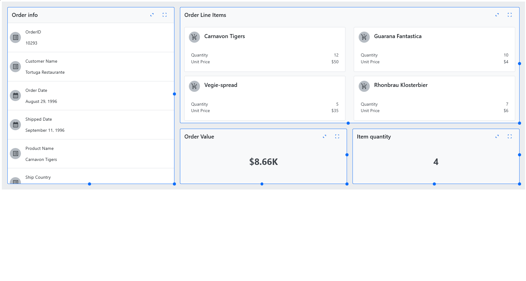
Master-Detail Templates
- Master-detail templates in App Builder bring powerful interactivity to your data grids.
- By enabling expandable rows, you can let users reveal more details tied to each record, like a customer’s recent orders, an employee’s performance, or a vehicle’s trip history right inside the grid.
- With App Builder’s intuitive design-time support, you can drag and drop components like cards or text blocks into the expanded detail area and bind them to the current row’s data context. It’s a fast and flexible way to build informative UIs that go beyond flat tables.
- To use it, just enable the Grid-details option from the Properties panel, add your components, and bind them to the row data.
AI-Powered Theme Management

- Creating and updating themes is now easier with AI assistance.
- App Builder can generate, modify, and delete themes based on your input, helping you maintain consistent branding and style across your applications.
Read more here:
What’s New: App Builder with Smarter AI Features, Pivot Grid Enhancements, & More
What’s New: App Builder with Conditional Data Actions, Grid Master-Detail, & More
Displaying Imagery from Azure Maps
With the latest release, we introduced support for displaying geographic imagery from Azure Maps using the new map components class across our modern web frameworks, as well as WPF and Windows Forms. This integration allows developers to easily enrich their map visualizations with high-quality, tile-based imagery—directly from Microsoft® Azure Maps. Whether you’re building geospatial dashboards or location-aware apps, you can now overlay Azure’s diverse map styles as background content in the map component, enhancing context, visual clarity, and user engagement without writing custom integration code.
Wrap Up…
With every release, we push the limits of what’s possible in modern web development, and this one is no exception. The latest Ignite UI update delivers unmatched speed, cutting-edge new components, and stunning new samples across Angular, React, Web Components, and Blazor.
Go ahead and try the new functionalities and start building better and feature-rich applications with the tools that modern-day app development requires.