HTML5 Sparkline Chart for Data-Intense Visualizations
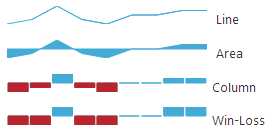
Described as “intense, simple, word-sized graphics”, Sparklines go beyond a simple line.
It’s a scaled-down, simplified version of your normal chart that is excellent for quick analysis of a lot of data and trend-spotting. For the more curious ones, the inventor of the Sparkline hosts a Q&A board on Sparkline theory and practice where you can find some general DO’s and DON’Ts as well as various scenarios people found Sparklines useful in. There’s also a very visually-rich blog on Sparklines in the Excel Blogs if you want more. The typical example is “inline with text”, however there are multiple cases where it would be useful as a part of a grid. At least from what I have seen, I accept the term as a synonym for small visualization of any kind suitable – lines and areas, of course, but also columns and bars, with/or without axes, ranges, markers, trend lines. It’s not the plethora of switches and knobs the Data Chart has, but it can be just as data-intensive while keeping it small. Just as note – these charts are still meant to be simple and even if you can show every extra bit of information on one, it might not always be the best design!
The Ignite UI Sparkline
After a series of Data Visualization controls have made their appearance in our Ignite UI product – the mighty Data Chart, then Pie, the Geographic map, translated from C# to jQuery, it was only logical to expand more. The Sparkline is a part of another wave of controls taking the HTML5 Canvas route, which means no plugins and available on most mobile devices. This specific chart is designed to be lightweight, so don’t expect too much extra bulk – single series supported with 4 display types and a single set of axes with limited amount of labeling and so on.
The default is line series:
$("#Spark0").igSparkline({
    displayType: "line",
    dataSource: employees,
    valueMemberPath: "SickLeaveHours",
    height: "50px",
    width: "50%",
    normalRangeMaximum: 49,
    normalRangeMinimum: 45,
    normalRangeVisibility: "visible",
    verticalAxisVisibility: "visible",
    highMarkerVisibility: "visible",
    lowMarkerVisibility: "visible"
});

Swap the line for area and markers for another axis:

Column series with a trend line:

and Win / Loss :

Both bar charts use the same data. The difference between is that Win-Loss is on a Boolean scale, which is to say that the points presented don’t match their values – it’s either full gain, full loss or neutral.
There are a few types of markers and 13 different trend line types and there’s a very nice igSparkline Overview article with visuals for everything, so you totally need to check that one out in case you haven’t seen all this control has to offer. Of course, as you would notice in the linked articles, the Sparkline is mainly intended for inline and the ones above are somewhat bigger. With some tweaking you can make them work inline as well:

It’s all in the name of having meaningful visualization for very high amounts of data squished in a very tiny space and make the most out of that. So, yes inline with text is a great and so is inside grid cells where such a chart can provide the ‘gist’ of a whole another table in a single cell and be easier to read as well. More on that on a follow up blog I have coming up real soon!
Tips and Tricks
So here comes an assortment of things you might find interesting and useful. Like for example, the fact that values and member paths are optional – the data source can be a simple array of numbers and then you don’t need to specify a value path. Label path is only needed when you are displaying an axis.
Beautify your data: Styling Guide
Yet another interesting topic, as it is still a Data Visualization control and it’s intended for the Web. So I’m hoping you’ve most seen the Styling igDataChart with Themes and perhaps for some other controls and if you are wondering if the Sparkline can do the same… Why yes, yes it can! And here comes a nice list of CSS classes that can be used to modify the looks of this control.
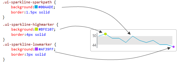
All of the classes are prefixed with “ui-sparkline-” and state what do they apply to – “sparkpath”, “negativesparkpath”, “trendline”, “markers”, “firstmarker”, “lastmarker”, “highmarker”, “lowmarker”, “negativemarkers”, “range”. For example, you have the spark path, the high and low markers:

The CSS background color along with CSS opacity, if you provide it, map to the brush color of the element in question. The border width (and width alone, regardless of this example showing a shorthand declaration) corresponds to the brush size. I think it’s visible enough to see that the high marker is bigger than the low one. Note that almost everything has a minimum value of 1.5px and will merely ignore lower values. There values are available for all markers, lines and range:
/* "background-color", "opacity", "border-width" apply */
.ui-sparkline-sparkpath {
    background:#00AADE;
    border:1.5px solid
}
.ui-sparkline-negativesparkpath {
    background:#D0284C;
    border:1px solid
}
.ui-sparkline-trendline {
    background:#555;
    border:2px solid
}
.ui-sparkline-markers {
    background:#36C0F3;
    border:3px solid
}
.ui-sparkline-firstmarker {
    background:#19994F;
    border:5px solid
}
.ui-sparkline-lastmarker {
    background:#FCB025;
    border:5px solid
}
.ui-sparkline-highmarker {
    background:#BFE107;
    border:4px solid
}
.ui-sparkline-lowmarker {
    background:#AF39FF;
    border:3px solid
}
.ui-sparkline-negativemarkers {
    background:#E5516F;
    border:3px solid
}
.ui-sparkline-range {
    background:gray;
    opacity:.2
}
In terms of columns the path is obviously applied as fill as well. For the axes you have slightly different rules – border corresponds to the axis stroke this time with color taken into account as well, there’s obviously no background, however font and color for the axis labels are used:
/* "border-width", "border-color", "color", "font" apply */
.ui-sparkline-axis-x {
    font-family:"Segoe UI", Arial, sans-serif;
    border:2px solid #989EA3;
    color:#4B4B4D
}
.ui-sparkline-axis-y {
    font-family:"Segoe UI", Arial, sans-serif;
    border:2px solid #989EA3;
    color:#4B4B4D;
}
An important note is that those classes correspond to the control options you see in the API, however they are taken into account during initialization. So it’s nice to have a separation of concerns between visuals and functionality.. and let designers pick better colors than I would, for example 🙂 However, if you want to modify the looks in runtime you will have to use the jQuery options.
Misc
As you may have noticed in the snippets, the width of the Sparkline can be set in percentages and, like the other Ignite UI charts, it has a built-in handling of resizing. That means this chart is good to go for Responsive design and also will work well inside containing elements with varying size – that will play an important role when we try the chart as a grid cell.
Also, since the scenario that makes the most sense (regardless of the bad data in my demos) is for analyzing trends, which means continuity and usually time-bound axis – and we all know the hell of JavaScript dates’ default string output. It is by far not appropriate for such a tiny chart, however you can format the labels to your liking with a simple function. It takes the “would’ve-been” value as parameter and should return the desired new label value instead. Keep in mind this event can and probably will fire multiple times and will also fire for the other axis (if you have one visible) – in which case, always check if you are formatting the right value. And one last thing – date values are already converted to a string when they reach you, thus:
$("#Spark1").igSparkline({
    labelMemberPath: "HireDate",
    verticalAxisVisibility: "visible",
    horizontalAxisVisibility: "visible",
    formatLabel : function formatFunction(val) {
        if (typeof val === "string") {
            // remove time from the label
            val = val.split("T")[0];
        }
        return val;
    }
    //...
});
Closing & Resources
I really hope the information above will come in handy. There’s a link to demos below with different types of Sparkline visuals, examples for inline setting, initializations, tooltip event handling and styling. I have one more post building on this information coming up soon, so keep an eye out for that one too.
- Sparkline theory and practice is a must-read for all of you interested in proper usage and in search for ideas
- Sparklines in the Excel Blogs has some more good scenarios
- The Documentation on the Ignite UI Sparkline has visual reference for all elements of this chart
- See it in action in our Samples
- The ASP.NET MVC Demo with mixed MVC helper / jQuery definitions
- JSFiddle for quick viewing showing most of the things described above
- Get yours:

I’d love to hear some thoughts, so leave a comment down below or @DamyanPetev.
And as always, you can follow us on Twitter @Infragistics and stay in touch on Facebook, Google+ and LinkedIn!