Infragistics Blogs
Get the latest trends in low-code, app development, product updates and more. Here we share our knowledge, best advice, how-tos, research, insights, and more - all with the aim of helping you learn how to build better apps faster.
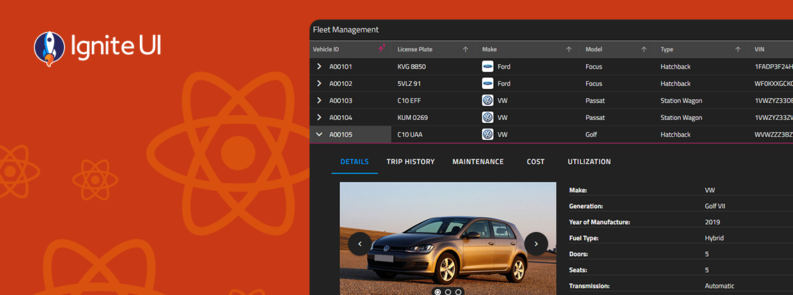
With Ignite UI for React 19, we’ve taken a major step toward delivering a more native, performant, and memory-efficient experience for React developers — without sacrificing the power, flexibility, and breadth our customers expect from Infragistics. See what's new.
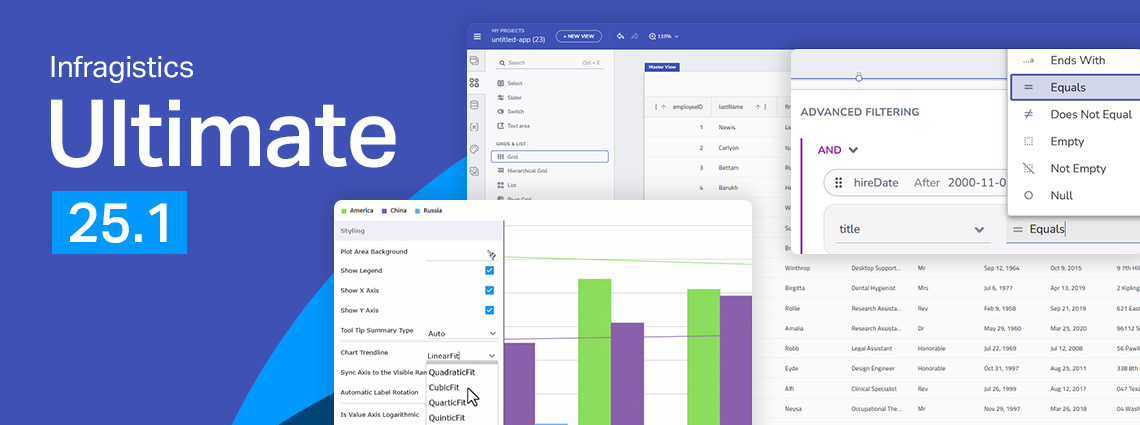
From brand-new components to exciting new features - here's everything you need to know about the Infragistics Ultimate 25.1 Release. Angular 19 updates, more charting capabilities, AI functionalities, and beyond.
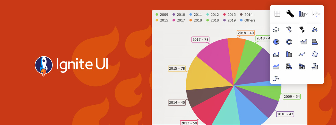
We are extremely excited to introduce a brand-new charting functionality – Dashboard Tile. Learn how to use this charting feature to build interactive Dashboards with almost no hand-coding at all.
With the year coming to a close, we are reflecting on all the milestones and updates we've made. Here is Ignite UI 2024 in review. Read more in this blog post.
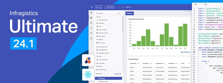
It’s release time and this time around Infragistics Ultimate 24.1 brings a host of new and much-anticipated features! See what’s new in our blog.
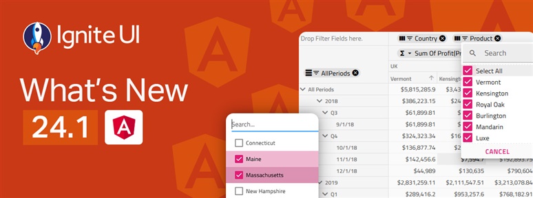
The latest release of Ignite UI is out and it brings tons of new features and components for Angular. Learn more about the updates and try the new capabilities.
Discover the latest enhancements in Ignite UI for Blazor, including .NET 8.0 support, new chart features, state persistence, and more components.
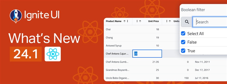
Discover all that's new in the latest Ignite UI for React 24.1. New grids, gauges, and features - these are all part of our continuous release. Read more here.
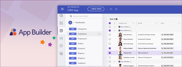
Another great App Builder release is out now! Catch up with all the updates - Two-way Data Binding, Datasource OpenAPI Schema updates, and more.
With every release comes a set of release notes that reflects the state of resolved bugs and new additions from the previous release. You’ll find the notes useful to help determine the resolution of existing issues from a past release and as a means of determining where to test your applications when upgrading from one […]