As a visual designer at Infragistics I am always keeping my eyes open for effective dashboard designs to lend inspiration to projects. By browsing design-rich websites like Pinterest, Behance, or Dribbble I easily find collections that stimulate me. Many…
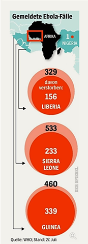
Here’s a cool data viz story. A large weekly magazine in Europe has recently published some statistics about Ebola cases in four African countries. It’s in German, but bear with me here.
Per country, the outer bubble depicts the number of…
I am currently finishing up working on a book with a few other Infragistics coworkers (and one other person outside of Infragistics) about designing and implementing Enterprise Dashboards using Silverlight. The book is due out in September, but it is…
We had a great turnout for the webinar on Dashboard design, thank you for joining! There were so many great questions and comments about User Experience and Design that we could not cover them all during Q&A. Because of this, I’ll address some more here…
There is a lot of data out there today. Spreadsheets upon spreadsheets of data. Presenting this in a meaningful form has, until recently, been the domain of bar charts and line graphs (think MS Excel). This wasn’t necessarily a good thing but at least…