This is just the beginning. We will continue to expand and refine both our open-source and premium controls so that every developer, from startup innovators to large enterprise teams, can build exceptional digital experiences with the right tools.
The App Builder Blog
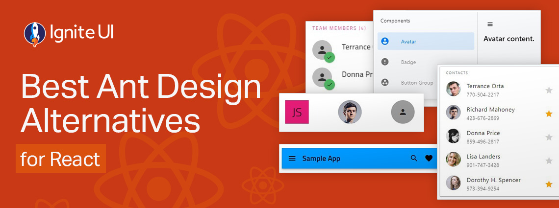
Is Ant Design really enough when you have to build more complex, data-rich and modern-looking applications? Are grid controls comprehensive enough and do they deliver the required features and performance?
Whether you’re building dashboards, internal tools, analytics apps, or customer-facing software, a React PWA built with Ignite UI will deliver a highly responsive, installable, offline-ready experience with far less development effort.
PrimeNG remains a capable starting point, but as your Angular apps scale, you may need a solution that offers better performance, design flexibility, and enterprise-grade reliability.

An Angular Progressive Web App is a web application enhanced with native-like features such as offline access, background synchronization, etc. And this blog post shows you how to build one.
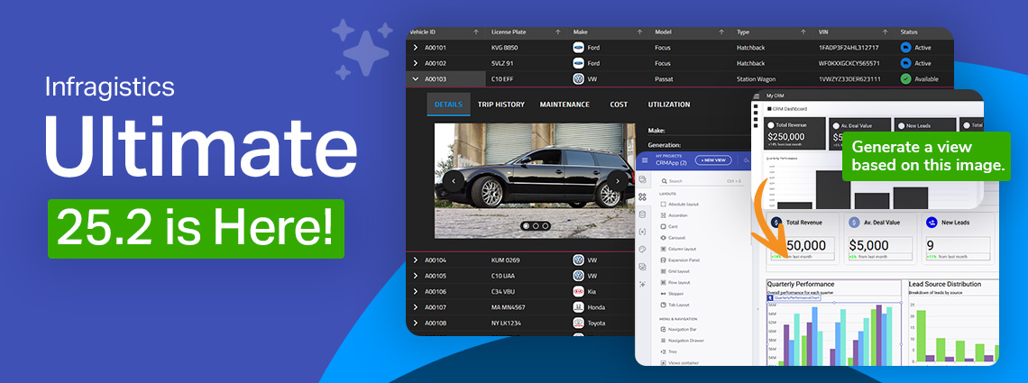
This release reinforces our commitment to performance, consistency, and modernization, while simultaneously empowering teams to design and develop with more speed, control, and cross-platform consistency than before.
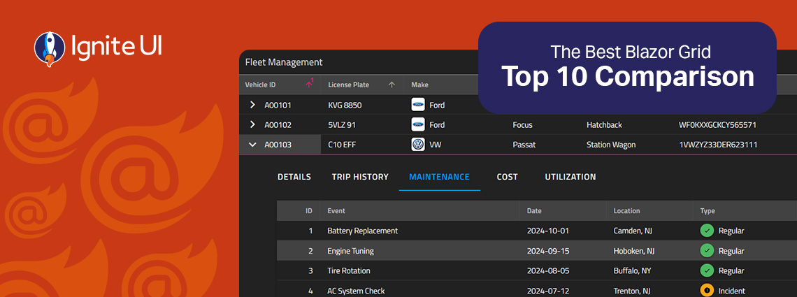
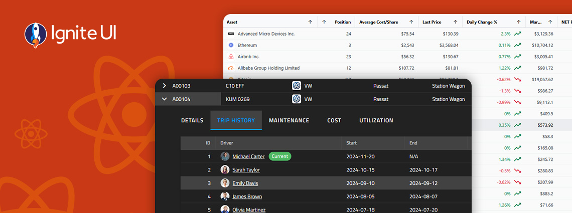
Fast and powerful Blazor data grid components are essential when building high-performance and data-driven applications. But with so many available controls on the market today, choosing the right one feels a bit challenging.
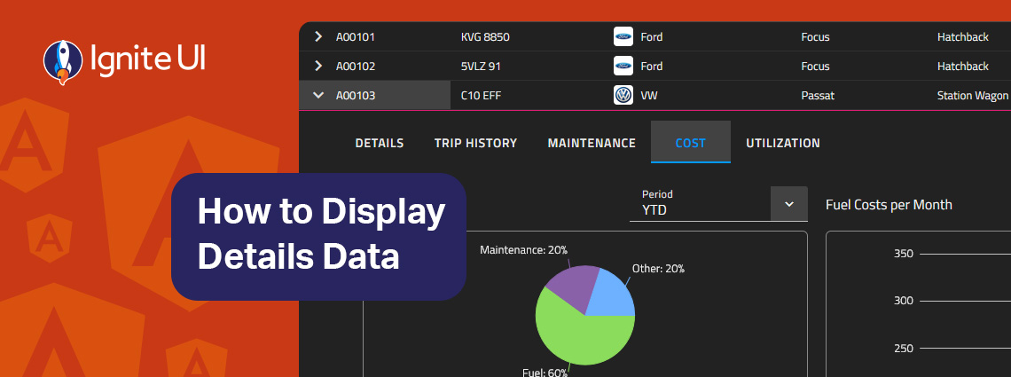
How can you easily display details data on-demand? In this blog post we demonstrate the exact steps, using Ignite UI for Angular Hierarchical Grid. Read more and explore code snippets and examples.
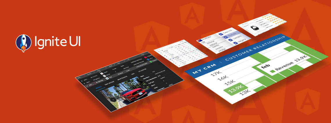
This article lists a mix of 10 Angular app examples that showcase the framework's versatility. See the Angular's strengths applied in action combined with Ignite UI for Angular.
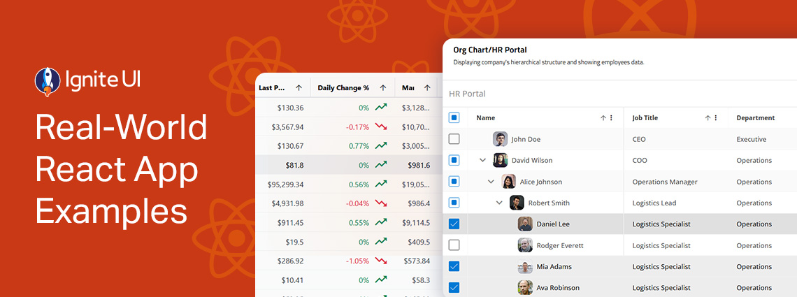
Explore the design patterns and UI components, get inspired, inspect the code, and learn how to integrate or customize each of these React samples. From business and organization applications to collaboration and productivity projects.