Visualizing data instead of presenting them as ASCII in lists or tables makes sense because we’re much better in processing graphical than numerical data (the so-called pictorial superiority effect). Also, graphical visualizations are considered to be…
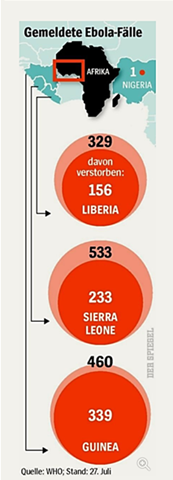
Here’s a cool data viz story. A large weekly magazine in Europe has recently published some statistics about Ebola cases in four African countries. It’s in German, but bear with me here.
Per country, the outer bubble depicts the number of…
With the advent of rich application frameworks (and the increased exposure to interaction models they make possible) it isn’t difficult to imagine that usability and design professionals may be feeling a little vulnerable.
After all, until recently…
What happens when your brain is trying to process conflicting streams of information? Let’s find out.
Read this list of colors to yourself:
Red
Green
Blue
Purple
Black
Brown
Yellow
Pink
Orange
Piece of cake right? You are only concentrating…
Friends – I’ve submitted a talk to the 2015 SxSW Interactive conference. If you like my concept and my video, please take a moment to follow the link (http://panelpicker.sxsw.com/vote/31967) and vote for me. Thanks very much!
Kevin
Businesses tend to…
Friends and colleagues,
I’ve submitted a presentation proposal to the 2015 SXSW Interactive Conference. If you like my proposal, please take a moment to visit the SXSW PanelPicker (http://panelpicker.sxsw.com/vote/32599) and vote for me. Thank…