Introduction to Angular 2 Components
A component is a main building block of an Angular 2 application, and an application may have any number of components. We can consider a component a particular view of the application with its own logic and data.
A component is a main building block of an Angular 2 application, and an application may have any number of components. We can consider a component a particular view of the application with its own logic and data.
In AngularJS 1.0, there was the concept of controllers, $Scope, and directives to bind data and logic to the view or to create custom elements on the view. In Angular 2, components perform all the tasks that were performed by controllers, scopes and directives. Data, logic and custom elements can all be created or added to the page using components in Angular 2.
Angular 2 applications are built around components, and we can consider component as a view with its own:
- Template
- Application Data
- Logic
- Styles, and more
Let’s Create Our First Component
Let us start with creating a very simple component to display “Hello World” on the page.
appcomponent.component.ts
import { Component } from '@angular/core';

@Component({
    selector: 'app-container',
    template: `<h1>{{message}}</h1>`
})
export class AppComponent {

    message : string = "Hello World";
    constructor() {
    }
}
There are mainly three steps to create a component
- Create a class and export it. This class will contain data and the logic.
- Decorate the class with @component metadata. Basically, metadata describes the component and sets the value for different properties, so that a TypeScript class can be used as an Angular 2 component.
- Import the required libraries and modules to create the component.
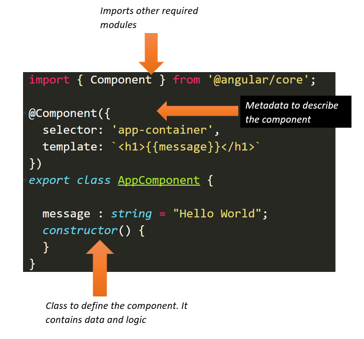
Three steps discussed above can be visualized in the diagram below:

As you can see, the Angular 2 component consists of:
- A TypeScript Class to hold data and the logic;
- HTML template and styles to display data in the app. It is also called as a view, which is seen by the user on the screen to interact.
- Metadata which defines the behavior of a component. Component metadata is applied to the class using the @Component decorator. Different behavior of the component can be passed as properties of the object, which is and input parameter of the @Component decorator.
Now, let us explore in detail these three parts of Angular 2 components.
TypeScript Class in a Component
A TypeScript class is a type and it contains a component’s
- data
- Logic
- Behavior
A TypeScript class used to create a CalculatorComponent can be created as shown in the listing next:
export class CalculatorComponent{
    num1: number ;
    num2 : number;
    result : number;
    add():number{
        this.result = this.num1 + this.num2;
        return this.result;
    };
    sub():number {
        this.result = this.num1 - this.num2;
        return this.result;
    }
}
Users can read, modify, and call behavior of the component class using different kind of bindings:
- Interpolation
- Property binding
- Event binding
- Two-way binding
@Component Decorator
TypeScript’s @Component decorator decorates a TypeScript class as a component. It is a function which takes an object as a parameter. In the @Component decorator, we can set the values of different properties to set the behavior of the component. The most used properties are as follows:
- Template
- TemplateUrl
- Directives
- Providers
- Styles
- StyleUrls
- Pipes
- Selector etc.
Apart from the above mentioned properties, there are other properties also. Now let us look into these important properties one by one.
Template and TemplateUrl
A template is the part of the component which gets rendered on the page. We can create a template in two possible ways:
- Inline template
- Template in an external file
An inline template can be created as shown below:
@Component({
    moduleId: module.id ,
    selector: "app-container",
    template:`
    <h1>{{ message}}</h1>
   `,
    styles:["h1{color:red}"]

})
One important point worth noticing here is the tilt symbol used to create multiple lines in the template. A single line inline template can be created using either single quotes or double quotes.
We would agree that the complex view should be put in an external HTML file instead of an inline template. Angular 2 allows you to put the template in an external HTML file, and that can be linked to the component by setting the value of the templateUrl property. By convention, it is better to keep the template and component in the same folder.
@Component({
    moduleId: module.id ,
    selector: "app-container",
    templateUrl: '/app/calculators/calculator.component.html',
    styles:["h1{color:red}"]
})
We can avoid giving the full path by setting the moduleId property of the component.
Selector
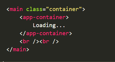
A component can be used using the selector. In the above example, the selector property is set to <app-container>. We can use the component on the page or different views using .

Styles and StyleUrls
A component can have its own styles or it can refer to various other external style sheets. To work with styles, @Component metadata has styles and styleUrls properties. We can create inline styles by setting the value of the styles property as shown in the listing below:
@Component({
    moduleId: module.id ,
    selector: "app-container",
    template:`
    <h1>{{ message}}</h1>
   `,
    styles:["h1{color:red}"],

})
A component can refer to various external files by setting the value of the styleUrls property.
@Component({
    moduleId: module.id ,
    selector: "app-container",
    template:`
    <h1>{{ message}}</h1>
   `,
    styleUrls:['app.component.css','./app/productorder.css']

})
Providers
In a real application, the component will use various Angular 2 Services or custom services. To use a service in a component, we need to follow two steps:
- Import the service in the component, and
- Set the value of the providers property in the metadata.
Component metadata has an array type property called the provider. In the providers we pass a list of services being used in the component. For example, in the next listing, we are passing two services in the component: CalService and InvoiceService.
@Component({
    moduleId: module.id ,
    selector: "app-container",
    template:`
    <h1>{{ message}}</h1>
   `,
    providers:['CalService','InvoiceService']

})
To use any Angular2 provided service or custom service, we need to import these services and pass as values of providers in metadata.
Nested Components as Directives
Angular 2 allows us to use a component inside another component. When we use a component inside a component, it brings us concept of nested components. To use a nested component, we need to use the directives property of component metadata.
Let us see, how could we use a nested component in action. Assume, we have a component called TasksComponent and we wish to use this component inside AppComponent. Steps to use TasksComponent (child component) as nested component of AppComponent(parent component) are as follows
- Import child component in the parent component
- Use child component using its selector in the parent component’s template
- Set value of directive property of parent component to the child component
As you probably notice in the listing below, we are importing the TaskComponent, which is a child component, and then using it as a directive in the AppComponent. To use a component as a nested component, we must set the value of the directives property.
import { Component } from '@angular/core';
import {TasksComponent} from './task/tasks.component';

@Component({
    selector: 'app-container',
    template: `{{message}}<tasks></tasks>`,
    directives:[TasksComponent]
})
There could be scenario in which we need to pass data from the parent component to the child component and vice versa, but we’ll cover that in detail in further blog posts.
So there you have it: we can use a component either as child component or bootstrap it. I hope you find this introductory post on Angular 2 components useful, and thanks for reading!