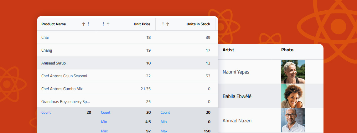
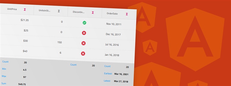
Do you know how to enable Excel-style filtering, Custom filtering operands, Custom filtering strategies, Advanced filtering, Programmatic filtering, or Remote filtering? This article will show you how, including code snippets, examples, and use cases.
The App Builder Blog
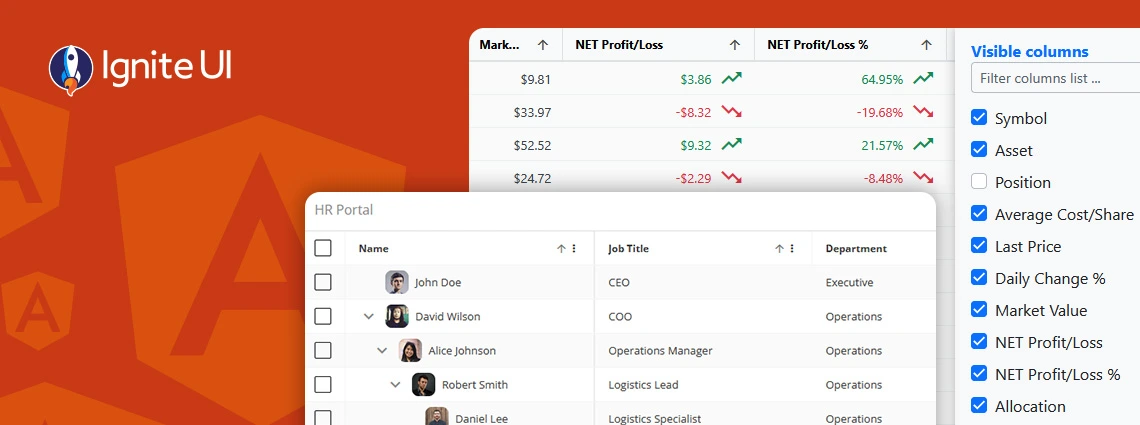
When selecting a React data grid, in addition to performance and price, you should also consider how real users will interact with it and what features you will need to match app requirements and users’ expectations. Features like Advanced Filtering, State Persistence, Keyboard Navigation, and Export to Excel aren't just a necessity.
What's the best Angular grid on the market in 2025 that can handle any data scenario and provide all the features (basic and advanced) you need? Find out in this detailed guide.
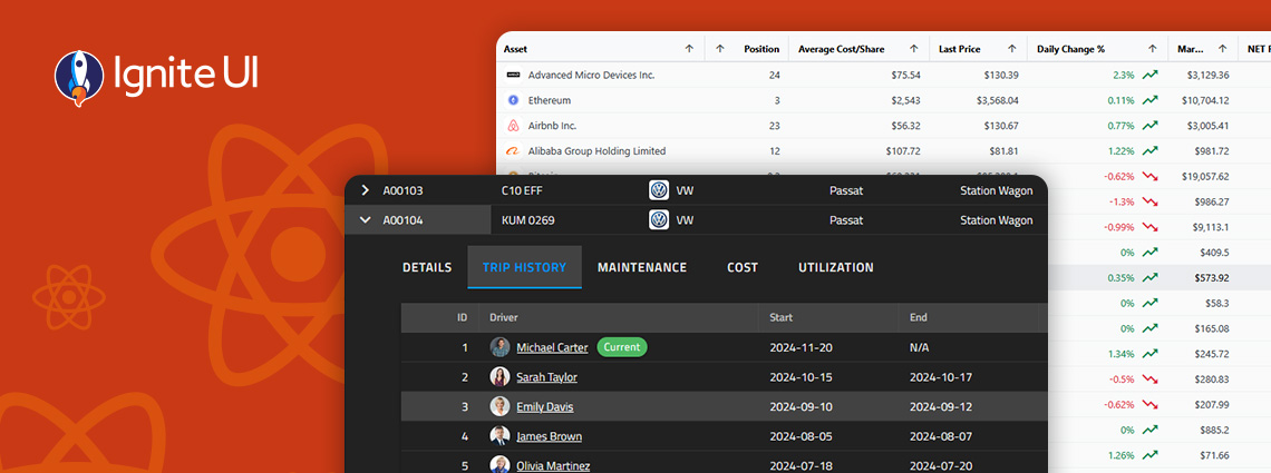
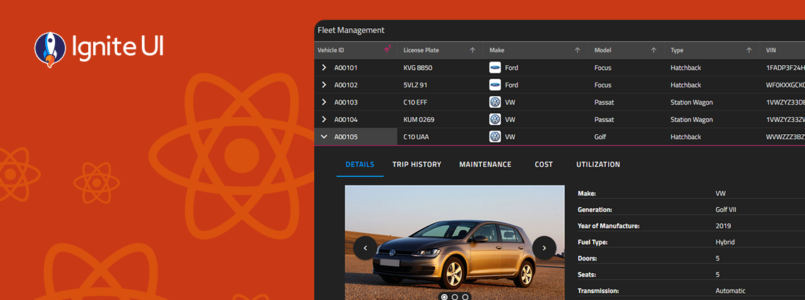
What's the best React Data Grid available on the market today? From Ignite UI for React to Syncfusion, the market is simply full of powerful grid solutions. That's why we've listed the top 10. Read more.
With Ignite UI for React 19, we’ve taken a major step toward delivering a more native, performant, and memory-efficient experience for React developers — without sacrificing the power, flexibility, and breadth our customers expect from Infragistics. See what's new.
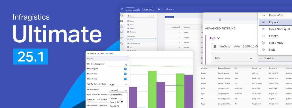
From brand-new components to exciting new features - here's everything you need to know about the Infragistics Ultimate 25.1 Release. Angular 19 updates, more charting capabilities, AI functionalities, and beyond.
Ignite UI for Angular 19.2 is here and it introduces a major update to SSR (Server Side Rendering) and SSG (Prerendering), plus a brand-new component - Angular Tile Manager. Read more about these enhancements.

Because of security concerns and code visibility, major corporations work with paid open-source software. Free open-source platforms, on the other hand, are the go-to choice for individual devs or small companies and startups with limited budgets.
We are extremely excited to introduce a brand-new charting functionality – Dashboard Tile. Learn how to use this charting feature to build interactive Dashboards with almost no hand-coding at all.
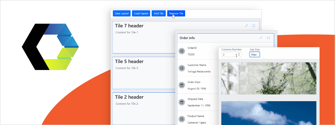
Ensuring ultimate app development flexibility and agility with the components you use is key. That's why we've added a new component to the Ignite UI for Web Components toolbox - Tile Manager. Check out its properties and see how to use it.