
This topic explains, with code examples, how to enable the default tooltips in the XamDataChart™ control and how to create custom ones.
In the XamDataChart control, tooltips are displayed as long as mouse cursor hovers over series in the XamDataChart control .
The XamDataChart control provides default tooltips for each type of series. Default tooltips are enabled by setting the ShowDefaultTooltip property to True. The default tooltips display all the information relevant to the particular series item (series title, data values, axis values etc.) and are styled to match the series' style.
If default tooltips are not sufficient, custom tooltips can be configured as well. Tooltips can be customized in the following aspects:
tooltip content
tooltip look-and-feel
The tooltip content is customized by providing custom content to the ToolTip property of the Series object. Tooltip look-and-feel is managed through the ToolTipStyle property of the XamDataChart control.
Note: If a custom ToolTip is set, the ShowDefaultTooltip setting is disregarded.
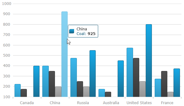
The following screenshot demontrates the default tooltip for category series.
This example demonstrates how to display tooltip information about the open, high, low, and close sales volumes for any point in a financial graph. This is achieved by creating custom tooltips that will display the volume value on LineSeries and the open, high, low, and close values on FinancialPriceSeries.
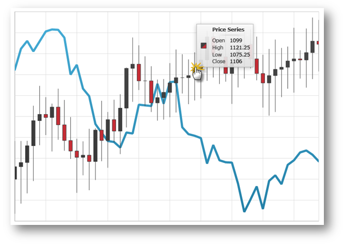
Figure 1: The XamDataChart control with custom tooltip showing values of Financial Price Series
Add a custom style for the chart’s Tooltip.
In XAML:
<UserControl.Resources>
   <Style x:Key="ToolTipStyle" TargetType="ContentControl">
        <Setter Property="Template">
            <Setter.Value>
                <ControlTemplate TargetType="ContentControl">
                    <StackPanel Orientation="Horizontal" Margin="5">
                        <ContentPresenter Margin="{TemplateBinding Padding}" Content="{Binding}" ContentTemplate="{Binding Series.LegendItemBadgeTemplate}" />
                        <ContentPresenter Margin="{TemplateBinding Padding}" Content="{TemplateBinding Content}" />
                    </StackPanel>
                </ControlTemplate>
            </Setter.Value>
        </Setter>
    </Style>
</UserControl.Resources>
Set the custom tooltip style to the XamDataChart control.
In XAML:
<ig:XamDataChart x:Name="DataChart"
                 ToolTipStyle="{StaticResource ToolTipStyle}">
        <!--TODO: Add Series with custom tooltip content -->
</ig:XamDataChart>In XAML:
<ig:XamDataChart.Series>
    <ig:LineSeries ItemsSource="{Binding}"
                   ValueMemberPath="Volume"
                   XAxis="{Binding ElementName=commonXAxis}"
                   YAxis="{Binding ElementName=volumeYAxis}">
            <!--Simple Tooltip showing volume on LineSeries -->
        <ig:LineSeries.ToolTip>
            <StackPanel Orientation="Vertical">
                <TextBlock Text="{Binding Series.Title}" FontWeight="Bold" />
                <StackPanel Orientation="Horizontal">
                    <TextBlock Text="Value:" />
                    <TextBlock Text="{Binding Item.Volume}"/>
                </StackPanel>
            </StackPanel>
        </ig:LineSeries.ToolTip>
    </ig:LineSeries>
    <ig:FinancialPriceSeries DisplayType="Candlestick"
                             ItemsSource="{Binding}"
                             OpenMemberPath="Open"
                             CloseMemberPath="Close"
                             HighMemberPath="High"
                             LowMemberPath="Low"
                             VolumeMemberPath="Volume"
                             XAxis="{Binding ElementName=commonXAxis}"
                             YAxis="{Binding ElementName=priceYAxis}">
            <!--Complex Tooltip showing all (OHLC) values on FinancialPriceSeries  -->
        <ig:FinancialPriceSeries.ToolTip>
            <StackPanel Orientation="Vertical">
                <TextBlock Text="{Binding Series.Title}" FontWeight="Bold" />
                <StackPanel Orientation="Horizontal">
                    <TextBlock Text="Open:" Width="40" />
                    <TextBlock Text="{Binding Item.Open}" />
                </StackPanel>
                <StackPanel Orientation="Horizontal">
                    <TextBlock Text="High:" Width="40" />
                    <TextBlock Text="{Binding Item.High}" />
                </StackPanel>
                <StackPanel Orientation="Horizontal">
                    <TextBlock Text="Low:" Width="40" />
                    <TextBlock Text="{Binding Item.Low}" />
                </StackPanel>
                <StackPanel Orientation="Horizontal">
                    <TextBlock Text="Close:" Width="40" />
                    <TextBlock Text="{Binding Item.Close}" />
                </StackPanel>
            </StackPanel>
        </ig:FinancialPriceSeries.ToolTip>
    </ig:FinancialPriceSeries>
</ig:XamDataChart.Series>