Version

Using the Control Configurator with XamDataGrid

This topic explains how to use the Control Configurators to configure the XamDataGrid control. All general features and information on how to update the Control Configurators, are covered in the Getting Started with Control Configurators topic.

Introduction

The XamDataGrid Control Configurator is a visual tool that enables the developer to configure an Infragistics WPF XamDataGrid control with a real-time preview of the control as it is being configured.

Real-time sample data is created after data binding the DataSource property; the sample data inflates the XamDataGrid on the configurator layout surface using the types in your project.

The primary use case for the XamDataGrid Control Configurator is to very quickly configure a new XamDataGrid or reconfigure a newly created XamDataGrid. The configuring of XamDataGrids that have been heavily hand edited in the Visual Studio XAML Editor is not a supported scenario. Please see the Control Configurator Limitations sections for a full explanation.

images\WPF_ConfiguringDataGrid_1.png

Requirements

The WPF XamDataGrid Control Configurator requires the latest version of one of these products be installed:

  • Infragistics Ultimate 2017 Vol 2 or later – including any services releases

  • Ultimate UI for WPF 2017 Vol 2 or later – including any services releases

Obsolete XamDataGrid Field XAML

The below code is using obsolete XAML syntax for defining fields for the XamDataGrid. This syntax is not supported in the WPF XamDataGrid Control Configurator.

In XAML:

<ig:Field Name="SubTotal">
    <ig:Field.Settings>
        <ig:FieldSettings EditorType="{x:Type igEdit:XamCurrencyEditor}">
            <ig:FieldSettings.EditorStyle>
                <Style TargetType="{x:Type igEdit:XamCurrencyEditor}">
                    <Setter Property="ValueType" Value="{x:Type system:Decimal}"/>
                    <Setter Property="NullText" Value="No Salary"/>
                    <Setter Property="Mask" Value="{}{currency:7.2}"/>
                </Style>
            </ig:FieldSettings.EditorStyle>
        </ig:FieldSettings>
    </ig:Field.Settings>
</ig:Field>

Current XamDataGrid Field XAML

The following single line of XAML replaces the above XAML. This greatly shortened syntax has been available since version 14.2. The WPF XamDataGrid Control Configurator supports this syntax for Field declaration in XAML.

In XAML:

<ig:CurrencyField Name="SubTotal" Mask="{}{currency:7.2}" NullText="No Salary"/>
Note
Note:

The Field control is supported by the Control Configurator, just not the nested styling. See the below Control Configurator Limitations section for a full explanation.

Data Model Used in this Topic’s Images

The sample project used in this help topic can be downloaded from this Infragistics GitHub Repository.

The below code snippet shows the Order class with an OrderDetails collection property. The OrderDetails collection property can be used to create a nested Field Layout if desired. In the above image you can see the Order Layout with a nested OrderDetails layout. The Features Layout is a child layout of the OrderDetails.

In C#:

public class Order
{
    public String AccountingCode { get; set; }
    public IList<OrderDetail> OrderDetails { get; set; }

    public Order()
    {
        this.OrderDetails = new List<OrderDetail>();
    }
}

Videos

Get the most from the XamDataGrid Configurator by viewing these videos.

Updates

Control Configurators are updated via the Microsoft Visual Studio Marketplace. Please ensure you have enabled auto updates to get new updates as they are published.

Ensure automatic updates are enabled

XamDataGrid Overview

The WPF XamDataGrid has a rich object model, feature set, and capabilities. Understanding the XamDataGrid object model is essential to using the XamDataGrid and the XamDataGrid Control Configurator.

images\WPF_ConfiguringDataGrid_2.png

The XamDataGrid object model uses object inheritance to resolve lower-level object property values. In the above image, orange or green objects are the objects that inherit from higher-level objects. Unset or unchanged lower-level values will inherit their value from higher-level objects. Many properties have a default value of null. At run-time, the property resolution logic will resolve the property value to non-null value.

The XamDataGrid object model enables developers to set settings at a high-level and then, when required, change a lower-level property value to achieve the required result.

For example:

A developer may set the RecordSelectorNumberType property on the XamDataGrid FieldLayoutSettings (high-level) and then set a different value for the RecordSelectorNumberType on a FieldLayout using that FieldLayout’s RecordSelectorNumberType property.

The same principle applies to FieldSettings which can be set on the XamDataGrid, FieldLayout, or Field objects.

Note
Note:

When using the Control Configurator and setting values on lower-level objects, and then setting those same values on higher-level objects, the higher-level object values will be not be resolved or used on that lower-level object because the lower-level object values have been set.

XamDataGrid Layout Modes

The XamDataGrid supports both simple and complex arrangements of cells within a record. The arrangements can be either specified manually (i.e., explicitly) or generated automatically. The Auto Arrange feature is enabled by setting the FieldLayoutSettings AutoArrangeCells property to either LeftToRight or TopToBottom. Setting this property to Never disables the Auto Arrange feature.

See this Infragistics Help Topic, Arranging Cells within the Record for detailed information.

To enable or disable Auto Arrange in the Control Configurator, select the FieldLayout and then click the Auto Arrange toggle button in the Ribbon to enable or disable this feature. Auto Arrange On is the default value.

images\WPF_ConfiguringDataGrid_3.png

When Auto Arrange is Off, developers arrange the cells in rows and columns by first selecting the desired field, then in the Property Grid, scroll down to the Layout category and set the desired values.

images\WPF_ConfiguringDataGrid_4.png

As field Layout values are set, the XamDataGrid UI will update to reflect the changes.

The below image pictures a layout achieved by setting row, column, row span, and column span properties.

images\WPF_ConfiguringDataGrid_5.png

Note
Note:

When Auto Arrange is On, the Property Grid Layout category is not visible since these values have no effect.

Control Configurator UI

images\WPF_ConfiguringDataGrid_6.png

The following list explains functional areas of the Control Configurator UI:

  1. Contextual Ribbon Tabs (1) – these are displayed based on the lowest-level selected object in the left column of the Control Configurator. In the above image, the Customer.FirstName field is selected and the Field contextual tab is active. To access the Field Field Settings contextual tab, click it.

  2. XamDataGrid Objects (2) – displays a hierarchical tree view of the XamDataGrid objects. Selecting one of these will change the displayed ribbon tabs, and will display the object’s properties in the Property Grid (6). Child objects of the top-level layout can also be deleted using this area. For example, the Features Layout can be deleted by clicking the minus icon to the right.

  3. Fields (3) – this panel is divided into two sections, Current fields (3A) and Available fields (3B). The Fields section is populated when a Field Layout has been selected in the XamDataGrid Objects (2).

    • The Current section (3A) section displays a hierarchical tree view of the selected Field Layout’s FieldItems that have been added to the UI. The FieldItem’s collection contains both Fields and FieldGroups. FieldItems can be deleted by clicking the minus icon. FieldItems can also be reordered by dragging them within the Fields Current section (3A). Selecting one of these will change the displayed ribbon tabs, and will display the object’s properties in the Property Grid (6).

    • The Available section (3B) lists fields that have not been added to the UI. When the plus icon is clicked, the field is added to the selected FieldLayout and UI.

  4. Field or Field Group (4) – when selected will change the displayed ribbon tabs, and will display the object’s properties in the Property Grid (6). A minus icon allows the developer to delete this FieldItem. Additionally, for all Fields, a field type icon is displayed to the left of the field text.

    • Nested model object syntax (Customer.FirstName) is used when the selected Field on the FieldLayout object is a class property. In our example, the Order class has a Customer class property.

    • Fields that have properties that are nested, use a different binding syntax as pictured below. The BindingType is set to UseAlternateBinding (in lieu of UseNameBinding). The AlternateBinding property is set to the Customer.FirstName.
      images\WPF_ConfiguringDataGrid_7.png

    • Unbound Fields have a BindingType of Unbound.

    • Notice below that a FieldGroup contains three child Fields. FieldGroups can also contain child FieldGroups. When all child FieldItems from a FieldGroup have been deleted or moved out of the FieldGroup, the FieldGroup can then be deleted.
      images\WPF_ConfiguringDataGrid_8.png

  5. Help – each ribbon tab has one or more links to help topics for items in the ribbon and property grid.

    • In addition, when hovering over an item in the XamDataGrid Objects (2), a help icon will appear. When clicked, your browser will be opened to the Infragistics Help Topic for that object.
      images\WPF_ConfiguringDataGrid_26.png

  6. Property Grid (6) – displays the properties for the lowest level selected object; in our example the Customer.FirstName Field object is the lowest level selected object.

    • When objects are selected the title for the Property Grid changes to reflect the selected object.

    • Properties are grouped in categories to assist in learning the APIs.

  7. Field Editor Specific Property Category (7) – when a FieldItem is selected, the first Property Grid Category (7) lists properties that are not found on the Field editor. The Field and Template editors do not have any specific properties, hence the Field category is their first one displayed.

  8. Field Category (8) – The Field Category and all Categories below the Field category are common to all field editors.

Fields Section Buttons and Expander Features

images\WPF_ConfiguringDataGrid_9.png

  1. Clicking the Maximize button (1) causes the Fields Current Section (2) to consume the entire left column, providing maximum room for working with FieldItems. To revert to the normal state, click the Restore button that is located where the Maximize button was (1).

  2. Clicking the Remove All button (2) removes all FieldItems from the selected FieldLayout and UI.

  3. The Add Options… (3) Expander control displays thee buttons when clicked:

    • Add Unbound – when clicked adds an Unbound field to the Current section.

    • Add Field Group – when clicked adds a FieldGroup to the Current section.

    • Add All – when clicked adds all Available Fields to the Current section.

Where Added Fields Appear

When fields are added using the available buttons in section (3B), fields are added to section 3A based on the following conditions:

  • When a FieldLayout is the selected object (meaning no fields are currently selected) the field(s) will be added at the end of the list in 3A.

  • When a FieldGroup is the selected object the field(s) will be added at the end of that FieldGroup’s children.

  • When a FieldItem is the selected object and it is within a FieldGroup, the field(s) will be added after selected FieldItem.

  • When a FieldItem is the selected object and is not within a FieldGroup, the field(s) will be added after selected FieldItem.

Taking advantage of this feature will save the developer time by not requiring them to move newly added fields.

Moving Items

When dragging FieldItems within the Current section (3A) a drag adorner indicates where the FieldItem will be placed. To add a FieldItem to a FieldGroup, the developer can drop the FieldItem on top of the FieldGroup or drop it within the FieldGroup.

Note
Note:

When not using Auto Arrange field layout, after dragging a FieldItem, the developer will need to use the Property Grid and set that FieldItem’s row, column, row span, and column span properties as required to obtain the desired layout.

Control Configurator Ribbons

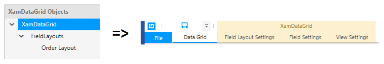
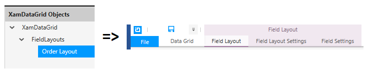
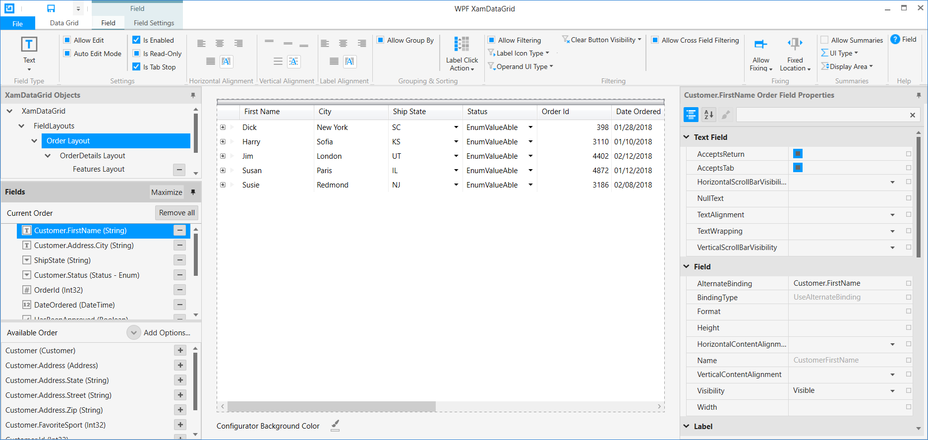
The XamDataGrid Control Configurator uses a familiar Ribbon based interface to help surface common actions and options to the end-user. The ribbon tabs are contextual to the objects selected in the XamDataGrid Objects pane and the Fields pane. Depending on which object you select, you will be presented with different ribbon tabs.

When you select the XamDataGrid or FieldLayouts objects from the XamDataGrid Objects pane, you will be presented with the Field Layout Settings, Field Settings, and View Settings tabs. These ribbon tabs will surface common features that you can turn on and off at the XamDataGrid level.

images\WPF_ConfiguringDataGrid_10.png

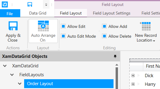
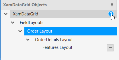
When you select a Field Layout that has been added to the XamDataGrid Objects pane, you will be presented with the Field Layout, Field Layout Settings, and Field Settings tabs. These ribbon tabs will surface common features that you can turn on and off at the selected Field Layout level. Any settings at this level will override any previous settings made on the XamDataGrid or FieldLayouts object level.

images\WPF_ConfiguringDataGrid_11.png

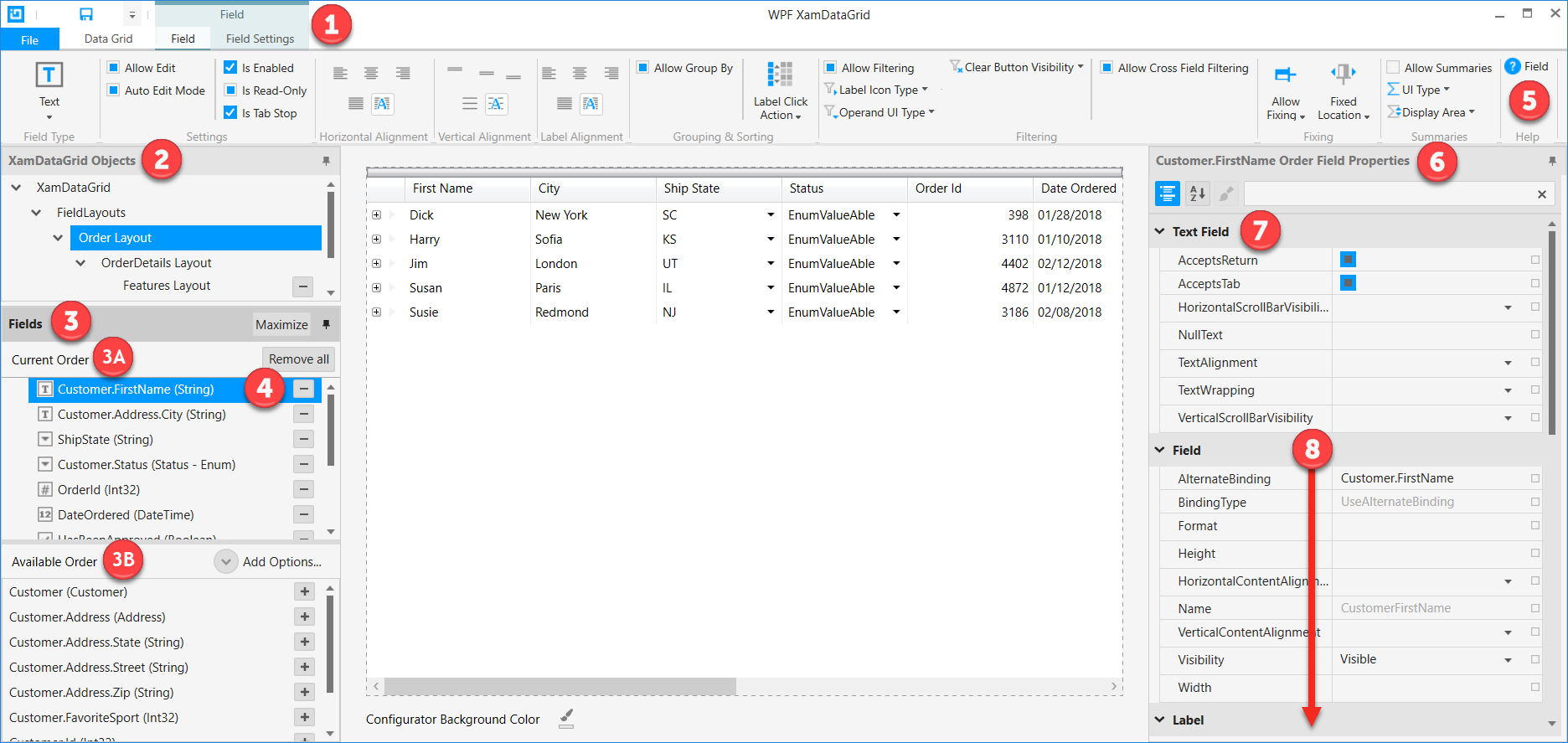
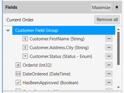
When you select a Field that has been added to a Field Layout in the Fields pane, you will be presented with the Field and Field Settings tabs. These ribbon tabs will surface common features that you can turn on and off at the selected Field level. Any settings at this level will override any previous settings made on the parent Field Layout object level.

images\WPF_ConfiguringDataGrid_12.png

The Data Grid tab will be available at all times. When you click on the Data Grid tab, you will be taken to the XamDataGrid level in the XamDataGrid Objects pane regardless of which object you have currently selected in the XamDataGrid Objects or Fields panes.

Ribbon Tools

The ribbon tabs contain many tools that allow you to turn on/off various features of the XamDataGrid control you are configuring. It is important to understand how these tools function so that you are properly setting the desired properties for the features of the XamDataGrid control.

The ribbon tools located on the Data Grid tab, and primary function tabs such as a Field Layout and Field, will surface many features that set properties on the XamDataGrid. These may be located across the various API objects such as FieldLayoutSettings and FieldSettings. For example, the Filtering group on the Data Grid primary tab sets properties across both FieldLayoutSettings and FieldSettings. The ribbon tools have helpful tooltips to provide more information about the name of the property you are setting and where that property can be found within the XamDataGrid API.

images\WPF_ConfiguringDataGrid_13.png

Buttons

Buttons are the simplest tool in the ribbon tabs. When you click on a button tool, it will perform an action. These actions will be explained in the provided tooltips.

images\WPF_ConfiguringDataGrid_14.png

Nullable Checkbox

A lot of properties on the various XamDataGrid API objects are Nullable Booleans which will be represented by a three-state checkbox in the ribbon tabs. The following are the visual representations of each state.

Null True False

images\WPF_ConfiguringDataGrid_15.png

images\WPF_ConfiguringDataGrid_16.png

images\WPF_ConfiguringDataGrid_17.png

Single-Select

Single Select tools will drop down a menu with multiple options to choose from. When you make a selection from the available options, the selection will be made and the tool will close.
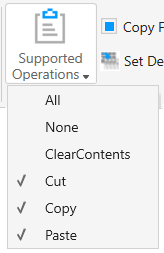
images\WPF_ConfiguringDataGrid_18.png

Multi-Select

Multi-select tools are very similar to single-select tools in that they show multiple options to choose from. Unlike single-select tools, the Multi-select tools will remain open to allow you to set multiple values. You can then click anywhere else in the Control Configurator to close the Multi-select menu. In some cases, you are presented with an All or None option in which case any previously selected options will be unselected, and the menu tool will close.

images\WPF_ConfiguringDataGrid_19.png

Advanced Options

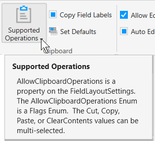
A handy feature of the ribbon tab group is the ability to launch a dialog that provides extended functionality related to a particular group. This is useful for situations in which the ribbon tab group only exposes a small number of common features, but has the capability for much more advanced configuration that may not be appropriate for, or be able to fit within, the ribbon tab group.

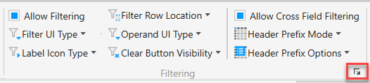
This dialog launching feature is noted by a small icon in the bottom right corner of a ribbon tab group.

images\WPF_ConfiguringDataGrid_20.png

Filtering

While the filtering ribbon tab group provides the most common filtering features, you can dive into more advanced filtering features by launching the Advanced Filtering dialog by clicking on the filtering group’s dialog launcher.

images\WPF_ConfiguringDataGrid_21.png

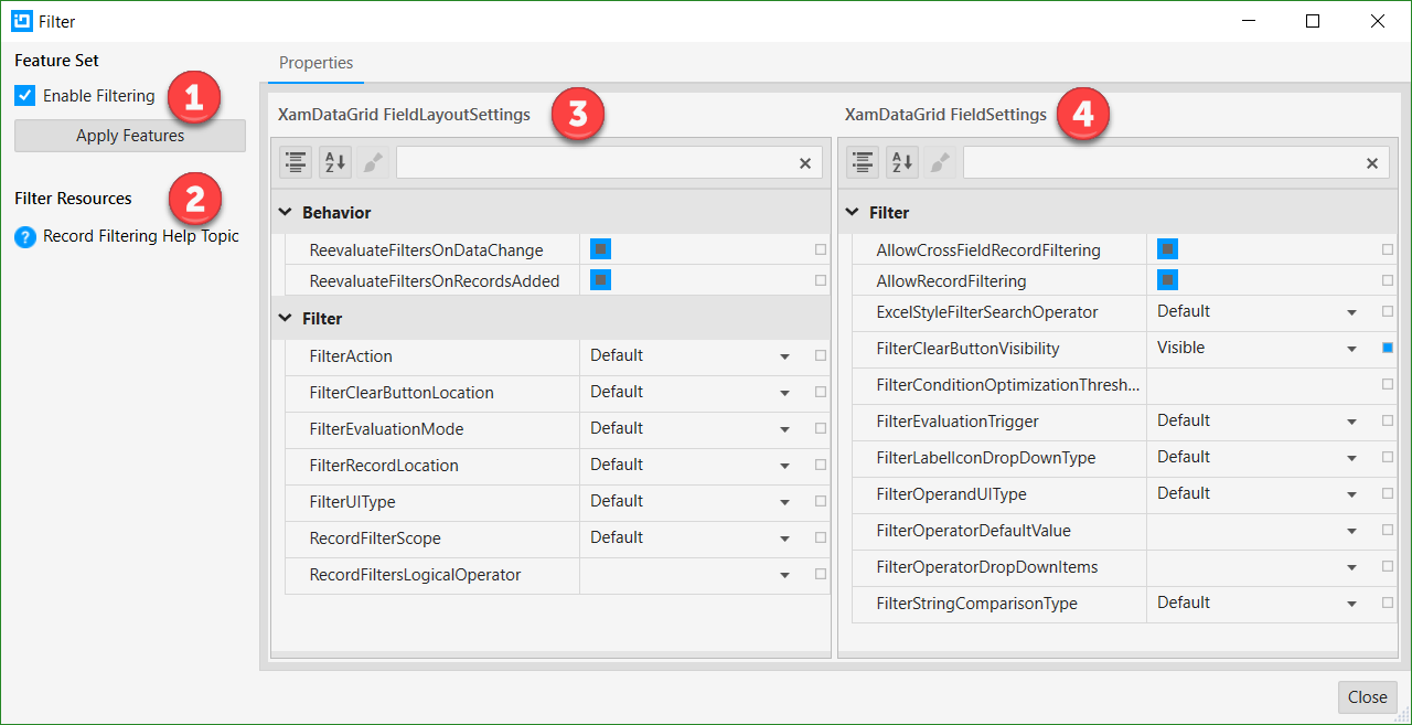
When the dialog launches you will need to be familiar with the Feature Set (1), the Filter Resources (2), the filtering options available on the FieldLayoutSettings (3), and the filtering options available in the FieldSetting (4).

images\WPF_ConfiguringDataGrid_22.png

When trying to change any values located within the Feature Set (1), it is important to note that you must click the Apply button in order for your changes to take effect. Any changes you make in the FieldLayoutSettings (3) or FieldSettings (4) will be set immediately. Closing the dialog via the “X” button on the Window, or by clicking the Close button will not cancel any setting you have made.

Performance

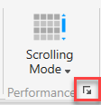
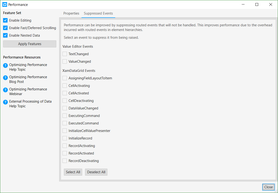
The performance tab group contains a single Scrolling Mode setting; you can dive into more advanced performance features by launching the Advanced Performance dialog by clicking on the Performance group’s dialog launcher.

images\WPF_ConfiguringDataGrid_23.png

When the dialog launches you will need to be familiar with the Feature Set (1), the Performance Resources (2), the tabs for the Properties and Suppressed Events (3), the performance options available on the XamDataGrid (4), the performance options available on the FieldLayoutSettings (5), and the performance settings available on the FieldSettings (6).

images\WPF_ConfiguringDataGrid_24.png

Suppressed Events

Performance can be improved by suppressing routed events that will not be handled. This improves performance due to the overhead incurred with routed events in element hierarchies. Select an event to suppress it from being raised.

images\WPF_ConfiguringDataGrid_25.png

When trying to change any values located within the Feature Set (1), it is important to note that you must click the Apply button in order for your changes to take effect. Any changes you make in the Performance dialog (3, 4, 5, 6) will be set immediately. Closing the dialog via the “X” button on the Window, or by clicking the Close button will not cancel any setting you have made.

Control Configurator Limitations

The XamDataGrid Control Configurator provides an outstanding design-time experience for new XamDataGrids or XamDataGrids that have very little hand editing XAML.

The XamDataGrid in the Control Configurator is a live running XamDataGrid. The Control Configurator can’t run any user code or attempt to parse and handle any user types or styles in XAML.

The default design-time experience will take the developer a very long way in their configuring of a XamDataGrid.

Based on the above explanation, the following properties for the below parent field objects are not supported by the XamDataGrid Control Configurator and any of these set in user XAML will be lost when the configuration saves the XAML.