<ig:XamCategoryChart ItemsSource="{Binding DataCollection}" />
This topic gives a brief overview of the new controls and features introduced in the Ultimate UI for WPF 2016 Volume 2 Release.
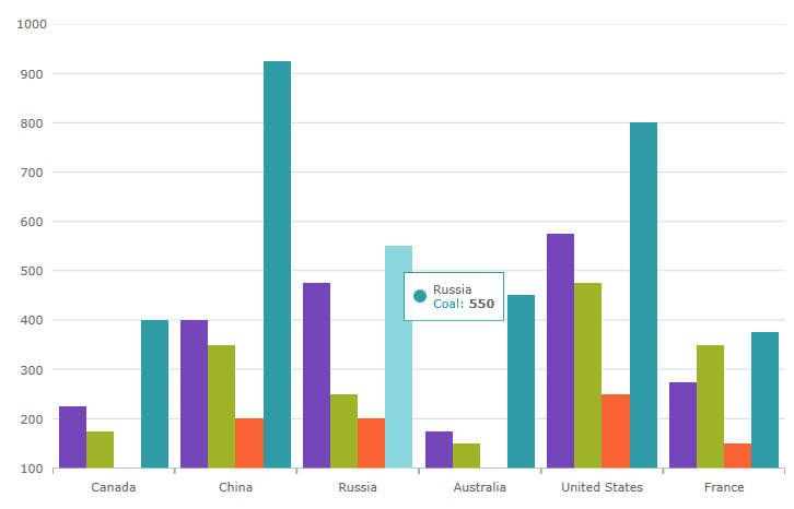
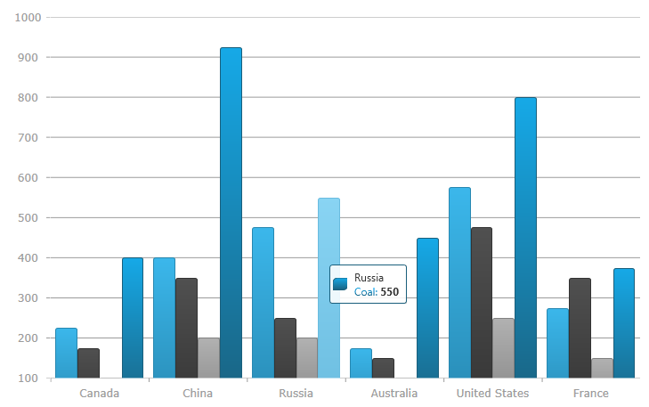
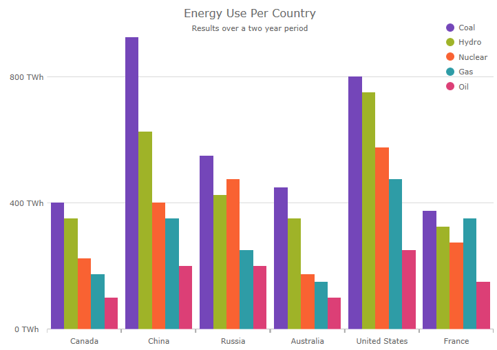
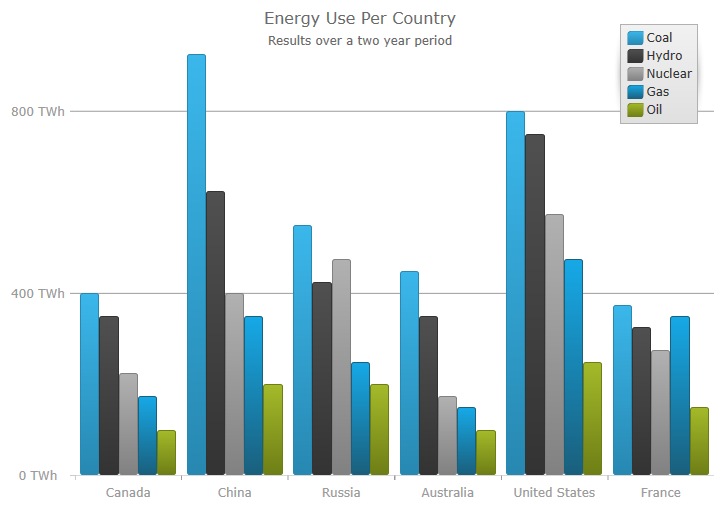
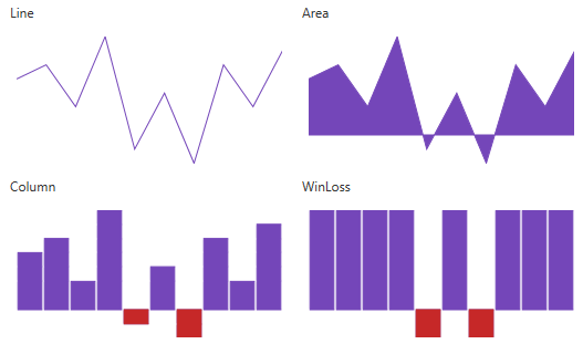
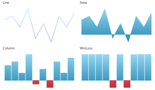
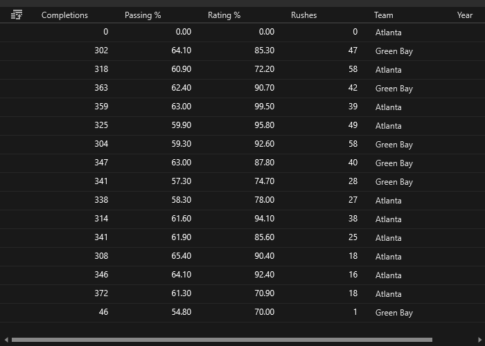
A new control, the Category Chart, is added in the Ultimate UI for WPF 2016 volume 2 release. This chart can be easily configured to display category data using a simple API. All you need to do is bind your data (a collection or a collection of collections).
In XAML:
<ig:XamCategoryChart ItemsSource="{Binding DataCollection}" />By using a smart Data Adapter, the data is analyzed and the appropriate visualization is rendered. For example, if the ChartType is set to "Auto", the control can determine that if it is provided a small data set then a column chart should be plotted, while a larger data set will draw a line chart.
In XAML:
<ig:XamCategoryChart ItemsSource="{Binding DataCollection}" ChartType="Auto" />However, you can also explicitly specify the chart type by setting the ChartType to Line, Area, Column, Point, Spline, SplineArea, StepArea, StepLine, or Waterfall.
Another example of the intuitive behavior of the Category Chart control is that you do not need to explicitly set the labels. The Category Chart will use the first appropriate string property that it finds and will use that for the labels.
Built to be easily configurable, it uses the Data Chart control as its engine, which means that it benefits from the high performing and powerful Data Chart features.
Related topics:
About xamCategoryChart
In the Infragistics 2016 volume 2 release, we significantly improved the performance of the Data Chart control.
New property ConsolidatedColumnVerticalPosition added
A new property ConsolidatedColumnVerticalPosition is introduced in this release in order to determine the positioning logic to use for columns which have been consolidated into a single visual element.
It accepts the following values:
Minimum - Consolidated Items should be positioned using their minimum value.
Maximum - Consolidated Items should be positioned using their maximum value.
Median - Consolidated Items should be positioned using their median value.
RelativeMinimum - Consolidated Items should be positioned using the value nearest to the reference value of the corresponding axis.
RelativeMaximum - Consolidated Items should be positioned using the value farthest from the reference value of the corresponding axis.
Related topics:
Column Series
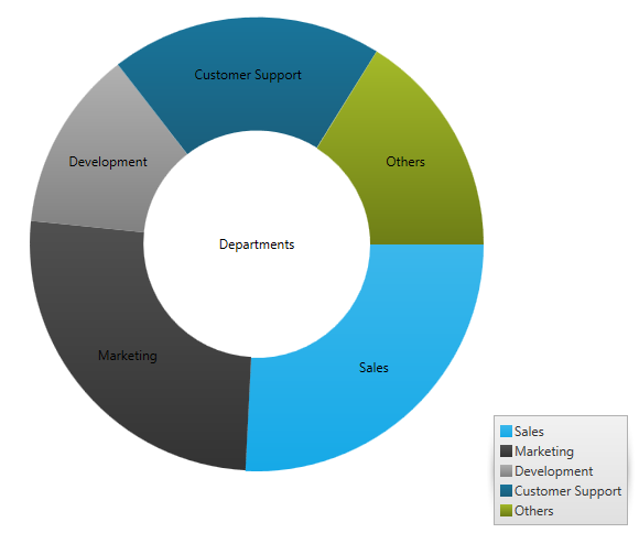
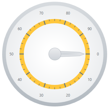
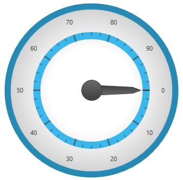
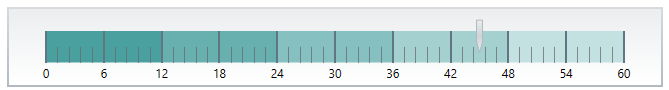
In the Infragistics 2016 volume 2 release, we redesigned the defaults of the xamDataChart, xamPieChart, xamDoughnutChart, xamFunnelChart, xamRadialGauge, xamLinearGauge, xamBulletGraph and xamSparkline controls.
The following screenshots are some examples:
New
Previous
New
Previous
New

Previous
New
Previous
New
Previous
New
Previous
New
Previous
New
Previous
New
Previous
New
Previous
New
Previous
Two new chart series, scatter area series and scatter contour series, are added to the chart in this release. These 2 series are a 2D version of the 3D surface chart control.
Scatter Areas Series
Scatter area series is a visual chart element that draws a colored surface, in a Cartesian context, based on a triangulation of X and Y coordinates with a numeric value assigned to each pixel of the surface. You can use this series to plot scientific data such as strength of magnetic field, 3d shapes projected/flattened onto 2d plane, or correlation between 3 numeric columns in your data
Scatter Contour Series
The scatter contour series can be used to plot the same data as scatter area series but data will be visualized using contour lines instead of interpolated surface area
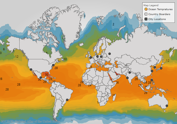
This CTP feature enables the Geographic Map control to display a legend.
The Shape Chart is a CTP control that is added in the Infragistics 2016 volume 2 release. This control displays cartesian and geographic shapes on a chart surface. It can be used display items such as floor plans, diagrams, and maps.
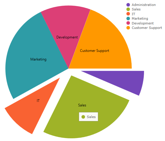
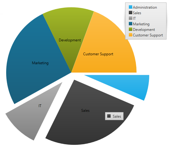
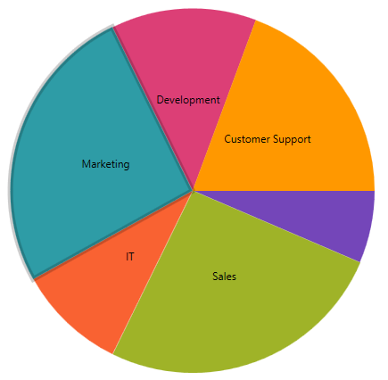
You can now select a pie slice on the xamPieChart control. This feature is enabled by default. You can set the SelectionMode property in order to support single or multiple slice selection and then check the SelectedItem or SelectedItems properties in order to see what data items are associated with those selected slices.
We also added new selection events, some of which are cancelable, so you can stop selection of particular slices from occurring. These events are:
You can see which pie slice is selected as it has a different style. The following screenshot shows the Marketing slice selected.
Related topics:
xamPieChart
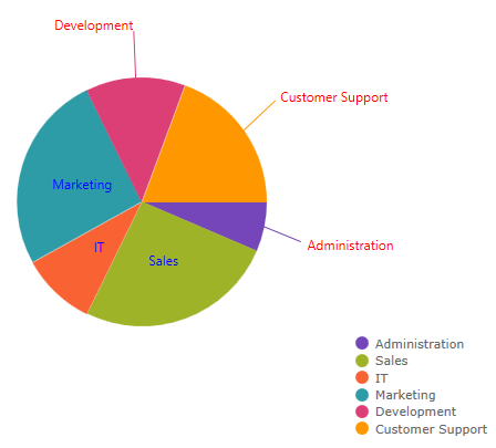
The xamPieChart control now has a LabelClick event that fires when the labels of the pie slices are clicked.
Related topic:
You can now specify the color of the labels depending on whether they are rendered inside or outside of a pie slice. These properties are LabelInnerColor property and LabelOuterColor property
Related topic:
LabelInnerColor property
LabelOuterColor property
Obtain All References for a Given Rule
The DataValidationRuleCollection now exposes a GetAllReferences method which returns a collection of references that have data validation rules equivalent to the given rule.
New Method for Comparing Data Validation Rules
The DataValidationRule now has an IsEquivalentTo method which compares this rule with the given one and returns true if the rules are structurally equivalent.
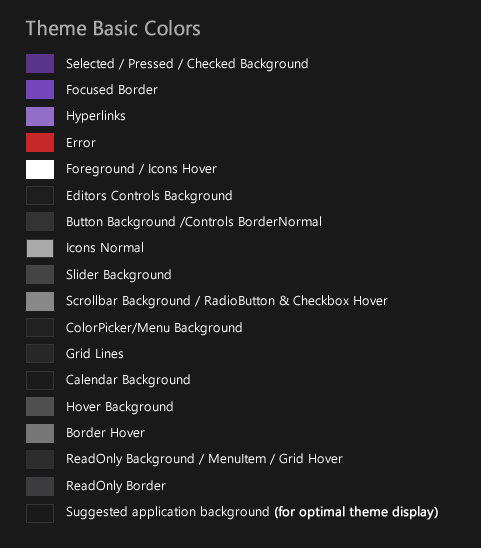
New Theme
The Royal Dark theme is a consistent and simplified new theme enriched with more visual states, featuring more depth and improved UX.
Featured Colors:
xamDataGrid
xamSpreadsheet
xamRibbon
Related topics:
Themes
MS Controls Implicit Themes
Ability to Configure the Scrolling Direction
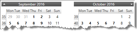
The xamCalendar, xamMonthCalendar, xamDateTimeEditor and xamDateTimeInput controls are exposing a new property ScrollDirection which allows you to configure the scroll direction of the calendar item group(s) when pressing the navigational arrows. Previously only horizontal scrolling was implemented.
Horizontal scrolling:
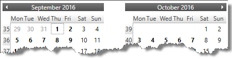
Vertical scrolling:
Related topics:
Using xamCalendar
Switch to a Different Calendar View (xamMonthCalendar)
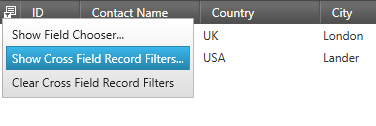
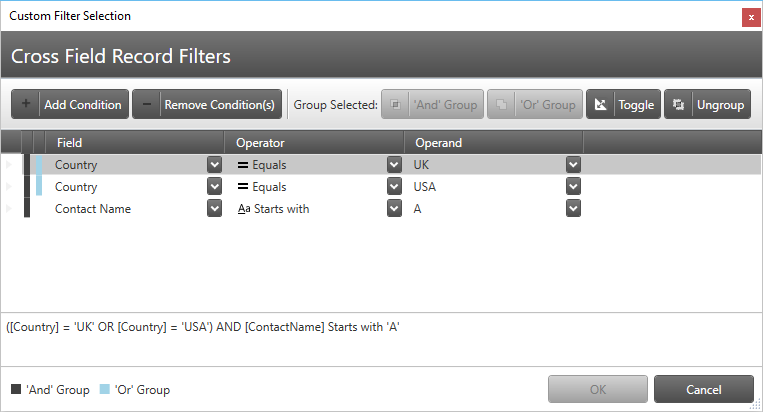
Cross-Field Record Filtering
The data presenter controls now support the definition of filtering rules with logical connections between them.
Related topics:
Cross-Field Record Filtering (xamDataGrid)
Cross-Field Record Filtering (xamDataPresenter)
Field Chooser Look
The default look of the field chooser for data presenter controls with a single field layout now includes a check box on the top for selecting all fields.
Related topic:
About the Field Chooser
Data Template Selector Support for Editor Definition
The xamPropertyGrid control now supports assigning of data template selector on an editor definition.
Related topic:
Configuring Data Template Selector for Editor Definitions (xamPropertyGrid)
New Event for the Document Adapters
All document adapters extending from RichTextDocumentAdapterBase are having a new DocumentLoadError event which is raised when an exception is thrown while attempting to load a document.
Related topic:
Binding xamRichTextEditor to Data