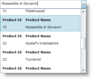
<ig:XamComboEditor
  ItemsSource="{Binding Source={StaticResource DataUtil}, Path=Products}"
  DisplayMemberPath="ProductName"
  EmptyText="Choose Product ..."
  Height="30" Width="300">
    <ig:XamComboEditor.ItemTemplate>
      <DataTemplate>
        <Grid ToolTipService.ToolTip="Product Info">
          <Grid.ColumnDefinitions>
            <ColumnDefinition Width="80" />
            <ColumnDefinition Width="180" />
          </Grid.ColumnDefinitions>
          <Grid.RowDefinitions>
            <RowDefinition Height="25" />
            <RowDefinition Height="25" />
          </Grid.RowDefinitions>
          <TextBlock Text="Product Id" Margin="5"
            Grid.Column="0" Grid.Row="0" FontWeight="Bold" />
          <TextBlock Text="Product Name" Margin="5"
            Grid.Column="1" Grid.Row="0" FontWeight="Bold" />
          <TextBlock Text="{Binding Path=ProductID}"
            Margin="5" Grid.Column="0" Grid.Row="1" />
          <TextBlock Text="{Binding Path=ProductName}"
            Margin="5" Grid.Column="1" Grid.Row="1" />
        </Grid>
      </DataTemplate>
    </ig:XamComboEditor.ItemTemplate>
</ig:XamComboEditor>
