
This topic explains how to bind the xamMultiColumnComboEditor™ control to data and configure the items layout in the control’s drop-down list.
The following topic is a prerequisite to understanding this topic:
This topic contains the following sections:
The following table briefly explains the configurable aspects of the xamMultiColumnComboEditor control and maps them to the properties that configure them. Further details are available after the table.
To populate the xamMultiColumnComboEditor control with data, set its ItemsSource property to a data source. Use any IEnumerable collection of data objects.
The following table maps the desired configuration to the property settings that manage it.
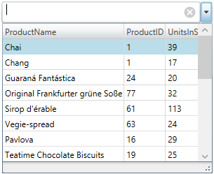
The screenshot below demonstrates how the xamMultiColumnComboEditor looks as a result of the following settings:
Following is the code that implements this example.
In XAML:
<ig:XamMultiColumnComboEditor x:Name="ComboEditorProducts"
                              Height="30" Width="300"
                              ItemsSource="{Binding Path=Products}"
                              AutoGenerateColumns="False"
                              DisplayMemberPath="ProductName">
    <ig:XamMultiColumnComboEditor.Columns>
        <ig:TextComboColumn Key="ProductName"/>
        <ig:TextComboColumn Key="ProductID"/>
        <ig:TextComboColumn Key="UnitsInStock"/>
    </ig:XamMultiColumnComboEditor.Columns>
</ig:XamMultiColumnComboEditor>Enable/disable the xamMultiColumnComboEditor columns auto generation using the AutoGenerateColumns property.
By default, the columns automatic generation is enabled. Columns are generated for every public property of the data object contained in the source IEnumerable.
If the AutoGenerateColumns property is set to False, specify the required visible columns using the Columns collection property.
The following table maps the desired configuration to the property settings that manage it.
Specify the visible columns in the xamMultiColumnComboEditor drop-down list using the Columns property.
Use the following available column types:
CheckboxComboColumn - for columns containing boolean values
DateComboColumn - for columns containing DateTime values
ImageComboColumn – for image columns
TextComboColumn - for columns containing string values
The following table maps the desired configuration to the property settings that manage it.
The following topics provide additional information related to this topic.