Time Picker
Use the Time Picker Component to represent a date's time portion (hour, minutes, and seconds) visually and provide appropriate means for its display in forms and selection from a dropdown or dialog. The Time Picker is visually identical to the Ignite UI for Angular Time Picker Component
Demo
Type
In Figma the user has the option to select either a dialog or a dropdown Time Picker via the Type property in the property panel.

Size
All Time Picker types are available in three sizes:
- Large
- Medium
- Small


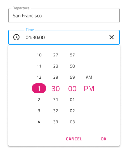
Time Picker Input
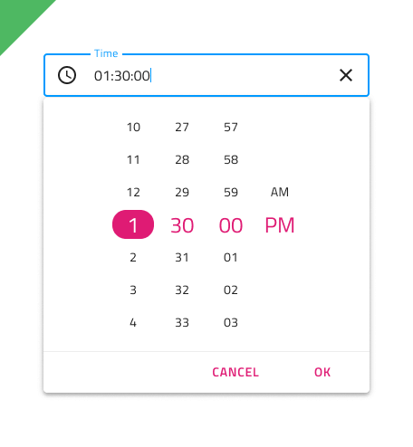
The Time Picker Input supports Enabled and Disabled interactive states, as well as variant for Dialog and Dropdown that will be shown upon user interaction.
Time Picker Input Type
In Figma the user can choose between two distinct Time Picker Input types: border style for a more structured perception on solid color backgrounds and boxed style which is most appropriate when the component is placed on top of a vivid image to improve the readability of its content.


Time Picker Input Sizing
All Time Picker input types come in three sizes in order to match the corresponding sizes of the Time Picker component:
- Large
- Medium
- Small

Time Picker Input States
The Time Picker input supports seven user interaction states: Idle, Idle & Hover, Idle & Disabled, Filled, Filled & Hover, Filled & Disabled and Focused, along with three validation states: Success, Warn and Error.

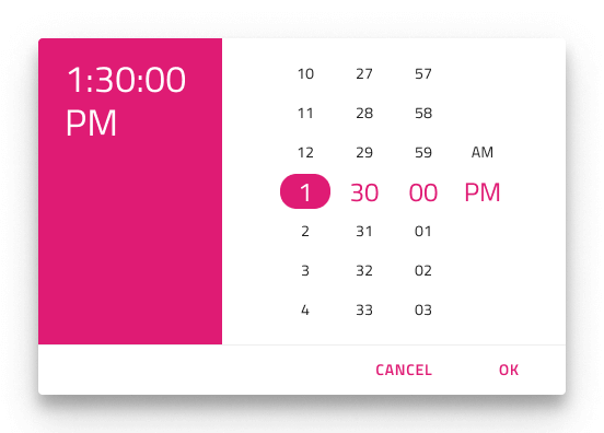
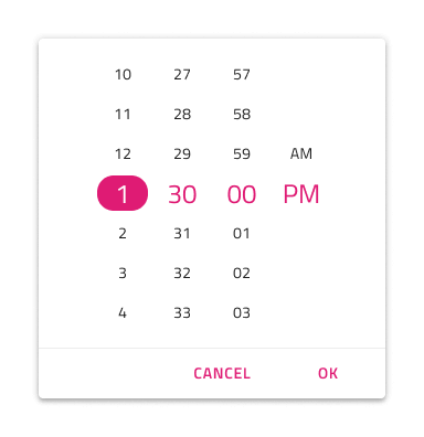
Layout
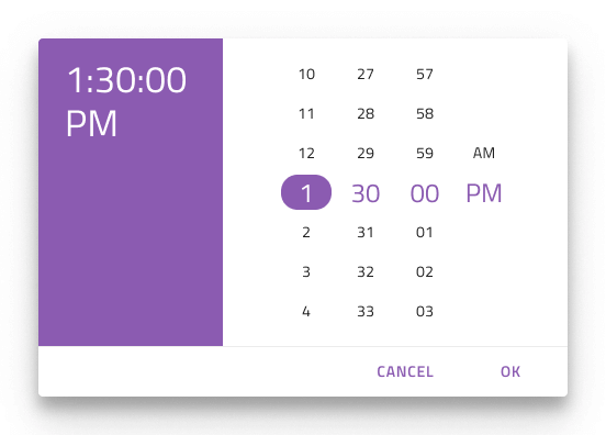
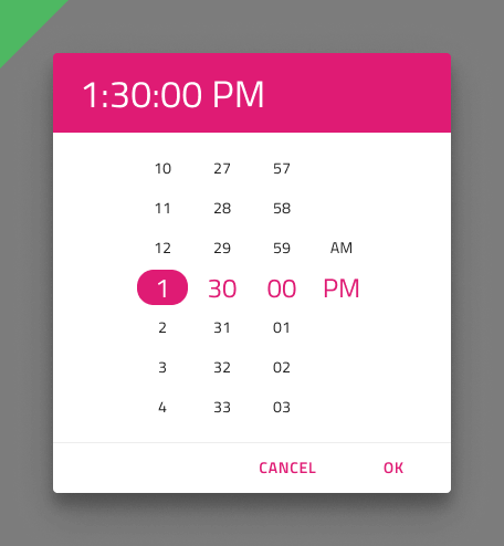
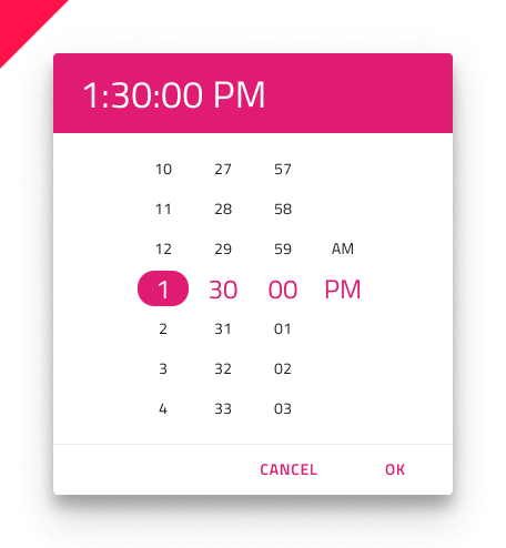
The Time Picker supports Dialog layout with Horizontal and Vertical orientation, as well as a Dropdown layout to facilitate different modes of picking time, casting different shadows to be more easily distinguished from each other. Notice that Dialog layouts come with a Header that you may hide in Figma by switching off the boolean Header property and the layout will adjust itself accordingly thanks to the added auto layout.

Content
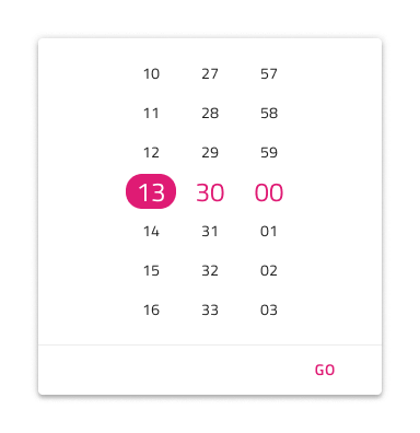
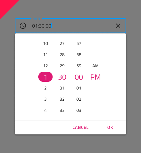
The Time Picker supports 12 and 24-hour formats through two distinct content modes. Besides the hour, minutes, and the seconds portion, the 12-hour content mode provides a meridiem portion, where selection between AM and PM is possible.

Buttons
The Time Picker comes with two buttons: one for canceling the selection, which would revert the time to the original one, and one for confirming the selection, which would save the changes made.
The Button area can be templated, making it easy to hide buttons as needed. In Figma, you can simply hide a button by hiding its instance from the layers panel or hide them altogether using the Action Buttons boolean property. To add additional buttons in Figma, you should first detach the component instance and then apply the desired changes.
Styling
The Time Picker comes with styling flexibility through the various options for header background and title colors, as well as text colors for the selected hour, minutes, seconds, and meridiem (AM/PM). The Cancel and OK buttons are Flat Buttons and can be styled accordingly.
Usage
When showing Time Picker as a Dialog add a layer that dims the rest of the UI, and when showing it as a Dropdown position it just below a Time Picker Input with Dropdown configuration.
| Do | Don't |
|---|---|
 |
 |
 |
 |
Additional Resources
Related topics:
Our community is active and always welcoming to new ideas.
 GitHub