


Blazor Data Grid for
Enterprise Applications
A Blazor data grid is a high-performance UI component for displaying, editing, sorting, filtering, and managing large datasets in Blazor Server and Blazor WebAssembly applications. The Ignite UI for Blazor Data Grid supports virtualization for millions of rows, Excel-style filtering, keyboard navigation, accessibility compliance, real-time data binding, and enterprise features like grouping, pinning, and export.
- Millions of rows without DOM bloat
- Works with Blazor Server, Blazor WebAssembly, and .NET 8+


Why Enterprise Teams Need More Than QuickGrid or a Basic Blazor Table
Microsoft's built-in QuickGrid and lightweight OSS options like MudBlazor's DataGrid work well for simple, read-only data — internal tools, short lists, basic admin screens with a few hundred rows. They're well documented, framework-native, and the right choice for many apps.
But enterprise applications hit limits fast. Financial dashboards stream thousands of updates per second. Admin panels need inline editing with validation and rollback. Analytics tools let users pivot, group, and export datasets that can exceed a million records. Procurement teams require WCAG 2.1 AA compliance and keyboard-only navigation before signing off on a component.
When teams reach for QuickGrid or an OSS table and start bolting on virtualization, editing, keyboard navigation, and accessibility one package at a time, the integration cost and maintenance burden often exceed the cost of adopting a purpose-built data grid from the start. A data grid provides these capabilities as a cohesive, tested unit — not a collection of loosely coupled add-ons.
Development teams choose Ignite UI for Blazor when they need to:

60fps Scrolling
Display and scroll through thousands to millions of rows without DOM bloat

Editing with Validation
Support cell and row editing with validation and transactional updates

Keyboard Navigation
Maintain full keyboard navigation and screen reader accessibility

Consistent Behavior
Build dashboards, admin panels, and data-heavy applications with consistent behavior across Server and WebAssembly hosting models
How does Ignite UI compare to other Blazor data grids?
The Ignite UI for Blazor grid competes most often against Telerik UI for Blazor, DevExpress DevExtreme Blazor, Syncfusion Blazor DataGrid, and Radzen/MudBlazor. The main differences come down to breadth of built-in features, licensing gates, and whether you need a full component suite around the grid.
| Feature | Ignite UI | Telerik | DevExpress | Syncfusion | Radzen / MudBlazor |
|---|---|---|---|---|---|
| Virtualization | Row + Column | Row only | Row only | Row only | Row only |
| CORE FEATURES | |||||
| Cell / Row Editing | Yes Built-in | Yes Built-in | Yes Built-in | Yes Built-in | Limited |
| Grouping + Summaries | Yes | Yes | Yes | Yes | Limited |
| Tree Grid | Yes | Yes | Limited | Yes | No |
| Hierarchical Grid | Yes (unique) | No | No | No | No |
| Keyboard navigation / WCAG | Full WCAG 2.1 | Full | Full | Full | Partial |
| Excel Export | Yes Built-in | Yes Built-in | Yes Built-in | Yes Built-in | Limited |
| ECOSYSTEM & LICENSING | |||||
| UI Component Suite | 60+ components | 100+ components | 65+ components | Broad suite | Grid-focused |
| Low-Code Builder | Yes App Builder | No | No | No | No |
| Licensing | Simple per-dev | Per-dev | Per-dev | Per-dev | Free / OSS tier |
Last updated: September 2026. Information based on public documentation.
For a full methodology and detailed analysis, see the Best Blazor Grid: Enterprise Comparison Guide.
Where the Ignite UI for Blazor grid stands out: it is the only grid in this comparison that offers both tree grid and hierarchical grid patterns, ships with a low-code App Builder for rapid prototyping, includes a shipping AI toolchain (Agent Skills + CLI MCP + Theming MCP) for use with Copilot, Cursor, and Claude, and is part of a 60+ component suite — so teams adopting the grid also get charts, editors, layouts, and scheduling components with consistent theming and API conventions. Radzen and MudBlazor are free/OSS but limited on enterprise features; Telerik, DevExpress, and Syncfusion offer broad suites but no hierarchical grid or low-code builder.
What are the key features of the Ignite UI Blazor data grid?
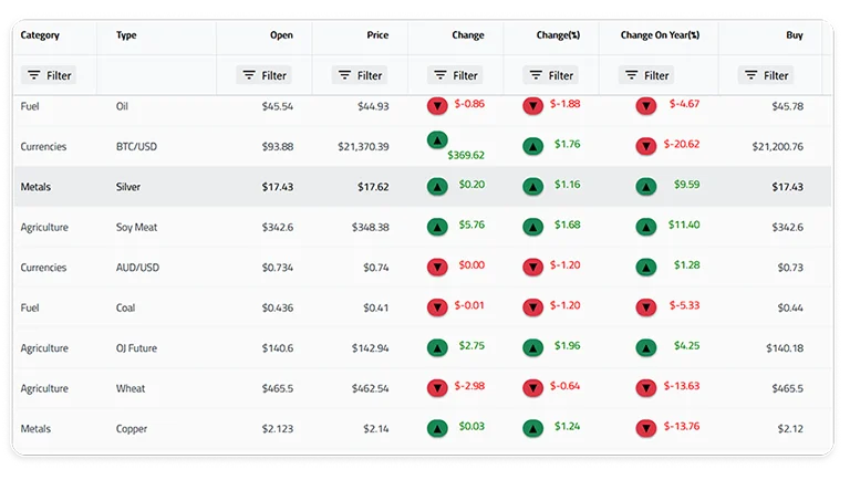
High-Performance Virtualization
The grid renders only the rows and columns visible in the viewport, keeping DOM size constant regardless of dataset size. Teams routinely load one million or more records with smooth 60fps scrolling and instant scroll-position restoration.
Both row and column virtualization are supported — a key distinction from grids that only virtualize rows. In wide datasets with dozens of columns (common in financial and scientific applications), column virtualization prevents horizontal rendering overhead that degrades scroll performance. The grid also supports variable row heights, deferred scrolling for extreme dataset sizes, and cell-level rendering optimization tuned for both Blazor Server's SignalR round-trips and Blazor WebAssembly's client-side rendering.
Common use cases: real-time monitoring dashboards, financial trading blotters, CRM admin panels, and IoT sensor data displays where users need to navigate datasets that would overwhelm a standard HTML table.

Sorting, filtering, and grouping
Multi-column sorting, Excel-style advanced filtering, and interactive Outlook-style row grouping with summary aggregations are built in. Users can combine these interactively — group by region, sort by revenue within each group, then filter to a specific date range — without any custom code.
Grouped views include collapsible headers with automatic count, sum, average, min, max, and custom aggregate functions. Filter UIs support both simple dropdown selection and advanced condition builders. Column pinning lets users lock key identifier columns while scrolling horizontally through wide datasets.

Inline editing and data interaction
Cell-level and row-level editing with built-in validation, undo support, and transactional commit/discard workflows. The grid exposes editing events at each stage — entering edit mode, validating input, committing changes — so teams can integrate with backend APIs, optimistic updates, or approval workflows.
Batch editing allows users to make multiple changes across rows and submit them as a single transaction, reducing server round-trips — particularly valuable in Blazor Server apps where every interaction is a SignalR message. The grid also supports clipboard operations (copy, paste, cut across cell ranges) and Excel export with formatting preserved.

Keyboard navigation and accessibility
Full keyboard navigation across cells, rows, groups, and editors. Users can tab into the grid, arrow through cells, enter edit mode, apply filters, and navigate grouped/expanded sections entirely without a mouse. Focus management follows WAI-ARIA grid patterns so assistive technology users get the same workflow as mouse users.
ARIA roles and live regions provide screen reader support that meets WCAG 2.1 AA requirements. Enterprise procurement teams increasingly require accessibility compliance as part of vendor evaluation — the Ignite UI grid is built to pass Section 508 and VPAT audits without aftermarket workarounds.

Hierarchical and tree grid
Most grids offer either a tree grid or a flat grid. Ignite UI for Blazor supports both: a tree grid for single-hierarchy expandable rows (org charts, file systems, category taxonomies) and a hierarchical grid for nested master-detail relationships (orders → line items → shipments, or accounts → contacts → activities).
Supporting both patterns in a single library is a meaningful differentiator — few competitors offer both in the same component library. Both grid types share the same API conventions, so developers who learn one can apply the same patterns to the other.
Getting Started in 60 Seconds
Install the grid package and render your first data grid in three steps:
dotnet add package IgniteUI.Blazor

<IgbDataGrid Height="100%" Width="100%"
    DataSource="DataSource"
    AutoGenerateColumns="true">
</IgbDataGrid>

Comparing Blazor data grids?
Build Grid Pages with AI — Skills + MCP
Ignite UI for Blazor ships an AI toolchain that grounds GitHub Copilot, Cursor, Claude Desktop, Claude Code, and JetBrains AI Assistant in the correct IgbDataGrid component APIs, import paths, and design tokens. Three independently usable layers:

Agent Skills
Developer-owned instruction packages that teach the AI assistant canonical IgbDataGrid patterns for your project. Discoverable from the cross-tool .agents/skills/ directory.

Ignite UI CLI MCP
A Model Context Protocol server that exposes project scaffolding, component generation, and documentation queries to the AI agent.

Ignite UI Theming MCP
A second MCP server that gives the agent access to design tokens, palette generation, typography, and WCAG AA contrast validation.
With the toolchain connected, ask the agent in natural language:
“Add a grid page to this Blazor project with sample financial data, Excel-style filtering, and summary aggregations.”
The agent uses the CLI MCP to scaffold the page, the Skills to apply canonical IgbDataGrid patterns and theme imports, and the Theming MCP to honor your design tokens.
FAQs about Blazor Data Grids
Frequently Asked Questions about the Ignite UI for Blazor Data Grid
What is the best Blazor data grid for enterprise applications?
The right choice depends on whether you need a standalone grid or a full component suite. Ignite UI for Blazor is built for teams that need enterprise features (virtualization, batch editing, WCAG 2.1 AA accessibility, hierarchical grids) alongside 60+ other components with consistent theming — see our comparison guide for a full breakdown against Telerik, DevExpress, Syncfusion, and Radzen/MudBlazor.
Does Ignite UI support both Blazor Server and Blazor WebAssembly?
Yes. The grid is fully supported across Blazor Server, Blazor WebAssembly, Blazor Web App, and .NET MAUI Blazor, with performance optimizations tuned for each hosting model.
Is Ignite UI for Blazor free to try?
Yes. Ignite UI for Blazor is available as a free 30-day trial with no credit card required.
Does the Ignite UI Blazor Grid support 1 million+ rows?
Yes. Row and column virtualization keep DOM size constant regardless of dataset size, with smooth 60fps scrolling at a million rows or more.
How does Ignite UI compare to Syncfusion's Blazor DataGrid?
Syncfusion offers a broad component suite but no hierarchical grid pattern. Ignite UI adds hierarchical grid support, a low-code App Builder, and a shipping AI toolchain under simpler per-developer licensing. See the full comparison guide for details.
Is the Blazor grid accessible / WCAG compliant?
Yes. Full keyboard navigation and ARIA roles meet WCAG 2.1 AA requirements, built to pass Section 508 and VPAT audits without custom overlays.
Can I use the same design tokens across Blazor, Angular, and React?
Yes. Ignite UI's theming system is shared across all frameworks — define design tokens once and the Theming MCP server generates framework-specific implementations.