Layout Best Practices
This topic provides design guidance regarding the positioning of Components in your app layouts and the setting of resizing rules that ensure good responsive app design. By sticking to the recommendations below, you will be able to generate an Angular app effortlessly with the responsive behavior specified in Figma.
Layout
In Figma you can either use absolute positioned frames/groups, in which case layout generation will follow the Absolute Layout rules, or you can take advantage of the Auto-Layout options:
Auto-Layout
Auto-layout is an unique Figma feature that allows structuring containers (such as Frames, Components, Groups) so that they have a more responsive layout that adapts according to the screen size. It allows setting rules on how the content should flow, how it should be positioned, sized and how it should spread within its container. As such it is very similar in concept as flexbox in web.
Auto-layout option can be set by the designer via Figma's UI:
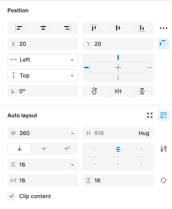
Below you'll find more information on each specific setting.
Layout Direction
Can be either Vertical, Horizontal or Wrap and determines the direction in which elements will flow in the container.
Will generate flex-direction: column for a vertical layout, flex-direction: row for a horizontal layout, and flex-direction: row and flex-direction: column of the nested columns for a wrap layout.
Alignment
Determines how items will be aligned within this container.
Correlates with the justify-content and align-items CSS options. Note that justify-content determines the alignment along the main direction axis (vertical for column, horizontal for row), while align-items determines the alignment along the counter axis (horizontal for column, vertical for row). So these depend also on the Layout Direction as well.
Others
You can also set spacing between items and padding via the related Gap Between Items and Padding options in Figma. These will parse as gap and padding in CSS.
Sizing
Figma has Horizontal and Vertical Resizing options that determine how items should resize relative to their parent or content.
Options are Fixed, Hug or Fill. Below you'll find what each one will generate.
Fixed - Size is fixed in pixels.
Hug - Size is based on the child content. No size is applied in this case.
Fill - Size is based on parent. It should stretch to fill parent. Relates to flex: 1 1 0px; or self-align: stretch.
Additional Resources
Related topics:
Our community is active and always welcoming to new ideas.
 GitHub