Accordion
The Accordion component allows users to reveal content in a vertical stack progressively. It typically consists of a list of Expansion Panels, where each item can be expanded or collapsed to reveal or hide its content. Accordions are often used to manage a large amount of information in a compact space and to allow users to focus on specific pieces of information selectively. The Accordion is visually identical to the Ignite UI for Angular Accordion Component
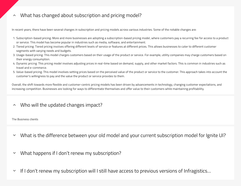
Accordion Demo
Using the Accordion in Figma
The Accordion comes with 5 panels. Each panel consists of top and bottom margins, which can be turned on/off with the boolean operations. By going into the nested Expansiоn Panels, you can modify their contents. If you need to design an Accordion with more Expansion Panels, the easiest way to do it is by detaching the component. To detach the component, you need to place it in your workspace (Frame). Right-clicking on it will open a contextual menu where Detach Instance should be selected.
After detaching the component, you will be able to add your additional Expansion Panels by duplicating any of the existing ones. In Figma, the size will be adjusted automatically thanks to the Auto Layout.
Expansion Panel States
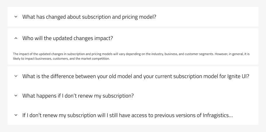
The Expansion Panel has Disabled and Expanded states, which can be toggled on and off for the selected Expansion Panel. Check Expansion Panels
In Figma, the Expanded property gives you the ability to configure the states of the panel as per your requirement. Additionally, based on the panel hierarchy in the Layers panel and which panel is expanded, you can activate the top and bottom margins from boolean properties, adding more space to your designs.
Styling
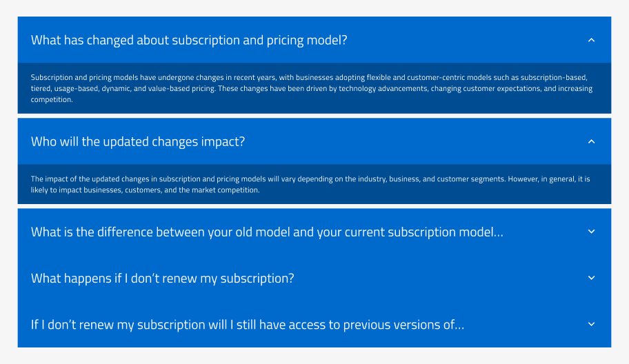
The Accordion component offers styling flexibility, with various options for customization. You can have different background colors for the Header and Body, and change the color and weight of the text. Additionally, you can customize the icon color and type.
Usage
If you are using an accordion to chunk information, only put non-essential information inside. For example, on a product page, you wouldn’t put the price or brand name inside an accordion. You would, however, put the sizing guide, delivery questions, and product materials inside one.
Additionally, avoid using accordions for small amounts of content that can be easily displayed on a single page or screen, and also refrain from overloading users with too many accordion sections or too much content within each section.
| Do | Don't |
|---|---|
 |
 |
Additional Resources
Related topics:
Our community is active and always welcoming to new ideas.
 GitHub