Avatar
The Avatar component is used as a graphical representation of a person, featuring options like a profile picture or image, an icon, or a string with initials. The Avatar is visually identical to the Ignite UI for Angular Avatar Component
Avatar Demo
Type
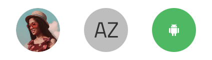
The Avatar supports various content types, including an image, initials as a string, or an icon.
Size
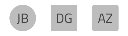
The Avatar is available in three sizes:
- Large: Ideal for profile pages.
- Medium: Perfect for custom menus and visualizations.
- Small: Suited for contact lists and repetitive scenarios.
Shape
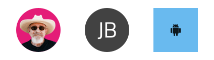
The Avatar component is available in three shapes: square, circle, and rounded.
Styling
The Avatar offers styling flexibility with options to customize the background color, initials and their text style, as well as the icon and its color, where applicable.
Usage
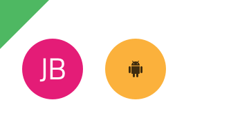
When using an Avatar with initials or icons, ensure their colors contrast well with the Avatar’s background. Avoid low-contrast combinations, such as similar shades of the same color or those that cause chromatic aberrations.
| Do | Don't |
|---|---|
 |
 |
Additional Resources
Related topics:
Our community is active and always welcoming to new ideas.
 GitHub