Banner
Use the Banner component to display a prominent message with optional actions. The Banner is visually identical to the Ignite UI for Angular Banner Component
Banner Demo
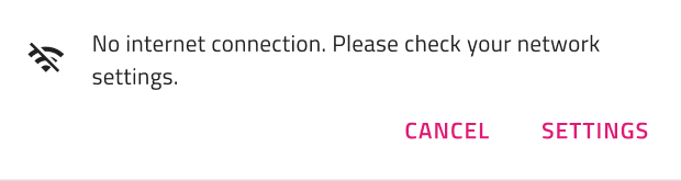
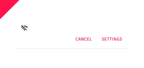
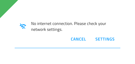
Message
The Banner's message section includes an Icon and a Text field. In Figma, you can toggle the Icon’s visibility using the “Icon” boolean operation from the properties panel.

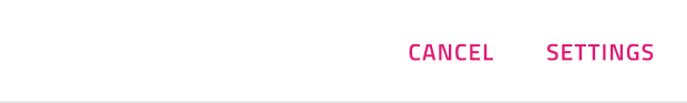
Actions
By default, the Actions section contains two Button components. In Figma, you can manage the displayed actions by keeping one button, hiding the other from the layers panel, or hiding the entire actions container using the “Actions” boolean operation.
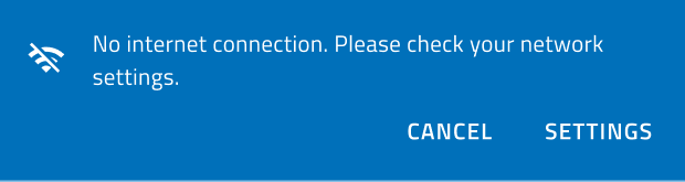
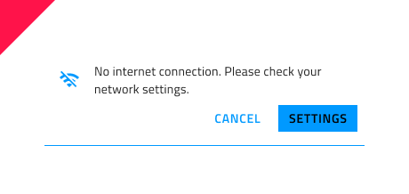
Styling
The Banner has styling flexibility with options for text, background and border colors, icon glyph and color, as well as the types of buttons with their styling options.
Usage
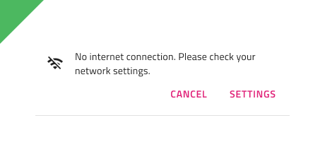
Illustrations are used to support the message. Don't use them without a descriptive text to promote the action. Don’t combine buttons with different emphasis, which would promote one action over the other.
| Do | Don't |
|---|---|
 |
 |
 |
 |
Additional Resources
Related topics:
Our community is active and always welcoming to new ideas.
 GitHub