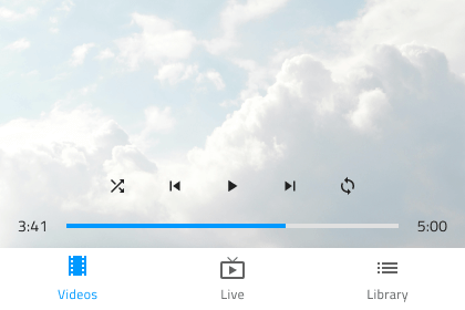
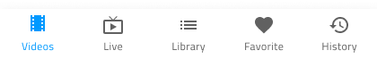
Bottom Navigation
Use the Bottom Navigation Component to implement application-level navigation by placing it at the bottom of the screen with up to five items that allow browsing between their associated views. The Bottom Navigation is visually identical to the Ignite UI for Angular Bottom Navigation Component
Bottom Navigation Demo
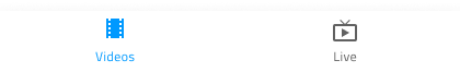
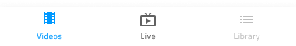
Items Amount
In Figma, the Bottom Navigation uses auto layout allowing it to adjust accordingly when one or more of its items are hidden from the layers panel. Bear in mind that the maximum number of items is limited to 5 and if you need to design application-level navigation with more items or views, consider using the Navigation Drawer instead.
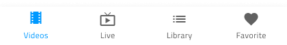
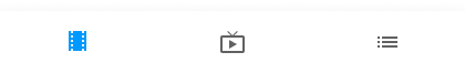
Item State
The Bottom Navigation consists of items that support Active, Inactive and Disabled states. In Figma, these items are nested .Base components inside the main Bottom Navigation component. To make changes, you have to select one or more items and modify their State through the Properties panel. In a Bottom Navigation there is always one Active item, and an arbitrary number of Inactive and Disabled ones.
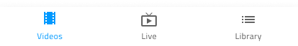
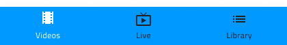
Item Content Template
The Bottom Navigation items come as a combination of icon and text by default. In Figma, you can switch on/off the label using the boolean operation from the Properties panel, once one or multiple items are selected.
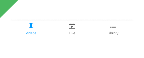
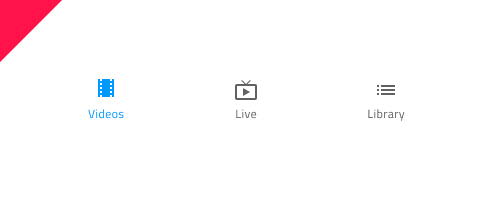
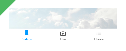
Styling
The Bottom Navigation comes with styling flexibility through the various options for the background color, as well as the item label and icon colors.
Usage
The Bottom Navigation always appears on top of other content, and the shadow it casts is a crucial visual element. Make sure that you always place its layer over those representing the screen content and under no circumstances should you remove the shadow it casts.
| Do | Don't |
|---|---|
 |
 |
 |
 |
Additional Resources
Related topics:
Our community is active and always welcoming to new ideas.
 GitHub