Checkbox
Use the Checkbox Component to allow the user make a selection, which most often expresses a preference or agreement in a form. The Checkbox is visually identical to the Ignite UI for Angular Checkbox Component
Checkbox Demo

Interaction State
The checkbox can be inserted in an Enabled or Disabled state. In Figma, you can additionally apply a single or a combination of the following properties: Hover, Focused and Invalid, which can be switched in the properties panel.

Layout Template
In Figma, you can change the label's position by using the "Label Position" property.


State
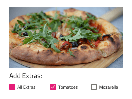
The Checkbox provides On, Off, and Indeterminate selection states. In Figma, you can switch the selection state using the "State" property from the properties panel.

Styling
The Checkbox comes with styling flexibility through the various options for its check and fill colors, as well as mechanisms to set a label position and color.

Usage
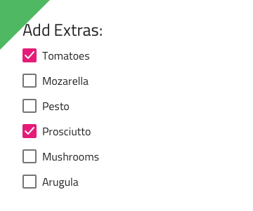
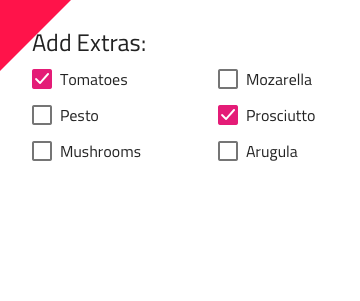
When many Checkboxes are necessary, you'll want to arrange them in a column group which makes it really easy to scan quickly through the list. Fewer Checkboxes may also be arranged on a single line next to each other but you should avoid arrangements in multiple columns.
| Do | Don't |
|---|---|
 |
 |
Additional Resources
Related topic:
Our community is active and always welcoming to new ideas.