Combo
Use the Combo component to allow users to select an option from a predefined list of choices or enter their own value. When the user clicks on the arrow down icon, a Dropdown list of options is displayed, and they can select one of the options, search for a value, or type their own value into the text box. The Combo is visually identical to the Ignite UI for Angular Combobox Component
Note
The Combo has two layout options: Combo with Multiple Select (Combo) and Single Select Combo (Simple Combo)
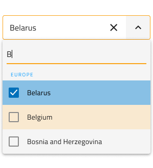
Combo Demo
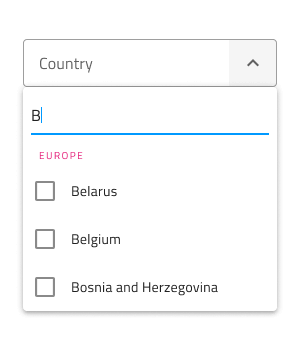
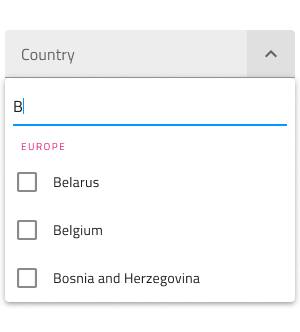
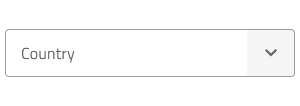
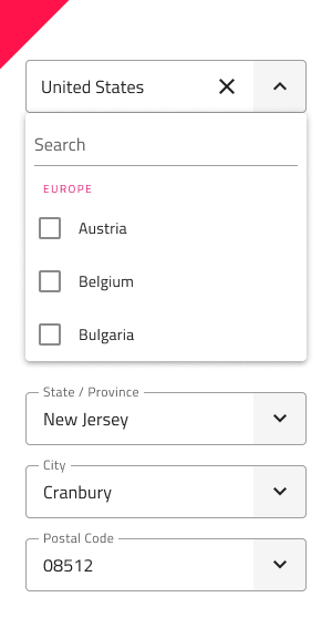
The Combo has two pieces: an Input containing the current selection or a placeholder, and a Dropdown that is shown in order to select one or more items.
Combo Input Type
The Combo Input in Figma provides selection between border type for a more structured perception on solid color backgrounds, and a boxed type that is most appropriate when placed on top of a vivid image to improve readability.
| Border | Box |
|---|---|
 |
 |
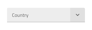
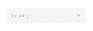
Interaction State
Each of the two Combo Input types can be inserted in an enabled or disabled state. The available border and box types in Figma can be switched to a disabled state from the properties panel.
State
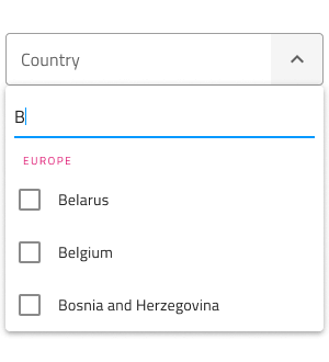
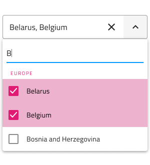
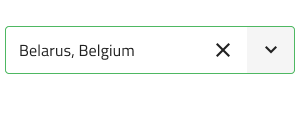
When the user interacts with the Combo, its input goes through various selection states: Idle with a placeholder in the place of the content, Focused when the Dropdown is open and the Search is Focused, Filled once the user has finished with selection and moved on. These flexibility enhancements afford a more dynamic interaction design that can seamlessly flow into high-fidelity prototyping.
| Idle | Focused | Filled |
|---|---|---|
 |
 |
 |
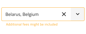
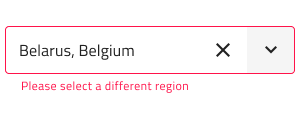
Every experienced designer uses constraints wisely to limit the user input and avoid invalid states, hence the availability of validation styles. Through the available validation styles, the Combo Input is consistent with the standard Input and equipped for sophisticated designs that display success, warning, and error visuals.
| Success | Warning | Error |
|---|---|---|
 |
 |
 |
In Figma changing the states is achieved via the properties panel.
Note
In Figma we have a separate base component called .Combo Input, which is explicitly used in the Combo component for both Single and Multiple selection types. The Combo Input has a Prefix container which can be switched on and off.
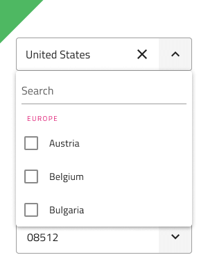
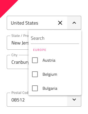
Dropdown Type
The Dropdown used for the Combo comes with the appropriate sizing for desktop and mobile use similarly to the normal Dropdown component. The Dropdown can be switched on and off from a boolean property which can visually affect the input, but this is an expected behaviour.
| Desktop | Mobile |
|---|---|
 |
 |
Dropdown Search Input
In Figma the Dropdown contains a Search Input that comes with a selection of states and options for layout akin to the standard Input.
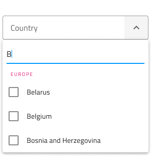
Dropdown Items
The Dropdown used for the Combo supports two types of items: header and multi-select item. Through headers, it is possible to organize items in groups. In Figma, the Dropdown utilizes the auto layout option, which adjusts the layout, once one or more items get hidden from the layers panel.


Dropdown Item States
The Dropdown items within the Combo support three different states: Idle, Hover and Focused. Disabled and Selected states can be switched on and off from boolean properties and they are applicable for all states of the Dropdown.
| Idle | Hover | Focused | Disabled | |
|---|---|---|---|---|
 |
 |
 |
 |
|
| Selected |  |
 |
 |
 |
Styling
The Combo comes with the combined styling flexibility of its input and dropdown pieces. There are options for the input text elements' color and bottom line style and color. For the dropdown one may change the background color, or use the various options related to the items in the Combo Dropdown, such as the Search Input and the items with their background and text colors.
Usage
When using the Combo, its input and dropdown should have the same width and their left and right borders should match. Regarding how the dropdown is shown when the Combo is focused, you should always show it on top of the content that follows the Combo triggering its display. Combos don't push content like expansion panels do.
| Do | Don't |
|---|---|
 |
 |
 |
 |
Additional Resources
Related topics:
Our community is active and always welcoming to new ideas.
 GitHub