Expansion Panel
Use the Expansion Panel Component as a way to preserve screen-space, where you have a lot of text and would like to hide it with the title in the Header giving initial information, and when opened, the Body's content giving more details. The Expansion Panel has two main states - Collapsed and Expanded. The Expansion Panel is visually identical to the Ignite UI for Angular Expansion Panel Component
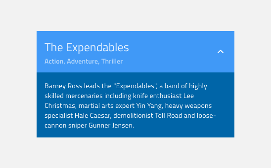
Expansion Panel Demo

Header State
The Expansion Panel's Header comes in Active and Disabled state. You can switch between them using the Disabled boolean operation in Figma.
 `Active`
 `Disabled`
Header Layout
The Expansion Panel's Header Layout consists of Left Expansion Panel Icon, Content including Title and Description, and Right Expansion Panel Icon. In Figma there are Icon and Description properties, which let you modify the layout.


Body
The Expansion Panel's Body contains a text paragraph that is visible only in expanded state.

Styling
The Expansion Panel comes with options for changing both the Header's and Body's background colors, as well as text and icon colors.
Usage
When using an Expansion Panel, make sure to use icons that give a proper idea of its usage, i.e. that there is more content available when the panel is expanded.
| Do | Don't |
|---|---|
 |
 |
Additional Resources
Related topics:
Our community is active and always welcoming to new ideas.
 GitHub