Grid Sizes
The Grid is available in three sizes — Large, Medium, and Small. The Large variant provides the most spacious layout, while the Small variant is the most compact. The Grid Size is visually identical to the Ignite UI for Angular Grid Size Feature.
The more data a grid has to display, the denser its layout needs to be. This also leaves less and less whitespace in the layout of all its elements including the header and body cells, overlays and dialogs, as well as elements that are attached to the grid above or below the main content like the Toolbar and the Summaries.
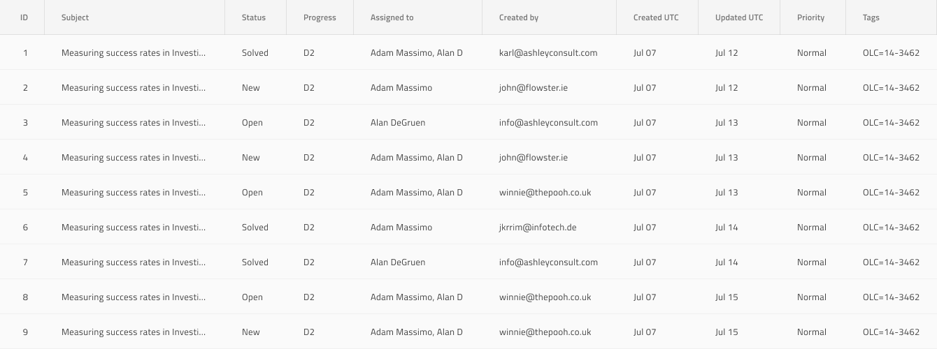
Grid Size - Large
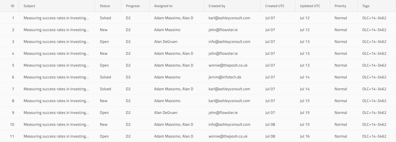
Grid Size - Medium
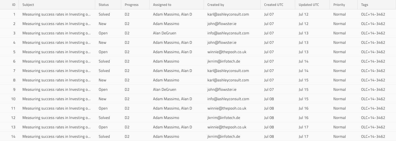
Grid Size - Small
Note
When working with Size make sure that all your Grid elements and features use the same Size type.
Additional Resources
Related topics:
Our community is active and always welcoming to new ideas.
View page on
 GitHub
GitHub