Icon
Use the Icon Component to provide subtle graphical information to the user that, in some cases, may also trigger simple interactions such as liking a product, saving an article for later, etc. You may choose between the already provided Material Icons or add the ones you need to the Icons page in Figma in the Indigo.Design System and the only condition here to use your icon is that it needs to be a component. We highly recommend exercising caution when selecting icons to add to the kit. It is important to maintain consistency in order to ensure the best visual coherence between them. The Icon is visually identical to the Ignite UI for Angular Icon Component
Icon Demo
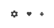
Size
The Icon comes in three different sizes:
- Large
- Medium
- Small
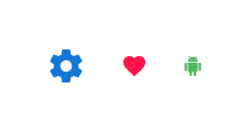
Styling
The Icon comes with styling flexibility through the options for selectable graphic and the color applied to it.
Usage
Carefully pick the Icon color to assure good contrast with the background and definitely avoid similar shades of the same color or combinations that create chromatic aberrations.
| Do | Don't |
|---|---|
 |
 |
Additional Resources
Related topics:
Our community is active and always welcoming to new ideas.
 GitHub