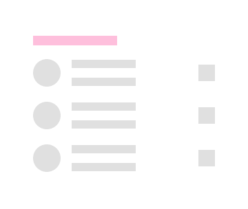
Skeleton List
Use the Skeleton List Component to layout the same type of information that you would in the standard one, but to also indicate an application state when no data is present at the moment e.g. when data is loaded from a remote datasource and there is either lack of connectivity, or it takes some time. The Skeleton List is just a visual representation of a List with known layout, but without any data to show.
Skeleton List Demo
Type
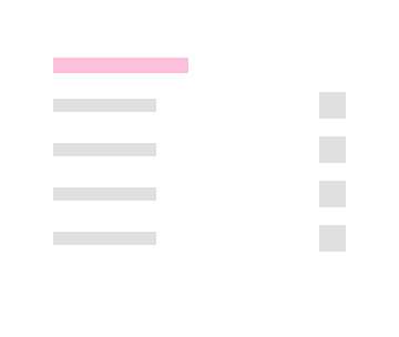
The Skeleton List supports the same two types like the standard List: One-line Item List and Two-line Item List.

Skeleton List Item
The Skeleton List Item comes in the same three preset types like the standard List under the property Line in the property panel: Header, One-line, and Two-line.


List Item Areas
The Skeleton List Item has two distinct areas like the standard List: Primary Action and Secondary Action.


Primary Action
There are 5 interchangeable Skeleton List Item Primary Actions available under Type property in Figma. The Skeleton List Item Primary Actions are like the standard List Item. The List Item supports One-line and Two-line options which can be found under Line property.
| Avatar + Label + Description |  |
||
| Checkbox + Label |  |
Checkbox in a Primary Action can not have a label, therefore, the before and after labels are toggled off in the layers panel in Figma and this setting should not be changed | |
| Icon + Label + Desc |  |
||
| Label + Progress |  |
||
| Label |  |
Secondary Action in Figma
The Secondary Action of the Skeleton List Item covers all scenarios possible with its counterpart from the standard List Item. In Figma all the actions will be added soon.
| Text and Icon |  |
Usage
When creating a list layout, avoid combining standard and skeleton list items. Data is either present for all list items, or for none of them, thus the two types should not be used within the same layout.
| Do | Don't |
|---|---|
 |
 |
Additional Resources
Related topics:
Our community is active and always welcoming to new ideas.
 GitHub