Navbar
Use the Navbar Component to provide clarity on the current position in the application and to implement simple application-level navigation. If your application requires more complex navigation with larger number of actions consider using a Navigation Drawer or Menu instead. The Navbar is always situated at the top of the screen and is visually identical to the Ignite UI for Angular Navbar Component
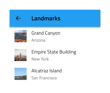
Navbar Demo
Type
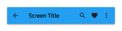
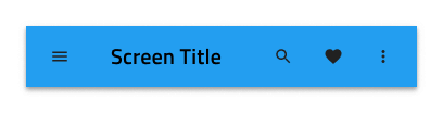
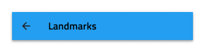
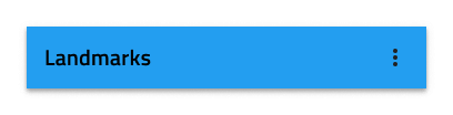
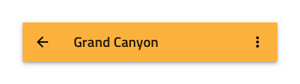
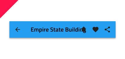
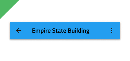
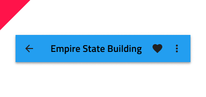
The Navbar casts a shadow on the main content area to separate it from the rest of the content and comes in two action variants: Icon Actions and Icon Button Actions.
Content Layout
The Navbar content is split into a left area, consisting of a Left Action and a Title (Left Action and a Content frame with the Title inside in Figma), and a right area with up to three adjacent icons or icon buttons that can trigger different simple events. In Figma, you can toggle the visibility of the Nav Icon and Actions using their boolean properties, go into the nested Icon and Icon Button components and change their icons or hide some of the Actions from the layers panel, after which the content will adjust itself thanks to the auto layout.
Styling
The Navbar comes with basic styling flexibility through the options available for the title, icons, border, and background colors.
Usage
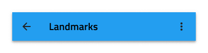
Navbar actions should be carefully set up to avoid situations where they overlap with the title. This can be avoided by hiding all icons to the right but one and assigning it a more icon represented by three dots to trigger the appearance of a simple menu. If a more icon is specified within the actions, aggregate all actions you would normally place in the Navbar under it and avoid placing any standalone actions in the Navbar.
| Do | Don't |
|---|---|
 |
 |
 |
 |
Additional Resources
Related topics:
Our community is active and always welcoming to new ideas.
 GitHub