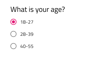
Radio Group
Use the Radio Group Component to allow exclusive selection for one item in a group. The items in the group come one after another laid out in a single column. The Radio Group is visually identical to the Ignite UI for Angular Radio Button Component
Radio Group Demo
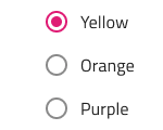
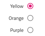
Label Position
In Figma the Radio Group supports label position variants where the Radio button label is placed after or before the Radio button element.
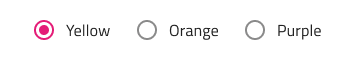
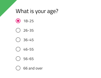
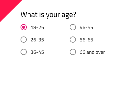
Orientation
The Radio Group comes in a Vertical and Horizontal orientation.
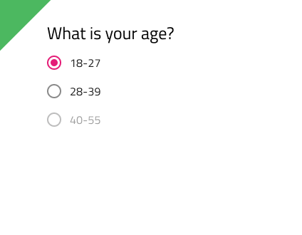
Interaction State
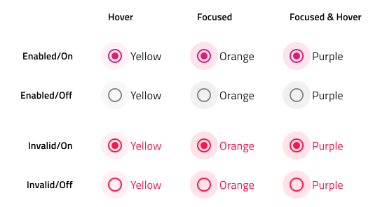
The Radio Group supports Enabled, Disabled and Invalid interaction states.
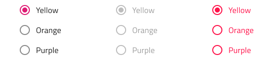
You may also set the state of a radio button in the group to Disabled to disallow user interaction with it.
In Enabled and Invalid interaction states, each radio element also supports Hover, Focused and Focused & Hover states.
State
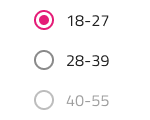
Each Radio element in the group supports on and off selection states. In Figma, you can switch between them by using the Checked boolean property in the right sidebar.
Styling
The Radio Group comes with styling flexibility through the various options for each item's label style and color.
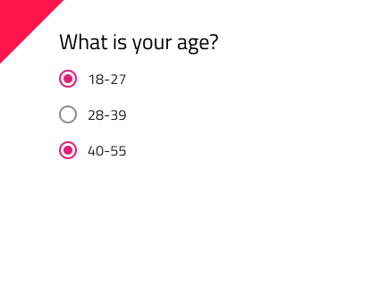
Usage
When extending a Radio Group with additional items, make sure that they are aligned consistently and form a single column. Avoid layout in multiple columns, as well as situations with more than one Radio element with on state at a time.
| Do | Don't |
|---|---|
 |
 |
 |
 |
Our community is active and always welcoming to new ideas.
 GitHub