Rating
The Rating component enables users to apply a rating to an item or experience, such as a product, service, page, other entity, and more. The Rating can display a single user's, or an aggregate, star rating and it's used to let users set their own star rating. The Rating is visually identical to the Ignite UI for Angular Rating Component
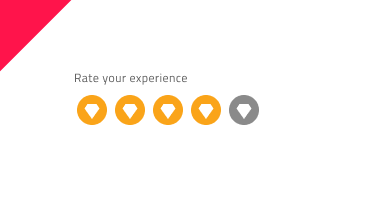
Rating Demo

Using the Rating in Figma
The Rating is built from Label and Value, where the Value is the number of the rating scale. The Label can be switched on/off using a boolean property. The number of icons in the rating scale is predefined to 5 stars in total, but if you need to design a Rating with more rating icons, the easiest way to do so is by inserting the component into your workspace. After that, right-clicking on the component will open a contextual menu, where Detach instance should be selected, and you should see the following detached layer structure:
| Layer | Use |
|---|---|
| 🚫 componentVersion | A special locked layer starting with a prohibited icon. This layer is required by the code generation and you should avoid deleting or modifying it. |
| 🚫 metadata | A special locked layer starting with a prohibited icon. This layer is required by the code generation and you should avoid deleting or modifying it. |
| Label | Text layer that can be changed or hidden, if not needed |
| Value | Contains all the rating icons |
After detaching, you may increase the number of the rating icons by duplicating any of the existing ones, nested in the Value frame, and the size will be adjusted, thanks to the auto layout.
To reduce the number of rating icons, there is no need to detach the component. You can simply hide the unnecessary icons from the Layers panel.
Interaction States
In Figma, when inserted, the Rating component is always enabled by default. You can disable it from the properties panel.
State
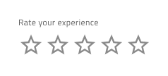
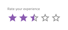
The Rating component has an Empty State and it can be switched on and off from a boolean property in Figma. In addition, there is a Value property in Figma, which is the opposite of the Empty State and allows you to select the fulfillment of the Value from predefined options from 0 to 5 (supporting half star as well).


Size
The Rating is available in three sizes - Small, Medium and Large.

Styling
The Rating comes with styling flexibility through the available options for the Value icons' color and type, as well as changing the label text color. However, it is recommended to use the predefined colors and icon type, based on the theme lightness, to assure optimal text legibility.
Usage
The star is a very recognizable ranking symbol, and people may not associate other symbols with a rating scale. If you replace the star with a custom symbol, make sure that its purpose is clear. Avoid colors with poor contrast, like similar shades of the same color or combinations that create chromatic aberrations. The Icons selections should be emphasized and should have a good visual distinct appearance.
| Do | Don't |
|---|---|
 |
 |
 |
 |
Our community is active and always welcoming to new ideas.
 GitHub